AP push alert project: Face-to-face collaboration is key
The Donald W. Reynolds Journalism Fellowship is an opportunity to try out ideas that have been talked about in a newsroom but for one reason or another haven’t been done.
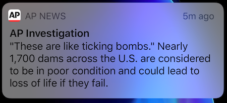
At the Associated Press, we wanted to take a closer look at our push alerts to our readers and increase collaboration between the editorial and products teams.
To start the project, we decided a good first step would be to have me observe the push alerting process in real-time. Sitting next to our editors gave me a chance to get out from behind the screen and see what really happens when news breaks, which is somewhat different than I imagined.
Our editors monitor breaking news through our internal systems, but I didn’t know the extent to which they also rely on Twitter and Slack. When we decide to send an alert, there’s the kind of editorial deliberation I’d imagined, but I was surprised that the process for sending it had quite a few steps. Watching it happen, it became clear to me that some of my initial ideas for the project might not work – there was already a lot happening within not much time – but I also thought about how some simple product changes could make their jobs easier.
One of our top editors showed me how he copied text into a Word doc to get a quick character count before sending out an alert. It was resourceful and smart, since he didn’t want critical information to get cut off by a lock screen. But for a product for which speed is critically important, it bothered me that this step added even a few extra seconds. A simple character count isn’t a huge development project, so after the observation we submitted a feature request to get one built-in to our alert tool. That was an easy win that might not have happened without the observation.
Not interfering with speed became a major takeaway – improving speed is better – but so was the need to introduce actionable business intelligence somewhere in the process. Our editors have strong news judgment, but they still want analysis of the alerts they’re sending so they can understand what works and what doesn’t for our users. The challenge for me was thinking about what data points could tell a useful story and how to deliver it to them in a way that would actually get used.
We know from other projects we’ve undertaken that introducing a new workspace often fails.
This lesson became apparent again when we tried creating an automated daily report about our push alerts. The report compiled data into a .pdf every morning, and it just didn’t take off. We included a count of the number of alerts we’d sent the previous day, as well as a breakdown of the best and worst alerts over the last 30 days. We defined best and worst by the total number of clicks, and we looked at how app traffic during the hour an alert was sent indexed against that hour’s typical traffic.
There was some good information in the report, but it wasn’t sparking conversation or helping us build a strategy. Trying to figure out why, I realized that the report was missing the critical context of why a given alert might have been good or bad. It was just numbers – and while we can say that bigger numbers are better, one of the undertakings of this project was to get beyond that simple way of measuring success. Also, the daily report wasn’t allowing us to step back and see bigger trends.
Like any good setback, we learned from our mistakes, and now we’re trying out different ideas. Rather than a daily report, we’re working on a deeper analysis over a longer period. Instead of comparing alerts over time – this week vs. last week – we’re looking for patterns among stories that look like each other.
If we go back a year, we can pull out the stories with many, ongoing developments like a hurricane or the impeachment trial. How often did we choose to send an alert as those stories evolved, and did our users want every development, or just the big ones? Plucking out recurring news events like the results of sporting events or awards shows is another way we can look for patterns. Did we send an alert with just the final result, or did we add context about why a win was significant, and how did that impact interest from our users?
The most important lesson from that .pdf goes back to the idea of working together. An automated report isn’t the same as face-to-face interaction. Over the course of this project we’ve had discussions about why certain things were sent and what we want to try. Were they in a rush? Did they intentionally try wording things in a new way? What would we change if we had a do-over? We pull specific data points and talk about them in person. And while I hesitate to recommend a format that has its own problems – a good, old-fashioned meeting — it’s how we’re making the most progress so far.
