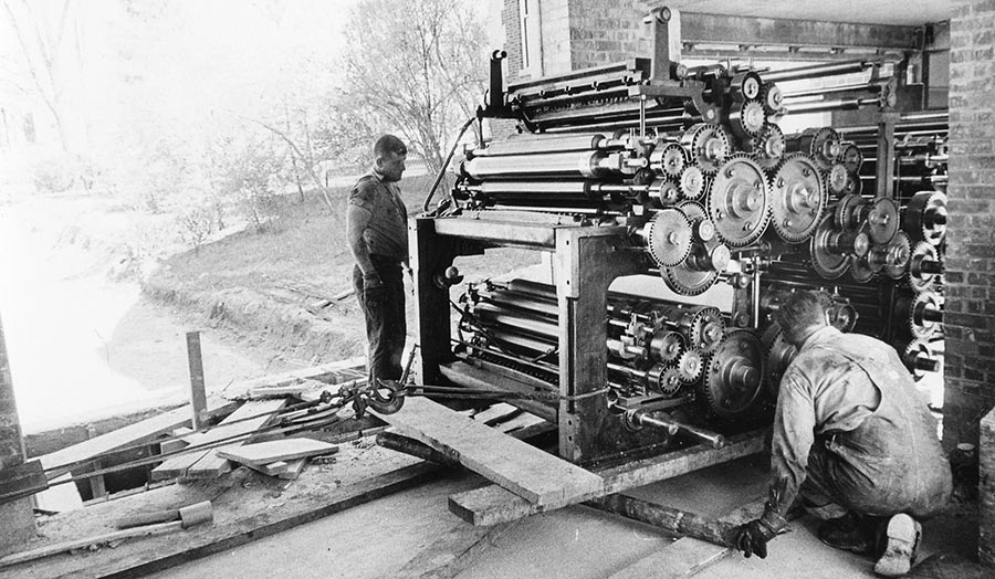
Moving Missourian printing presses, 1961, courtesy of University Archives (C:11/15/1 Box 3 FF 11), University of Missouri at Columbia.
WordPress moves news past the printed newspaper
Local newspaper sites have long broken all the rules for building a sticky site. Most still load painfully slowly. They are difficult to navigate and — let’s be honest — often ugly.
—Matthew Hindman, Shorenstein Center
For centuries newspaper design has stayed about the same. In 1880 printers introduced halftone photographs and in the 1980s the four-color process. Many newspapers use this centuries-old aesthetic to design their websites, then surround the design with slow-loading ads.


Some papers, though, are exploring beyond the printed page. They’re experimenting with simple ways to enhance print articles online, adding multimedia, interactivity and auto-updates while making sure these enhanced Web pages load quickly.
It’s time for us to treat performance as an essential design feature, not just as a technical best practice.
—Brad Frost, “Performance as Design”
The examples below are all print newspapers with innovative Web page design and speedy Web page performance. These papers — large, small and student — illustrate the range of what news sites can do. All use WordPress, the most popular open-source content management system (CMS) for newspapers. I consider WordPress the most flexible CMS. It powers 25 percent of all websites and is the focus of my fellowship project at the Donald W. Reynolds Journalism Institute.
Page design, page performance

Page speed: 2.6 seconds (70 requests, 3.4 MB).
Uses: WP Engine hosting, Font Awesome icons, Underscore.js library, Typekit fonts.

Page speed: 2.3 seconds (60 requests, 1.6 MB).
Uses: Bootstrap framework, CloudFront CDN, WordPress API (to pull content), Mustache (for HTML templates), Typekit fonts.
Alternative weeklies are pioneers of nontraditional home pages. The 225 Magazine, from Baton Rouge, Louisiana, is unafraid of color. Louisville, Kentucky’s LEO Weekly likes lots of photos with a wide one front and center.
These newspapers are page-speed demons, loading in less than three seconds. Compare that to the 16-second load time of the Pittsburgh Post-Gazette, above, and the industry average of 17 seconds.
Readers, however, don’t care about home pages. They come for content. So let’s look inside to see how local newspapers augment their print stories online.
In-depth multimedia reports

Page speed: 3.5 seconds (58 requests, 13.5 MB).
Uses: Novella child theme, StoryMapJS, W3 Total Cache, Google Fonts, Font Awesome.

Page speed: 4.2 seconds (105 requests, 2.6 MB).
Uses: HTML5 Boilerplate template, Starkers starter theme, TN3 Gallery, SoundCloud audio.
The Texas Observer’s “Graves of Shame” is a collaboration with The Nation Institute investigating the mishandling of migrant remains. The Web article is a multimedia version of its July 2015 cover story. Images and large pull-quotes guide the reader down the page. At the bottom is a click-through photo gallery and an audio embed of a Texas Standard public radio interview with the reporter.
Additional kudos to the Texas Observer for making its archives available back to its first issue in 1954. That’s a good first step in the preservation advocated by RJI’s Journalism Digital News Archive initiative.
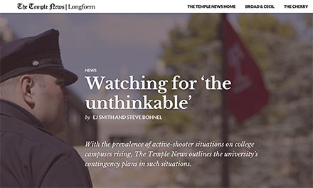
A WordPress plugin named Aesop Story Engine “presents rich, interactive stories or articles in any WordPress theme.” The student-run Temple News puts the plugin to work in the paper’s Longform section. “Watching for ‘the unthinkable’” comprehensively covers “active-shooter situations on college campuses” with videos, a large infographic, a StoryMap of past incidents and striking browser-wide photographs.
Longer articles must be readable and “brain-friendly.” That requires a keen design eye and an intimate relationship with practical typography. The websites LongReads.com and Longform.org curate collections of great online journalism features.
Photo galleries

Page speed: 6.4 seconds (171 requests, 2.1 MB).
Uses: NextGEN Gallery, HTML5 Blank child theme, Google Fonts.

Page speed: 5.9 seconds (169 requests, 8.1 MB).
Uses: Galleria gallery, WordPress VIP hosting.
When an article has enough good shots, a photo gallery is a good way to go. The Framework section of the Los Angeles Times highlights its visual work by “capturing the world through photography, video and multimedia.” The designers use the Galleria image gallery.
The San Francisco Examiner’s Photo Galleries use the popular NextGEN Gallery, a WordPress plugin with 1 million active installs.
WordPress has its own built-in gallery. Combined with the Jetpack plugin’s Carousel module, it can display slideshows or a tiled mosaic of thumbnails that open into a full-page gallery (see the collection of “Qatar’s seafaring history” photos at Doha News).
Interactivity

Page speed: 3.3 seconds (48 requests, 0.8 MB).
Uses: Largo child theme, TablePress plugin, WP Engine hosting.

Page speed: 4.1 seconds (77 requests, 1.1 MB).
Uses: MapBox with Leaflet map library, D3.js data visualizations.
Data no longer must sit statically in a chart. The Web lets people interact with information, drilling down into individual data points or rearranging the entire sample.
The Albuquerque Journal’s “New Mexico Voting Locations” map shows addresses inside the map markers. The newspaper for public media, Current, embedded a table of compensation for station executives with user-sortable columns.
“How They Did It — Part I” (and Part II), subtitled “Spotting Storytelling Tools in The Wild,” lists the tools major news sites use to present interactive data. Storybench, from Northeastern University, tells the behind-the-code stories about making visualizations at news sites.
Landing pages

Page speed: 41.1 seconds (496 requests, 5.5 MB).
Uses: Storify, Brightcove video.

Page speed: 7.7 seconds (241 requests, 2.1 MB).
Uses: WordPress REST API, RequireJS loader, oEmbed.
Landing pages are the Web’s way of aggregating information on a single subject, whether it’s the UFO Blog at the Syracuse New times, the kitschy covers of the New York Post or the World Cup coverage of USA Today.
First Draft is a “vertical for politics” updated throughout the day by reporters at The New York Times’s Washington bureau. Blogs like this at the Times run on WordPress. The nerds among us will appreciate developer Scott Taylor’s posts about getting the paper’s many platforms to place nice together, and the deft date queries needed to form First Draft.
The idea is: you open the site in a tab at the beginning of the day, and you receive updates throughout the day when new content is available.
—Scott Taylor, The New York Times
The Seattle Times page, above, fails from a performance perspective, but it succeeds as an example of turning a news article into a landing page: The paper’s initial post about a powerful wind storm shows how a story can grow online to become a hub for the latest updates. Reporters added breaking-news posts all day. They created a Storify embed of tweets from readers and from the state transportation department, videos of raging ocean waves and Snoqualmie Falls, and a gallery by staff photographers.
Lauren Rabaino, now at Vox Media, was the news applications editor at The Seattle Times when she wrote “The New, Convoluted Life Cycle Of A Newspaper Story.” This seminal essay considers how stories evolve online, from reporters’ tweets to by-lined articles, which are later inter-linked with future articles and shared on social sites.
Special sections

Page speed: 6.8 seconds (193 requests, 2.7 MB).
Uses: Photon CDN, custom theme based on Twenty Thirteen.

Page speed: 6.5 seconds (205 requests, 1.5 MB).
Uses: Google Maps, Google Calendar.
Beyond landing pages is the ability to easily add entire new website sections that can expand with its topic. Those special sections can house both an archive and breaking news.
The “Homicide Watch” section of the Chicago Sun-Times extends the idea of obituary to include video remembrances, map navigation, and a calendar of court dates to “Remember every victim. Follow every case.” It’s part of a national network of Homicide Watch sites.
A simpler special section is the Bangor (Maine) Daily News (BDN) “Act Out with Aislinn” column. It auto-lists all posts in the “1-Minute Adventures” category, with links to local hikes, dog walks and trail maps, along with lots of photos and videos. Like The New York Times, the BDN’s developers also blog about building special features. Among them: “Proof,” on rape survivors, and “Homeless,” about a night in a shelter.
WordPress in the news
The galleries of newspaper themes at WordPress and WordPress VIP demonstrate how far news sites can transcend what’s possible on paper — using free, open-source CMSs.
Here’s a map of U.S. newspapers, both daily and alternative weekly print papers, which run their main websites on WordPress:
Here's a map of U.S. newspapers, both daily and alternative weekly print papers, which run their main websites on WordPress:
Correction (March 9, 12:10 p.m.): An earlier version of this article had references to features in Vox Magazine which are no longer online. The earlier version also did not have image from the The Seattle Times.

