Art in the newspaper: Love, guns and kiwis
The goal of my fellowship at the Donald W. Reynolds Journalism Institute is to explore how journalists might find new uses for and maximize the dormant advantages of analog media by “thinking like artists.” As an artist who happens be a former Associated Press reporter, I’ve thought often about ways these two professions overlap — one of them being whether art and journalism should even be called “professions” in the first place. Perhaps art and journalism should be called “practices,” which we learn only by doing and that, ideally, evolve through rigorous self-examination. Both share a commitment to social relevance and reinvention.
My particular focus was the newspaper as a physical object: what can it do that online editions can’t? Just to consider the “object-ness” of the newspaper puts us in art territory. What’s it made of? What’s in it? What color is it? What size? What texture? How does it move and fold? What does it smell like? Who uses it? What’s its intended purpose and, beyond that, what else can you do with it? Artists of all stripes, from painters and photographers to ceramicists and weavers, spend their life’s work investigating these kinds of formal questions about a medium as a way to honor it, subvert it and advance the conversation around it.
After applying “art thought” to the problem of the newspaper, the project I landed on was, on its face, pretty simple: Let’s put art in the newspaper. By which I mean, let’s give readers and subscribers a work of art as a “gift” that highlights the “object-ness” and purpose of the physical edition. The idea: treat the newspaper as a special exhibition space for art that, unlike a regular political cartoon, functions on its own terms as a work of art but simultaneously engages the newspaper as a site of information and opinion. The art is both a keepsake and conversation trigger and — most important — something readers can experience only by getting the physical edition.
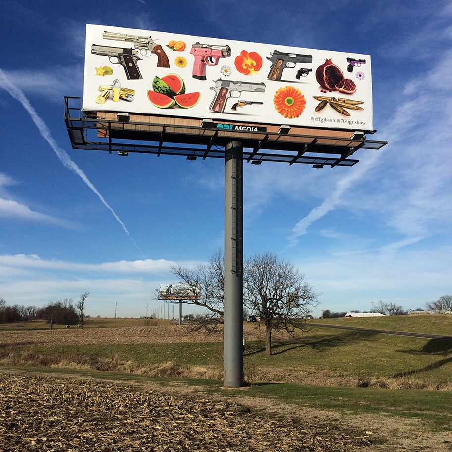
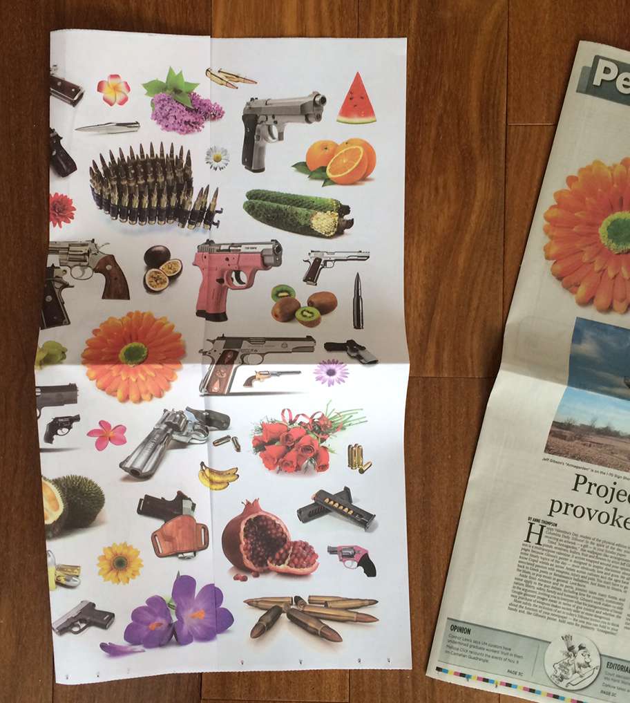
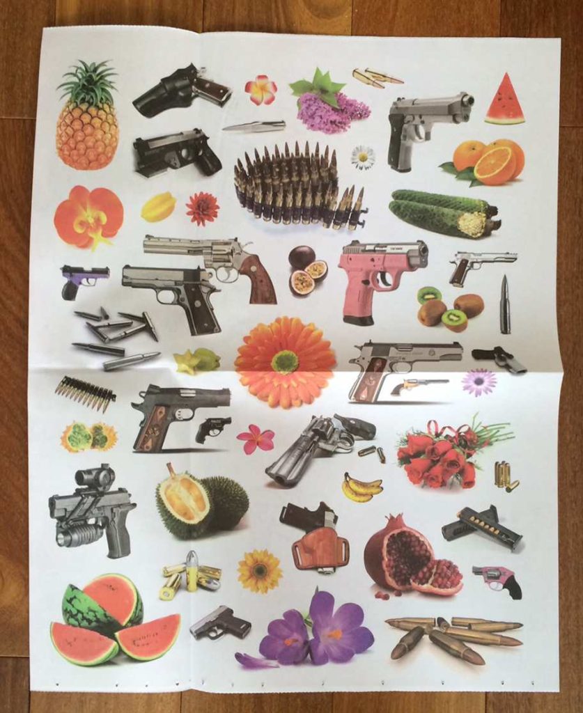
These ideas flow from my art-on-billboards project, the I-70 Sign Show, which uses Missouri’s signage surplus to exhibit art as political and cultural commentary. With that in mind, RJI Executive Director Randy Picht and I approached the Columbia (Mo.) Daily Tribune about printing and distributing a poster version of a current Sign Show billboard. Tribune President Andy Waters and Publisher Vicki Russell gamely agreed to this experimental collaboration. They didn’t blink when we presented the proposed artwork — a wallpaper-like taxonomy of guns, fruit and flowers by artist Jeff Gibson, titled “Armagarden” — designed to provoke nuanced conversation about gun control.
And they agreed to do this on Valentine’s Day.
Below is a timeline of how the project progressed. (For more about the motivations and implications of “Art in the Newspaper,” please check out the Tribune editorial I wrote to accompany the poster.)
- Organizing starts in mid-November 2015 for poster publication Feb. 14 and public event about the project Feb. 16.
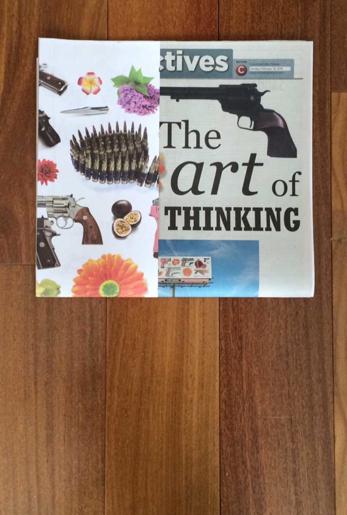
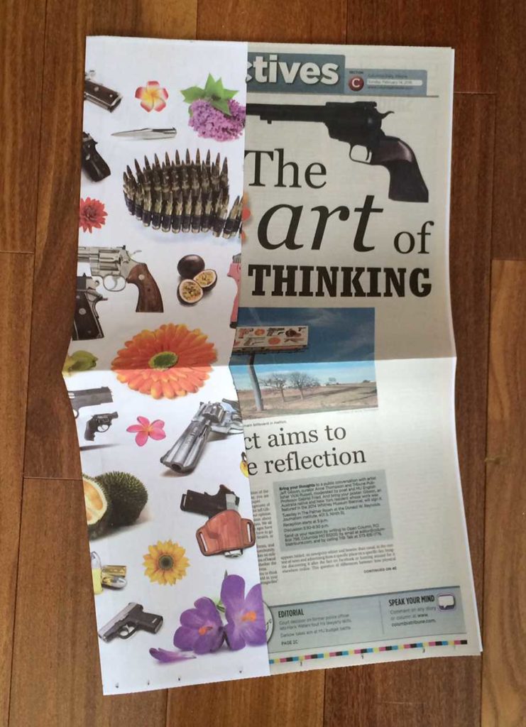
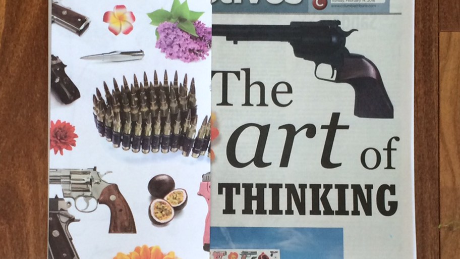
- We decide to print poster as spadea to wrap Tribune’s Sunday opinion section.
- Tribune dedicates front and back of opinion section to content about poster project including my editorial, Q-and-A with the artist, and sidebar explaining the poster image in terms of art history.
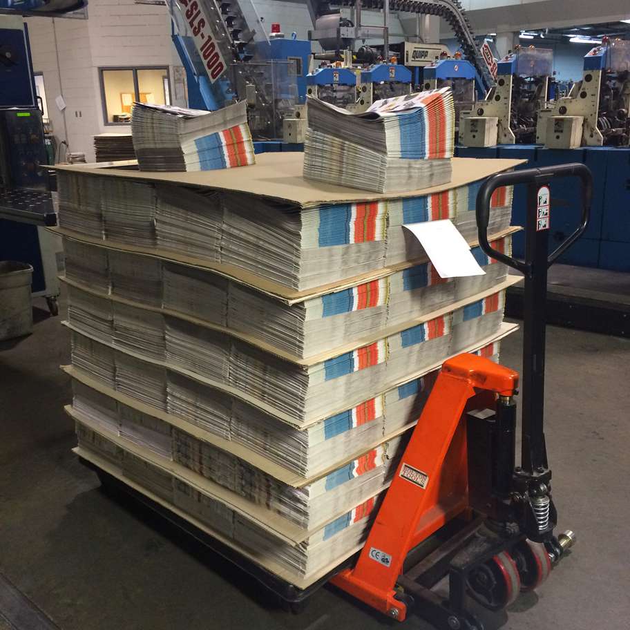
- Tribune orders special paper, whiter and heavier than usual newsprint, and runs press tests for bleeding over margins and into the gutter fold.
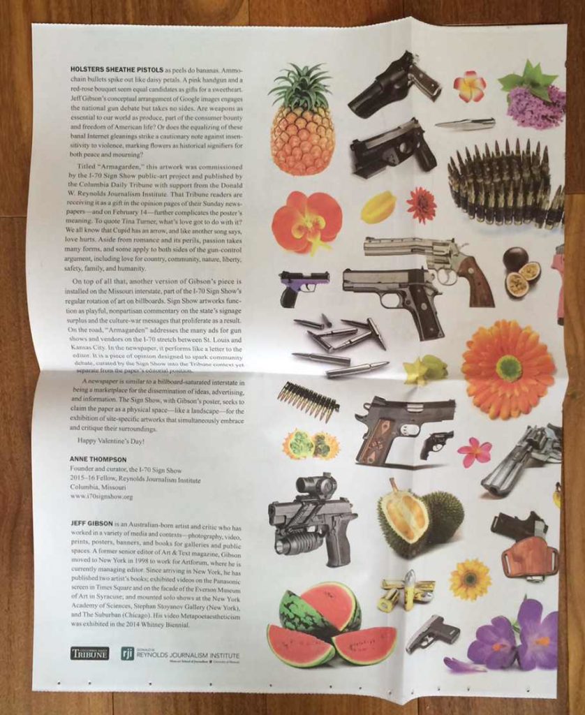
- Artist produces files to Tribune specs for double-sided poster. One side has full image; the other side includes text about project, artist’s bio, and Tribune and RJI logos.
- Two weeks ahead of press run, Tribune runs teaser ads alerting readers to upcoming Valentine’s Day “gift” and promoting Feb. 16 event.
- RJI communications team promotes project and event to Columbia and University of Missouri communities.
- Feb. 14: Poster appears in Tribune.
- Feb: 15: Artist Jeff Gibson arrives from New York City.
- Feb. 16: Public event at RJI starts with reception where artist signs posters and Tribune sells copies of Feb. 14 paper. Gibson, Russell and I speak on a panel moderated by poet and university English professor Gabe Fried, followed by an audience Q-and-A that goes overtime.
Feedback about the poster has been anecdotal and — aside from a few anonymous online grousers on the newspaper’s Talk Back page — positive. People were surprised and excited to open their newspapers to find whiter, heavier newsprint and the resulting vibrant color, and to receive an artwork “Valentine” that was relevant to current events and local politics yet playful and nonpartisan.
The project’s success hinged partly on prepublication buzz but mostly on high-quality production. We managed a perfect storm of three elements: timely artwork; precise digital files courtesy of our skilled and responsible artist; and a state-of-the-art press. This last point is key. The Tribune Publishing Co., the Tribune’s parent company, is one of 26 U.S. sites that prints The New York Times’ national edition. Times’ print sites are evaluated regularly for quality — including ink densities and consistency across pages, register, folds, blemishes and so on — and the Tribune routinely ranks near the top. So in terms of appealing to readers (current and future), the project allowed the newspaper to showcase its visual and formal capabilities, as well as its interest in doing new things beyond the ordinary demands of day-to-day production.


