Tools and tips to make your news site accessible
There are some good places to start, even if not everything works for you
Digital accessibility as a goal can be intimidating. There are so many aspects of your news site – not to mention social media, newsletters and data visualizations – to consider. Barriers to access also go far beyond people who have hearing or vision loss, including people who are neurodivergent or have different levels of language fluency.
Recognizing the need to focus on these barriers, some bigger news organizations are including accessibility in more job descriptions.
But for small news organizations without a team member dedicated to these efforts – or maybe even without a web developer – it can be difficult to know where to start. It can also be tempting to use services advertised as quick-and-easy fixes like overlay widgets, which several advocates and experts have cautioned against.
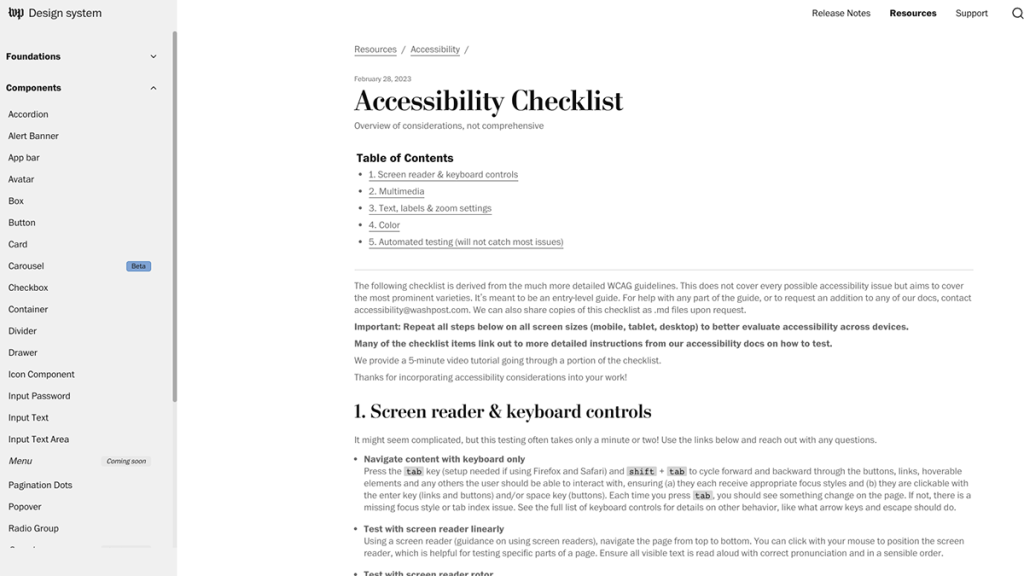
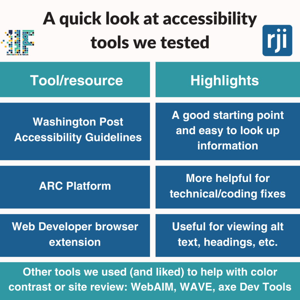
Recently, The Washington Post published an accessibility checklist and guidelines for anyone to use. We partnered with KOMU and the Columbia Missourian to test these guidelines, as well as tools like the ARC platform and Web Developer browser extensions paired with an accessibility checklist.
Here’s what we learned.
Lesson #1: What could we accomplish now?
We wanted to test the ARC Platform from TPGi because this service promised to provide actionable data that would help our partner newsrooms prioritize.
We liked that ARC allowed us to monitor the news site every month and track our progress as we made improvements. However, we quickly learned that this platform is designed more with the developer in mind. When we worked with KOMU and the Missourian to review their sites, we often got stuck because we didn’t have the knowledge or the ability to fix the coding or fully understand the Web Content Accessibility Guidelines (WCAG) failures.
ARC’s wide knowledge base and training resources can also be helpful for educating your team, but these capabilities aren’t available unless you subscribe for $29/month/seat.
If you do use ARC, we recommend using their Chrome extension with the platform because that helps you see where on the page these errors are appearing. (This is also available on the free tier!)
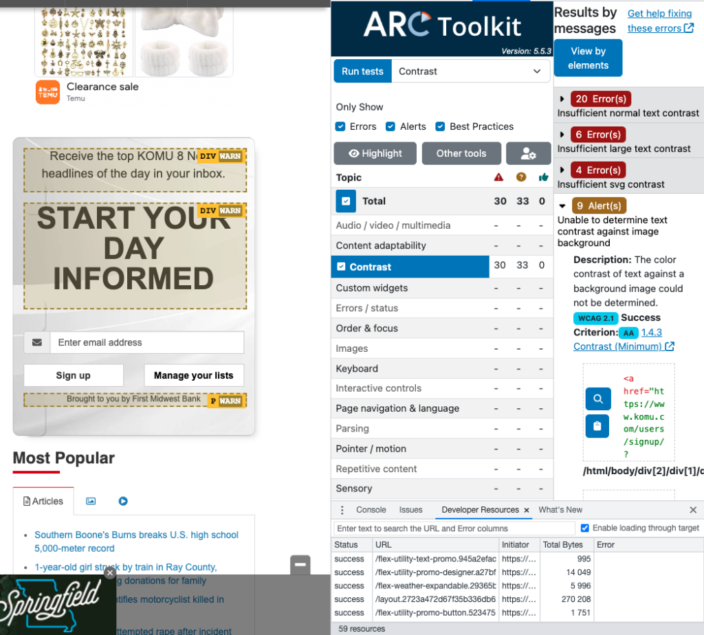
Experimenting with this service ultimately taught us our first lesson: We needed to start our accessibility plan with things that we could control with our skill sets and staff.
After reviewing the Washington Post’s guidelines, other online resources like these posters, and talking to people more familiar with accessibility, we identified a few areas that KOMU and the Missourian could start to address immediately:
- Alt text
- Readability
- Color contrast
- Automatic movement or sound
- Captions and transcriptions
Color contrast was the first thing that KOMU and the Missourian began to adjust. Through the Post’s guidelines, we realized that black text on a pure white background could cause eye strain, and we were able to begin fixing that within minutes on both sites.
Then, we looked at alt text.
Unfortunately BLOX, the CMS that both KOMU and the Missourian use, limits how news organizations can edit the alt text. Right now, the only way to change the alt text of an image is to enter it in the headline field of that image. Because we didn’t have the access to the backend or HTML to fix this, we skipped over the coding specific guidance in the Post’s guidelines to learn more about how to write good alt text.
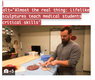
This alt text on the Missourian’s website, made visible while using the Web Developer browser extension, shows how BLOX’s default of using the headline field can result in unclear and unhelpful alt text.
Overall, the Post’s guidelines made it easy to follow and find more information about these priorities. When we didn’t understand something – like how to use a screen reader or what it meant to reduce the motion on a screen – the text linked out to more information. Make sure to hover over the text to find these links, though, because we didn’t always catch them at first glance.
Lesson #2: How can we incorporate this into the newsroom?
Then, we ran into another pressing question: Once we identify our next steps, how do we ensure that these tasks don’t all land on one person and that the strategy survives staff turnover? Both teams wanted to find ways to work these accessibility efforts into their workflows.
KOMU wanted to address alt text first. The digital editor and art director decided to create their own checklist that they could give to staff to use as they wrote alt text. (One key piece of advice from Gareth Ford Williams, co-director of Ab11y.com: The person who chose the image should always be the one writing the alt text).
After changing the alt text for some images, we were able to use the Web Developer browser extension to see what it looks like and ensure that it properly describes the image. This was way easier than when we tried to review the alt text by inspecting the code ourselves.
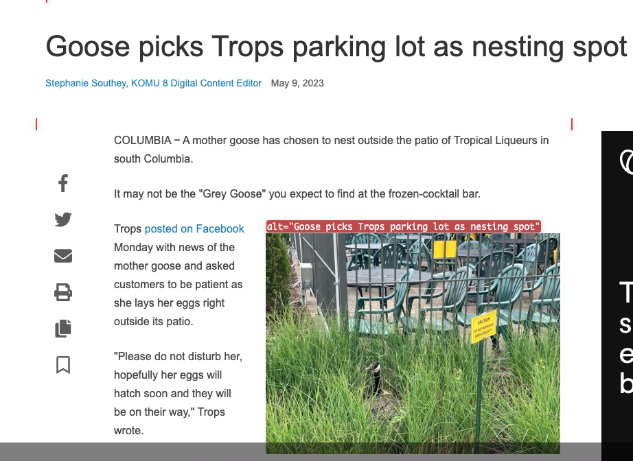
Overall, these browser extensions seem to be most helpful if you have a specific goal in mind (like alt text) because you can usually filter what you’re looking for rather than look at all the errors at once, which can be overwhelming.
Beyond alt text, KOMU plans to create posters and post other reminders in the editing booths, including readability tips like keeping sentences and quotes short when possible. (We found that tools like Readable and Hemingway App could be helpful to help introduce staff to this).
The Missourian decided to create specific accessibility guidelines for long-form stories. Because the headline is often placed over a background image, the text is often difficult to read.
To start, Missourian staff used browser extensions WAVE and axe DevTools (both suggested in the Post’s guidelines) to review some examples of the long-form stories. While DevTools was better at explaining the errors in non-technical terms, staffers said they preferred WAVE because of how easy it was to view the alt text of images or where errors appeared on the page.
For example, with DevTools, they learned that their hyperlinks were not distinguishable enough, so they made a plan to underline all links. With WAVE, they could see where color contrast errors were most prevalent in a story.
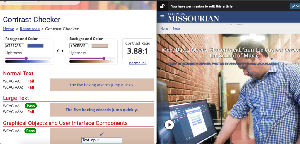
The Missourian found that it could use the eyedropper tool in the WebAIM color contrast checker if they placed the windows side by side.
The Missourian’s favorite and most practical tool was the WebAIM color contrast checker. The editors plan to bring this to a meeting with their photo team and explain how this can help them ensure that there is at least a 4.5:1 color contrast ratio when designing long-form stories.
The next step will be to work with the photo editors to document these accessible design standards, so they can train the incoming cohort of photographers.
Lesson #3: No one resource can be the perfect solution, but we can pick what works best for our team
As we worked through making these sites more accessible, we found that tools that work well for one organization may not be ideal for another. Or using a set of guidelines or a checklist was a good starting point but ultimately led us to other resources.
Also, none of these will be able to magically make our sites more accessible. Accessibility experts will always remind you that automatic testers are limited and should be used with manual testing. While this is challenging for an already stretched-thin staff, we encourage you to find tools like color contrast checkers or browser extensions to help you accomplish your goals.
Like KOMU and the Missourian, you can pick one thing to start. Find a small team of people (this can be two or three) and commit to working on that goal for a month or so. Then, you can build on that, grow your knowledge, and keep collecting new tools and resources that will help you make your news coverage more accessible.

Sign up for the Innovation in Focus Newsletter to get our articles, tips, guides and more in your inbox each month!
