Mapping COVID-19 cases in Observable with Vega-Lite
Choropleth maps show how data varies across a geographic region, a visualization technique used often to present a wide variety of data, including economic data, election results and, more recently, the prevalence of COVID-19 cases and deaths.
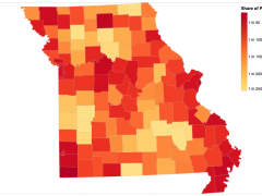
I recently created a choropleth map that pulls live county-level COVID-19 case data from the Missouri Department of Health and Senior Services ArcGIS dashboard.
1 in every 51 people in Missouri confirmed Covid-19 positive
As of a day ago, I created this graphic in Observable using Vega-Lite, two complimentary tools I taught in Visualizing the Pandemic, an online workshop I led in June.
Observable is an online computational notebook environment that allows you to mix together blocks of text and snippets of code to produce something that resembles both “an essay and a program” as described in this excellent introduction.
Compared to Jupyter notebooks, which are more often used in the journalism profession and beyond, I’ve found Observable notebooks to be more reader-friendly because the cells of the notebook can be re-ordered without affecting the execution of the code. Also, code snippets can be hidden while their output—be it a computed value, a rendered chart or an interactive HTML element—remains visible.
Observable is more than just a single-user tool. It’s a platform where data specialists, including those working in news organizations like the LA Times and the The Chicago Reporter, are creating, publishing and collaborating on data analysis and visualization.
Many Observable notebook authors also rely on Vega-Lite to define and display their data visualizations. Compared to lower-level visualization libraries, such as D3, Vega-Lite is easier to learn and easier to use when producing the most common types of graphics: bar charts, line charts, scatterplots, heatmaps, etc. Vega graphics can also be layered, linked to each other and react to user inputs like scrolling, panning and clicking.
The connections between these all these tools run deep. Observable, the company, was co-founded by Mike Bostock, an alum of The New York Times Graphics Department, who also created D3. Bostock did his PhD at Stanford where he was advised by Jeffrey Heer. Heer now directs the University of Washington Interactive Data Lab, which developed and actively maintains Vega, Vega-Lite and other related data visualization tools.
Here’s my notebook that walks through the steps of producing a choropleth map like the one embedded above. The same approach can be used for any dataset that includes geographic categories and shapes. For example, this November I will be guiding student journalists using Observable and Vega to visualize live election results for Boone County and the state of Missouri.
Observable’s reactive environment along with Vega’s simple declarative syntax are killer combo for data journalists like me who need to wrangle, analyze and visualize data and explain our work.
