Creating advertising graphics for your newsroom’s Instagram
Creating graphics for Instagram may seem easy, but strategy and technique are required when generating graphics for your organization to engage your audience.
When creating graphics, the first thing to consider is the color theme. You have three options when it comes to themes: using the colors of your organization’s brand, colors that match the current Instagram theme or colors that go with the content you are sharing.
For example, if you are making a graphic advertising a contest in which the winner receives a gift card to Target, the color scheme could be red and white to match Target’s logo, or if your organization’s branding has a lot blue in it, then the ad could have a blue theme, and you can include Target’s logo in the corner so there isn’t much clashing between the colors.

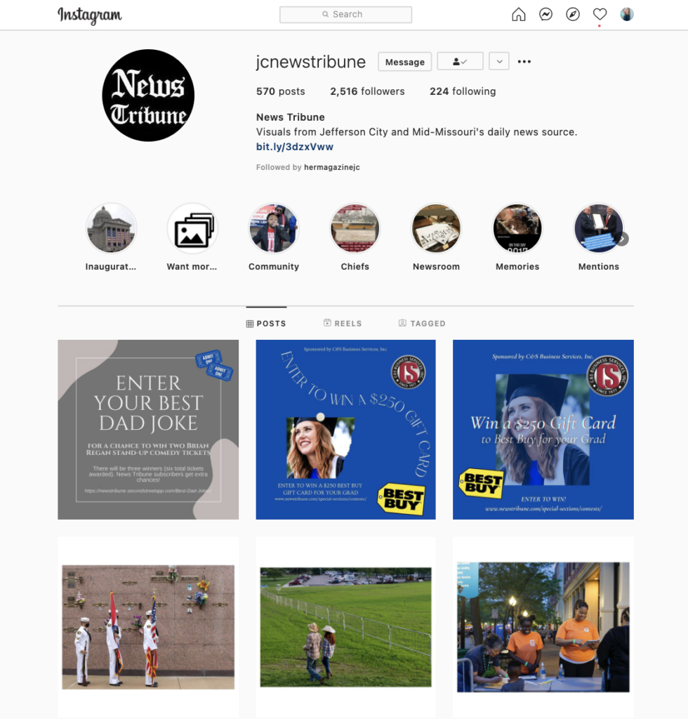
Here is a graphic I made for the News Tribune when we were hosting a contest to give away a $250 Best Buy card. This graphic ran on the News Tribune’s Instagram.
Measuring impact
There was a 50% increase of entries in the contest after my graphic was posted, which was a win considering the contest had been going on for a few weeks and was close to ending. In the future, I hope to push out more graphics at the beginning of the contest and analyze how many entries come directly from Instagram. Having a link to the contest in the bio of the organization’s Instagram account is something else I want to push – this will make it easier for users to enter the contest directly from Instagram.
For this contest, I created multiple graphics with the same style and images used, but I didn’t anticipate them going on the same platform. Next time, I will make graphics that can be posted together and are cohesive but different.
Tools for creating graphics
There are many different tools you can use to make creative graphics, but it is important to check with your organization first to see if there are particular ones they want you to utilize and/or already have a subscription with.
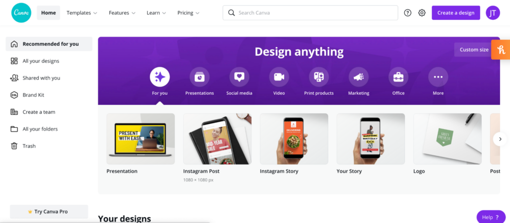
One of my favorites is Canva. This website has templates that you can utilize and are extremely customizable. Canva also allows you to choose whether you are making an Instagram story, an Instagram post, a Twitter banner, a flyer, a brochure, a newsletter and much more. You can start with a template or a clean slate and add all kinds of elements, colors and text fonts.

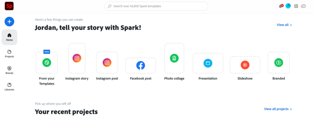
Adobe has a few options too, such as Photoshop, InDesign and Spark. There are many YouTube videos that share tutorials and tips for making graphics with Adobe programs, which are very helpful for new users.

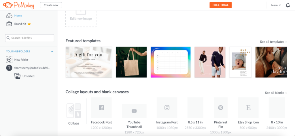
Another popular software among new designers is PicMonkey. It is similar to Canva, but has different templates and more specific layouts for various platforms, such as a YouTube thumbnail, Etsy shop icon, Pinterest pin and Facebook post.

When making Instagram stories, it is important to make sure they flow nicely together. Using programs like the ones mentioned above will help make cohesive and attractive slides.
Next, I plan on diving deeper into the impact graphics on Instagram stories. How well do they reach people? What is the average amount of views? Do users prefer interactive elements such as polls and questions? These are all questions I want to answer for my newsroom in the next few months.
Jordan Thornsberry is the RJI Student Innovation Fellow at the News Tribune in Jefferson City, Mo. This summer our student fellows will be sharing dispatches from their fellowships in newsrooms across the country as a part of Innovation in Focus.
