Building interactive visual experiences from data
How we helped the Current analyze and visualize public salary data
For this project, I helped the Current analyze and visualize data from a survey it conducted of 1,900 public media employees. The survey results included salary data, demographic information and other work-related fields such as years of experience and organization information.
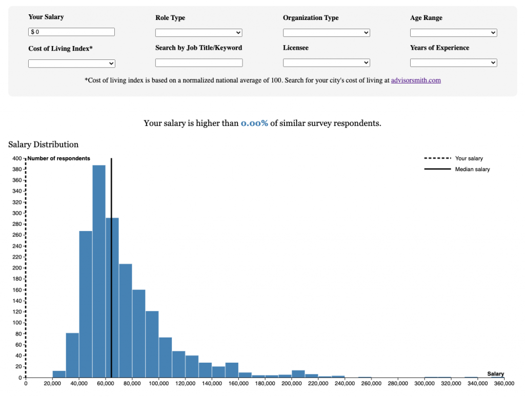
The staff had two goals in mind when we started this project. First, they wanted to run an article that highlighted findings from the dataset that would include various static and interactive charts. However, they also wanted users to be able to explore the dataset to see how their salaries compared to those of other public media journalists with similar work experiences and demographics around the country. To do this, I built this interactive interface using Observable.
While JavaScript is great for visualizing data, I wanted a more robust option for actually analyzing the survey results, so I created a Jupyter notebook and used Pandas, the popular Python data analysis library. This let me pull the Excel files into dataframes where I could better manipulate the data before exporting the cleaned files into Observable.
Interactive Data Visualizations with Observable Notebooks and D3.js
For many data and graphics journalists, Mike Bostock’s D3 JavaScript library has been a data visualization staple for years. With a little technical know-how, designers can build interactive, data-driven visualizations to publish on the web.
However, building D3 charts and graphs from scratch can be tedious at best. In 2018, Bostock launched Observable, a browser-based computational notebook that lets users quickly build and share visualizations. You can also copy notebooks that other users have created, so you don’t have to reinvent the wheel every time you start a new project.
If you’re familiar with Jupyter notebooks, you’ll notice that Observable notebooks are based on a similar concept. They let you combine markdown and code on a single document, allowing you to walk readers through your processes step by step. However, unlike Jupyter, Observable notebooks use exclusively JavaScript and just run in the browser, so you don’t need to download any software. They are also geared specifically towards data visualization, making them a great environment for working with D3.js charts.
Interactivity
While using D3.js to add hoverable tooltips or animations to charts is fairly straightforward, making charts respond to user input can be a little trickier. If you’re not using Observable, you could accomplish this by creating form elements, adding event listeners with D3, jQuery or vanilla JavaScript and then rerendering the chart whenever the user input changes.
Observable makes this process significantly easier by doing much of this work for you. Observable’s views allow you to define an input element and then dynamically reference the input’s value.
For example, you could create a simple number input like this:
Whenever you want to access the value that the user enters in this text field, you can just reference the “minimum” view.
If you had a charting function that would plot an array of objects passed as a parameter and you wanted the user to be able to filter out points below a certain value, you could filter the data using the “minimum” view. Whenever the user changes the input field’s value, Observable will rerender the chart based on the filtered data.

Embedding
Observable offers several easy embed options that allow you to drop your charts into other websites. The simplest allows you to export your charts as iFrames that you can place directly into many content management systems. However, one possible drawback of this method is that each embedded chart will include an irremovable credit line at the bottom that will link back to the notebook.
To get around this, you can also export your cells as JavaScript (or React) runtimes. These allow you to delete the credit line when you add the charts to your website. However, you may find (or have already found) that your CMS doesn’t like script tags. I ran into this issue when trying to embed the salary survey charts into Current’s WordPress website.
To handle this, I turned to GitHub Pages and NPR’s Pym.js responsive iFrame library. I knew that for the searchable interface I also wanted more control over the structure of the various components I was importing from Observable, so I built a very basic Pym-enabled HTML page hosted (for free) on GitHub Pages where I pasted the Observable runtime code and formatted the cells. I then used a Pym shortcode WordPress plugin to embed the interface into the site.