Embrace your constraints: How to build better products by accepting what you can’t change
The RJI Futures Lab is creating a new tool to help reporters who cover live events save time and effort on deadline. TweetsToText is a Twitter bot that transforms live event tweets into a plain text file, saving time on copying and pasting tweets for an article post-event. The tool was built for journalists who cover events like sports games, city council meetings or breaking news via Twitter.
Our previous post was about prototyping and how and why to test your assumptions before investing too much in your product idea. Our main point: Think of each idea you generate — and all the feedback that comes from that idea — as an opportunity to learn more about the problem you’re trying to solve.
But how do we generate new ideas based on what we learn?
Often it seems creative ideas arise out of an unpredictable mix of serendipity and instinct. From this perspective, all we can do is let our imaginations run wild and open ourselves up to unlimited possibilities in the hope that, eventually, the right idea will float within our reach.
Turns out, that’s not how creativity works. As research over the last decade has shown, people tend to generate more ideas — and more imaginative ideas — when their resources are limited and the range of acceptable solutions is narrowed.
When we have fewer resources, we have a stronger incentive to use whatever is available to us in novel ways. Also, we tend to be more focused when afforded fewer choices, and we can then more fully comprehend the implications and opportunities that follow from our decisions.
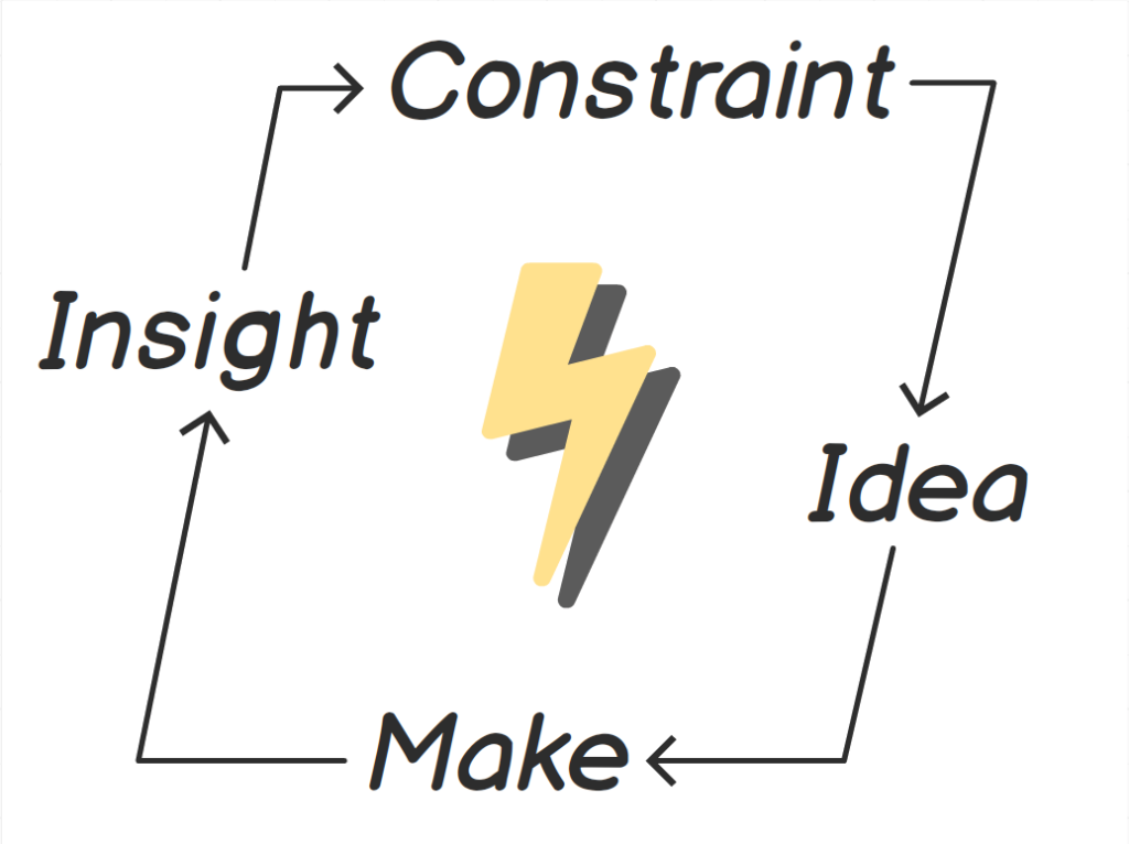
This powerful tension between constraint and ingenuity has always been at the heart of design practice. In the act of making something new, designers must engage more deeply with their materials and grapple with how their creation will integrate into the world. Constraints give form and meaning to what the designer makes, and what the designer makes inevitably reveals new constraints that further shape the next iteration of the design.
By accepting constraints, then, designers gain purpose and momentum in their work. The trick is to connect these constraints to meaningful insights about the context of users and the affordances of the materials we use.

How design constraints lead to meaningful products
To demonstrate how this works, let’s review some of the insights we gathered from our user interviews and prototyping exercise:
- Sports writers aren’t eager to download or install new apps.
- They usually work on small laptops or tablets with lots of browser windows and applications open, so screen real estate is precious.
- While covering a game, they’re really active on Twitter, sharing their observations and analysis as the action unfolds.
- A lot of what they share on Twitter ends up in copy they file at the end of the game.
Insights 1 and 2 felt frustrating. If our targeted users are automatically averse to more apps, then what hope for success did we really have?
Insights 3 and 4 felt noteworthy. Granted, these discoveries were not profound or even all that surprising. They just felt important in the context of covering sports and other journalism contexts as well.
While mulling all this over, we had a breakthrough when we hit upon an exciting design constraint, one that synthesized all of these insights into one provocative prompt:
What if the entire experience had to be in Twitter?
At first, we weren’t sure if we could pull off such a feat. If we could, though, journalists would be able to interact with our tool through a platform and interface that’s already part of their workflow. Maybe then they would be more likely to actually use it.
By accepting this constraint, we were afforded only the functionality already built into Twitter. Surprisingly, this made our design more obvious and effortless.
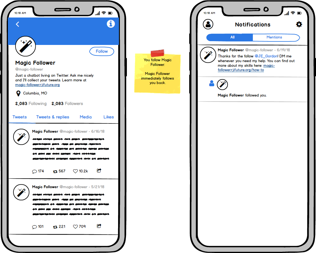
At first, we called it “Magic Follower”.

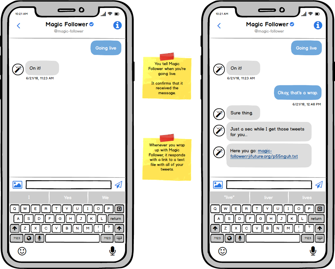
We imagined it as personal assistant that lived on Twitter. Reporters out covering live events would interact with it via direct message, just as they might with a colleague back in the newsroom.

Unlike our previous prototype, the feedback we gathered from this new idea was uniformly positive. That gave us the confidence we needed to actually start building it.
The important points here are:
- We never would have come up with this creative idea without a clear, provocative constraint.
- We never would have come with the constraint without meaningful insights into the contexts of our users.
How feasibility constraints lead to sustainable products
Not all constraints come to us by way of our users. Some are baked into our budgets or inherent to the materials and technology we use.
Since feasibility constraints are often outside our control and untethered from our users’ contexts, they tend to feel more arbitrary and stifling. But fighting what we can’t change only slows us down. If instead we accept these constraints, we can do the creative work of adapting our designs to meet our users’ needs more sustainably.
For example, as soon as we started building our Twitter bot, we encountered problems we couldn’t have anticipated, problems that initially struck us as impossible barriers.
According to our design, when a user sends a direct message to the Twitter bot, we would capture the timestamp of that message and pass it along as a parameter when querying Twitter’s Search API to retrieve the user’s tweets.
Turns out, if you want the option to search by timestamp, you need to pony up for “premium” access to the API. That costs anywhere from to $150 to $2,500 a month, depending on the total number of requests you send.
Furthermore, the chat-style interface we imagined felt potentially fun and personable in theory. But in reality, it would allow users to type whatever they want, in any number languages. So how would our bot be able to understand the exact intents of the users? And if the bot received an ambiguous message, how would the it respond in a way that didn’t come off as dumb?
As we realized our design was too expensive and too complicated, we reconsidered what interactions were necessary for our minimum viable product. Essentially, users only needed a way to signal the bot to start or stop collecting tweets. Words weren’t really necessary, maybe even a little cumbersome.
We also found another (free) way to get a user’s tweets, using Twitter’s Timelines API. This endpoint allows you to narrow results by identifying the earliest and most recent tweets you want to include.
We eventually boiled the design down to the simplest interaction we could imagine: Just ask the users to @mention the bot in their first and final tweets. We could then use Twitter’s Account Activity API to listen for those mentions. And those notifications would gives us the IDs of the user accounts and the tweets: everything we needed to query the timelines API.
Not only was our new experience more sustainable and straightforward, it had a built-in self-promotional cycle. Through using our bot, people would draw more attention to it, which we expected would drive more people to use it.
Keep it simple
The design described above is exactly what we built, save for one important detail: The bot’s name.
“Magic Follower” was just a working title until we had a better idea of what our product would be. We needed a new name that was, let’s be frank, much less goofy.
Aside from the pleasing alliteration, TweetsToText had an immediate straightforward quality to match our simple design. It says what it does, and it does what it says.
TweetsToText is currently live. You can use it now for free, and we would love it if you would.
Here’s an important caveat, though: This bot is still in beta. We’re asking people to try it with the understanding that it might not always work as expected. We need more feedback in order to make it better.
