
Fact checking police claims about crime with data maps

Identifying the influx of one local police department’s calls for service
Sophie Rentschler is a 2025 RJI Student Innovation Fellow partnered with the Source. The RJI Innovation Student Fellows will be sharing their innovative work throughout the summer through Innovation in Focus.
The Source, a local news organization in Bend, Oregon, is reimagining the way they visualize figures in their stories. While reporters at the Source have often based their investigative stories on data and its design team creates beautiful in-house graphics, the newsroom is wanting to incorporate more interactive data pieces into their social media and website to increase engagement with their stories. Nicole Vulcan, editor-in-chief at the Source, said one of the broad goals for the publication is to use data across its stories to enhance reader interest.
Working with general assignment reporter Julianna LaFollette, we identified tools and methods for transforming large datasets — including those with more than 400,000 records — into a digestible map.
Creating our own data hub
The Bend Police Department keeps a continuous record of calls for service, which has more than 400,000 entries which are available as a data visualization on its website. However, we wanted to convey the data differently, so we decided to make our own.
LaFollette published an article detailing one area of Bend and the city’s plans to urbanize it. Surrounding this chatter to renovate the area is equal community speculation that the part of the city is riddled with crime, homelessness, prostitution and more. LaFollette was interested to see if the data would support the speculation, especially because the local police department doubled down on claims from local discussion saying the “community perception is rooted in fact.”
After a lot of work on QGIS and Flourish we ended up with our own data hub that caters to the specific questions posed in her story.
Some tools we utilized in the early ideation stage of the project were SQLite and Google Gemini’s chatbot. To sort large datasets with 400,000 fields, SQLite is a reliable tool but requires you to learn the language to use it. Users can export their filters on the database as a .csv file, making the data compatible with visualization tools like Datawrapper and Flourish. Google Gemini has the same capabilities in sorting large data sets and it can do so quicker and easier. However, as is the nature of artificial intelligence tools, Gemini alerts users that all chatbot outputs are not exempt from having potential errors, so we needed a reliable method, like SQLite, to fact check calculations.
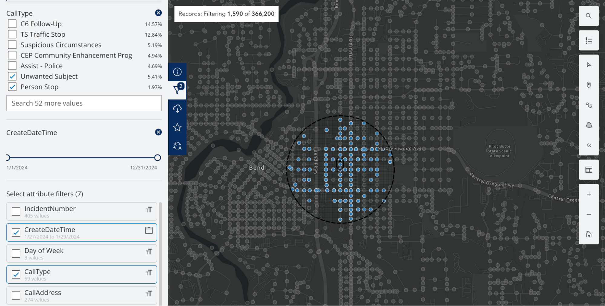
Ultimately, we didn’t need to use external tools because we could sort the data within the Bend PD’s hub by filtering it to only show calls within a 0.5 mile radius of the area.
In collaboration with the editorial team, we determined a map would be the most accurate depiction of the calls for service across the two areas we’re comparing. Considering some streets stretch across the city, our look at a specific point and half a mile of its surrounding area could have been clouded by data from across town.
We used .geojson files to make an interactive map with Flourish. This file type was an intuitive decision, considering the type of data visualization and the road line features we wanted to include as the base map.
Using the Bend PD Data Hub, we could filter specific call types and years and drop a pin to filter road intersections within a specific mile radius. We downloaded the data with these filters in .geojson file format.
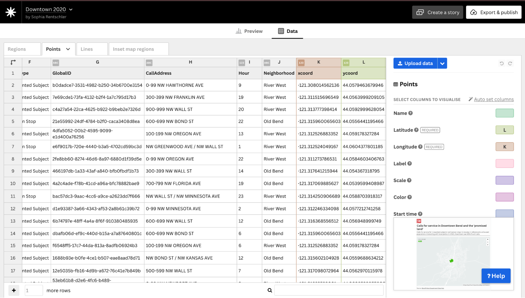
The geojson files used x and y coordinates, so we had to convert these coordinates to longitude and latitude values to be compatible with the Flourish template for a 3D point map. We exported .geojson files that captured data for each year and in each region, Downtown Bend and what LaFollette identified in her story as the “promised land,” or the area of Bend the city plans to urbanize.
QGIS
We used QGIS, a free and open-source GIS software, to change these coordinates.
Here are the steps to do this:
- Upload the .geojson file as a vector layer and right click on the layer.
- Select “Open Attribute Table.”
- On the right side of the screen, click “add geometry values” and select the geometric convention to latitude and longitude. This convention for longitude and latitude is EPSG: 4326.
Flourish
From there, we could import the data into Flourish and match the “xcoord” and “ycoord” columns with their designated longitude and latitude columns.
We also utilized the “lines” tab to import a file of road lines in Bend, which was publicly available on the city’s website. Using the road lines template was especially important for this project because the “promised land” could be identified by a few street intersections. The same goes for the downtown area.
These two datasets, the road lines and the points for “calls for service,” combined to form a complete map. We replicated this process for the datasets we had for Downtown Bend and the “promised land” across four years.
With the story feature on Flourish, a user can click through each individual data visualization and see the call for service counts double from Downtown Bend to the “promised land”.
Try it below!
Next steps
Some of my next data pieces will be in collaboration with Peter Madsen, the Source’s features and investigative reporter, and his work on bias crime in the area. In addition, we will be working on visualizations alongside his reporting on the disparities between shelters for unhoused residents and Bend’s housing stock. We’ll also be conducting newsletter audits for the publication’s daily and weekly newsletters and creating Instagram Reels to run alongside the reporter’s investigative stories.

Sign up for the Innovation in Focus Newsletter to get our articles, tips, guides and more in your inbox each month!
Cite this article
Rentschler, Sophie (2025, June 30). Fact checking police claims about crime with data maps. Reynolds Journalism Institute. Retrieved from: https://rjionline.org/news/fact-checking-police-claims-about-crime-with-data-maps/