
How we built a statewide election map


A simple, no-code solution to sharing voting information and four additional tools for your newsroom election projects
Working with South Dakota Public Broadcasting, our goal was to create a one-stop-shop for educating South Dakota voters about the upcoming state legislative races. Since SDPB is partnering with several other newsrooms to produce statewide election coverage, we wanted to find the most accessible way for anyone in South Dakota to find their election district, learn who is running for State House and Senate and a few things about each candidate’s platform.
We ultimately decided to create a map with interactive pop-ups because editors at SDPB shared that many folks would first need help finding their election district in addition to breaking down information about the candidates in each district.
However, we did not have a developer on staff to build something from scratch. So, we looked at several no and low-code solutions before landing on a Flourish template that we could use to link out to individual candidate profile pages. Check out how SDPB used that template to create a map with all the candidates for State House and Senate.
What worked best
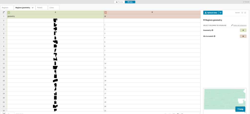
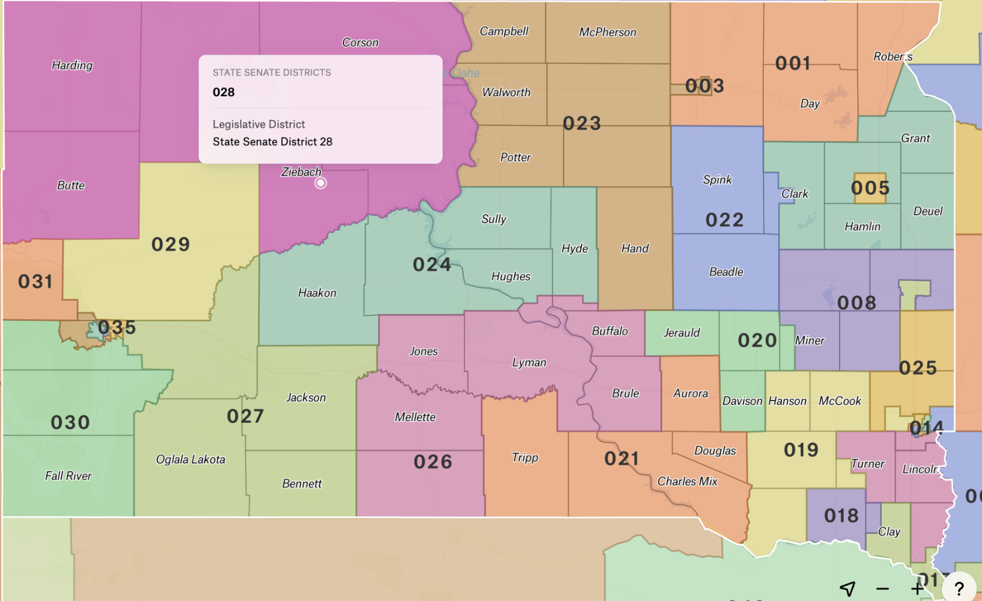
We used the Flourish projection map template to make this guide. We first needed to upload a custom map of South Dakota — ideally with the legislative districts already marked.
How we uploaded the state legislative districts to Flourish
- We found the state legislative districts in a shapefile format through the U.S. Census Bureau (with help from the News Nerdery Slack group).You can find other existing datasets in Flourish and on external public sites.
- Then, we converted the shapefile to a JSON format using QGIS, a free spatial visualization tool, because Flourish only accepts the GeoJSON format. You can also use tools like Mapshaper to convert a file.
- Next, we selected the blank projection map template and uploaded the new JSON file.
- We then needed to label the column with the polygons as the “Geometry” category and the associated “id” as “IDs to match.” This tells Flourish what kind of data we’re uploading, and how the system should treat it.
This gave us the state of South Dakota broken down by legislative district. Next we needed to customize the pop-ups and map design by using the settings in the Preview tab of Flourish Studio.
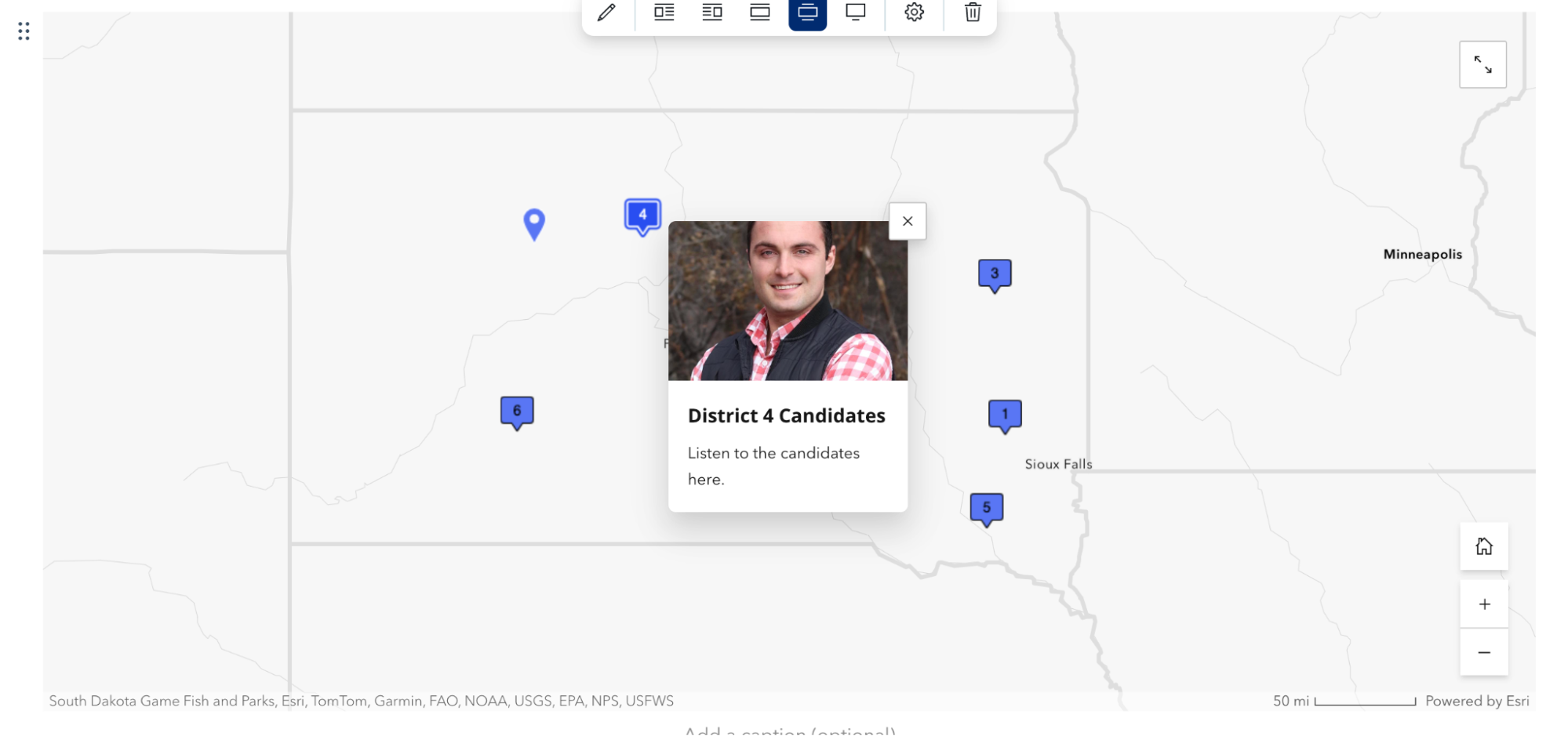
Format the pop-ups
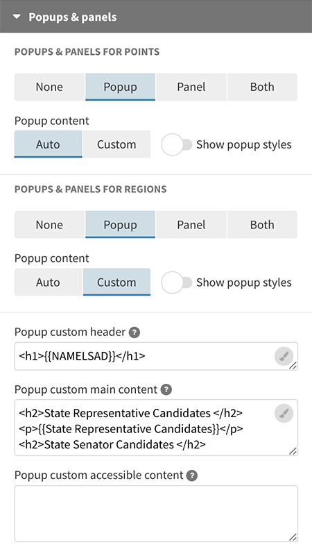
- Start on the “Preview tab” in Flourish Studio, and select the “Popups and panels” category on the settings menu.
- Switch from “Auto” to “Custom” under “Popup content.”
- Then, use the paintbrush next to “popup custom header” and “popup custom main content” to customize which categories in your data sheet you want to include here.
- See this help sheet for more info on how to customize pop-ups.
You can add links to the popups in two ways. We added a link directly in the data table (using a simple href attribute) for each candidate since we expected to have separate links for each person. You can see how we did that in our template by looking at District 1.
However, if you create a column with all your links, you can include those links the same way you include other data categories like {{State Representative Candidates}}.
How to add candidate information to the pop-ups
- Add two new columns to the Flourish data sheet by right clicking a column and selecting “add column to right”.
- Label the two new columns: State Representative Candidates and State Senator Candidates, respectively.
- Make sure that those columns are listed under “info for pop ups” in the panel on the right side of the screen.
- Copy and paste the candidates’ names. We included the HTML code <br> to add a line break between each name.
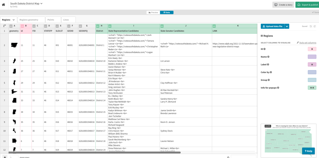
After these steps, we had a map with pop-ups on each legislative district that included the names of the candidates and links to more detailed profile pages.
Add new layers like cities or roads
We realized that we wanted to give readers a reference point when finding their legislative district, whether that’s a city or highway they can find on the map.
We found a spreadsheet of city locations using an open data source on ArcGIS, and we uploaded this into the Points tab in Flourish. The U.S. Census Bureau also had a map of primary and secondary roads that we uploaded into the Lines tab. While we didn’t make all of these points and lines visible because they distracted from the districts, including the city points allowed us to make the map searchable.
Other tools and options
We explored other mapping and interactive tools before identifying our final solution. Here are the four other tools we tried, how much they cost and what they do best!
Mapster
After learning about the Mapster WordPress plugin, we were excited because it seemed to do exactly what we wanted: We’d be able to create custom pop-ups with links to candidate data. Unfortunately, SDPB’s voting site did not use WordPress as the CMS, and the estimated cost of building a map without the plugin was around $1,000. The plugin has a free version or a pro version for $20 per month.
However, if your news organization uses WordPress, we recommend checking out the tools through Mapster because of its abilities to upload custom maps and customize pop-ups.
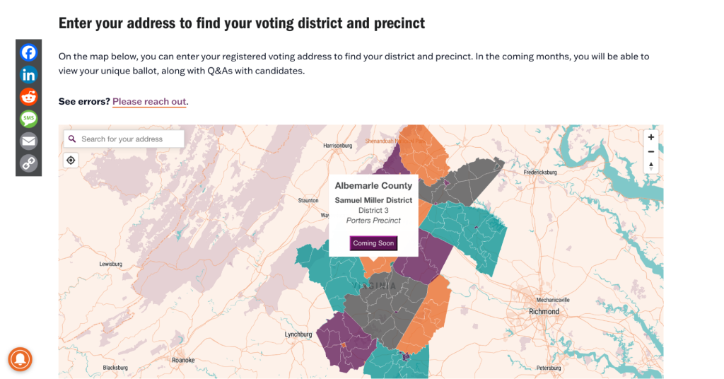
You can see an example of a newsroom using this tool by checking out Charlottesville Tomorrow’s 2023 guide. Product and technology officer Ashley Harper broke the map down by county and district, allowing people to click on their district (or enter their address) to see their individualized election ballot. The news organization’s 2024 map is going even more granular by dividing the map by precinct!
StoryMaps
StoryMaps allowed us to create maps with pop-ups that included multimedia elements, but we could only choose one photo or video per pop-up. We considered creating a two-step process, such as: 1) Find your legislative district using the map. 2) Scroll down to use a list of links to jump to the candidate profiles for your district.
With hundreds of candidates, though, this meant that South Dakota residents might have to scroll through many pages before accessing their candidate’s profile. StoryMaps has the ability to use anchor links to jump to specific headings, but we could not do this within the map. StoryMaps also lacked the ability to upload a custom map with the South Dakota legislative districts.
Because StoryMaps has a free version and easily allows you to embed interactive stories onto your own site, this may be a helpful solution for other projects with less data.
Felt
With the Felt mapping tool, we were able to use the Senate District map for South Dakota already in Felt (with the U.S. Census Bureau as the source), as well as easily upload a shapefile of the county boundaries from an open data site. This was a promising solution because we originally wanted to overlay the counties and legislative districts to help residents find their district.
We liked that we could color code the map by district and easily customize the font sizes and views. However, we had difficulty isolating just the state of South Dakota, and – more importantly – we could not add custom data to the maps (such as candidate information) without using an additional GIS tool like QGIS or ArcGIS.
To view the full custom map with the legislative districts and counties and access the iframe embed code, we had to pay a monthly subscription of $36.
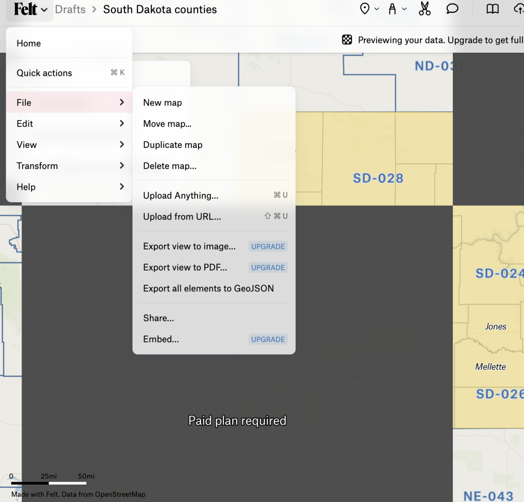
We also tried to upload the GeoSON file from Felt to Flourish to add our own data, but the file would not upload properly even after following these instructions from Flourish.
Padlet
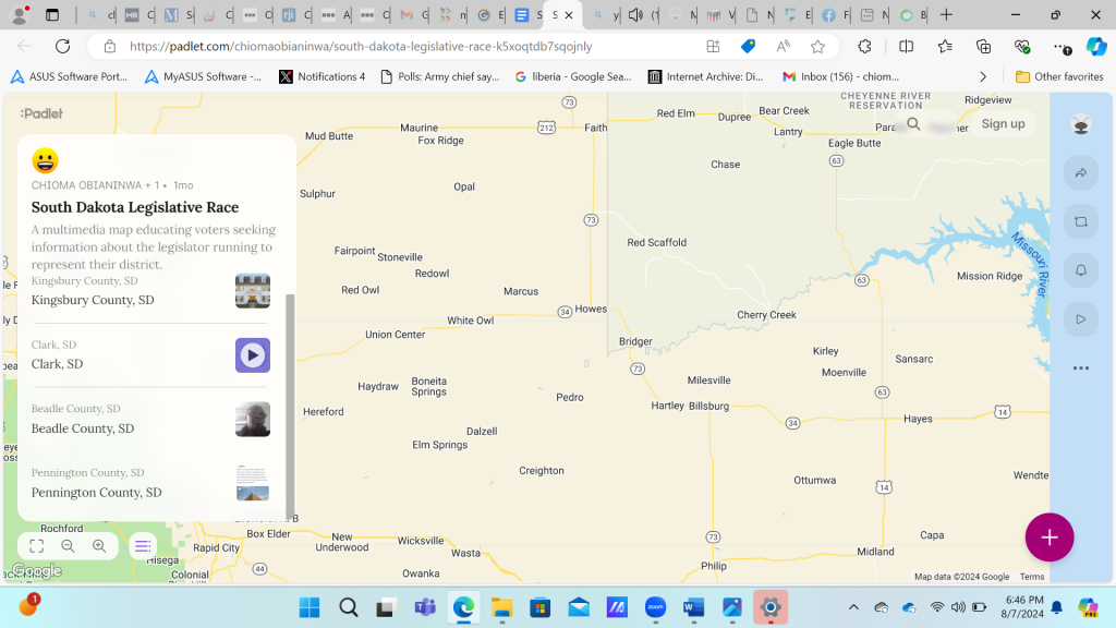
This was a little closer to what we were looking for because the map allowed for multimedia pop-ups such as image, audio or video. However, the pop-ups were limited to only one kind of multimedia element. We were able to create pop-ups by creating markers in specific counties, but we couldn’t customize the map to show the legislative districts.

Sign up for the Innovation in Focus Newsletter to get our articles, tips, guides and more in your inbox each month!
Cite this article
Obianinwa, Chioma; and Lytle, Emily (2024, Aug. 19). How we built a statewide election map. Reynolds Journalism Institute. Retrieved from: https://rjionline.org/news/how-we-built-a-statewide-election-map/