How to make online news ‘brain friendly’
Online news can work with or against the brain.
When RJI Fellows Alex Remington of The Washington Post and media researcher Paul Bolls applied brain science principles to news design, readers’ comprehension, recall and engagement increased. We interviewed the researchers (audio below) to learn how to make articles “brain friendly.”
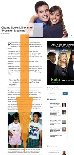
It’s all about the “reading path,” says Remington. “Classify the direction or the path the story takes along the page.”
Bolls adds, “Avoid popping in unrelated content midway through a flow of a body of text. That is probably one of the most brain unfriendly practices in news design.”
Keep reading paths clear
Your eye naturally follows straight, uninterrupted reading paths. Your brain has a hard time processing kinked lines and cluttered paths.
We know this already. For a century we’ve laid out print articles that flow down the page in straight, clean columns.
But somehow, when we went online, we lost our minds, err, we mean that knowledge. Now we turn story lines into obstacle courses, with flashing hurdles blocking the reader’s path.
Remington describes brain-unfriendly design as “advertising all over the page; and long bars of social sharing, print icons and recommended article modules.”

Story lines are for story elements
Anything not part of the story shouldn’t be in reading path. Ads are fine when they don’t interfere with the user experience. Annoying the reader is not effective advertising.
“The push model that says brands have to shout to grab attention is an old model,” says Bolls. “Now brands are more focused on having conversations with potential customers. Structuring an online news presentation for a more effective user experience is good for advertising.”
Social engagement starts with engagement
The best place for related-news widgets and sharing buttons is below the article. Your visitors came for a story. Let them read it. Then tell them about your other offerings.
Bolls advice: “Don’t throw everything in there at once, hoping something gets through: that’s brain unfriendly. First, deliver a great online news reader experience. Then you might have a larger community of readers willing to engage, a reader more motivated to go, ‘Hey, this is worth sharing, this is worth commenting on.’”
Brain truths
There are “three fundamental brain truths” news designers should consider, says Bolls.
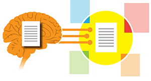
The brain is a limited-capacity processor

“The brain only has so many resources to allocate mental tasks such as perceiving, paying attention, trying to remember, and learning information. It has to simultaneously shift attention and effort between the tasks. So there’s a cost. For every task, there are fewer resources left to process other tasks.”
The brain is a contextual processor

“Anything that pulls processing away from what the individual is focused on will be either frustrating or ignored. We’ve developed the ability to completely tune out distracting elements. A poorly placed ad may get us for a moment and evoke negative emotion — not good for an news organization wanting to build relationships. Or the user is just going to block it out, known as ‘banner ad blindness.’”
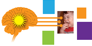
The brain is a motivated processor

“In milliseconds, the brain immediately determines the motivation and significance of information in our sensory environment. Therefore, in reporting and delivering the news, journalists shouldn’t be afraid of emotion. That motivates the brain to process the article and to signal importance. Ask, ‘Is there any element in here portraying emotion, such as good photographs?’”
Paul Bolls is associate director at the Center for Communication Research of Texas Tech University. At the time of this study, he was associate professor of Strategic Communication at the University of Missouri School of Journalism.
Neeley Current of the School of Information Science & Learning Technologies interviewed Bolls for this article. This is a lightly edited version of the audio (13:37):
Brain truth images by Laura Stanton of LaVidaCo.
Society of News Design
These slides are from the Society of News Design presentation “Brain-friendly design: How brain science can help keep readers engaged” by Alex Remington of The Washington Post and RJI’s Brian Steffens:


