Tracy Clark’s take on 15 news aggregation apps: Part 2
Google Play Newsstand
Google has made several attempts at media aggregation, first with Google News in 2002, which was deemed beta for the first three years. It promotes itself as a service that “aggregates real-time news content from news sources around the world, generating 72 editions in 55 languages, and powering Google’s news search. In total these services deliver more than 10 billion clicks to publishers monthly.” The interface “aggregates headlines from news sources worldwide, groups similar stories together and displays them according to each reader’s personalized interests.” This is a basic RSS technology and each headline links back to the original source. They filed a utility patent in June 2012 titled “Systems and Methods for Improving the Ranking of News Articles” on the 13 metrics it uses to filter and prioritize the news. This service is still available and I deem targeted to its Web audience.
Google Reader, launched in 2005, was more positioned for serious RSS readers. It pulled in the entirety of all publishers’ content versus any sort of prioritization to make it more consumable like Google News. My account of more than 30 publications daily had more than 1,000 unread articles for me to comb through. Subsequently, it shut down July 1, 2013, for “two simple reasons: usage of Google Reader has declined, and as a company we’re pouring all of our energy into fewer products. We think that kind of focus will make for a better user experience.” Feedly and Feedspot greatly benefitted from this. See their respective sections for more.
Google Currents launched in 2011 to “deliver beautiful magazine-like editions to your tablet and smartphone for high-speed and offline reading.” The interface was far from ideal and rather clunky. Sources can be added by typing a specific publication into a search box or by searching through 11 topical areas. For example, there are more than 50 publications within the business section. The UX then forces you to scroll through one publication’s content at a time before moving to the next — similar to LinkedIn Pulse’s original version. This prevents you from having one aggregated reading experience. Full articles appear without having to click out, which makes me assume they have licensing agreements set up with publishers. Certain publications like The New York Times and The Wall Street Journal do not appear (so I assume they don’t license content to Google) but I am given the option of their RSS feed, which shows articles but then forces me to click back to see the original article. It was sunset from Android in 2013 and iOS in 2014.
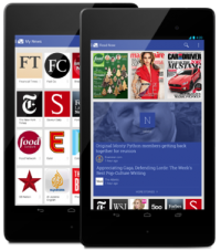
Google Play Newsstand replaced Google Currents for reasons unknown, perhaps as a product consolidation effort. “On November 20, 2013, Google Play Magazines was renamed Google Play Newsstand and combined the features of Google Currents and Google Magazines into one single product, which serves subscriptions to magazines, Web feeds and server-generated topical feeds.” Newsstand organizes content into topical areas and lets a user “explore” to add specific sources or related topics to that feed. It pulled over my publisher selections from Insights, but when I click “Read Now” it also includes a ton of other publications I did not want, including National Post and VOA News. Even turning those sources off in settings does not remove them from my list. The New York Times and The Wall Street Journal content is available within the Google interface but both include their own respective paywalls. Within “business and news” they list 100 publishers available in a hodge-podge list ranging from the big players down to the unfamiliar-to-me brands such as mUmBRELLA and Hindustan Times. In addition to aggregating various providers by topical relevance, they also offer for purchase traditional subscriptions to siloed publications (such as $5.99 for The New Yorker and $2.99 for Time).
My take: Google is not done in this space (as evidenced by their Google News Lab announcement last month). I wouldn’t be surprised if they acquired Flipboard to compete more directly with recent content aggregation work by Apple, Facebook and LinkedIn. Flipboard’s keyword algorithm and like preferences would help better curate Google’s topical lists. I do not like their magazine kiosk approach (similar to NextIssue) offering digital access to existing one-to-many pre-packaged publications. Break it down to the article level using their technology and build back customized news packages for each user! They take this approach with Newsstand but I want more customization and personalization than what they currently offer.
LinkedIn Pulse
Pulse was founded in 2010 by Akshay Kothari and Ankit Gupta while they were students at Stanford University.
They raised a $925,000 seed round in October 2010, and in June 2011 raised a $9.15 million Series A round. Linkedin acquired Pulse in April 2013 for $90 million, 90 percent stock and 10 percent cash. At time of acquisition the service had about 30 million users in more than 190 countries. Approximately 40 percent of its users were outside of the U.S.
Pulse is considered a leader in terms of engagement, with the average visit in 2014 lasting 3 minutes and 24 seconds versus 2:40 for Flipboard, 1:36 for News360, and 0:45 for now-defunct Zite.
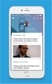
LinkedIn acquired Newsle in July 2014 to add sharing habits and news mentions of social connections to the Pulse app. This month they announced a completely revamped Pulse: “In the past two years, we’ve been hard at work to marry the best content that Pulse has with the deep identity and network data that LinkedIn has, to create the world’s first personalized business news digest.” Going forward they will blend content from traditional publishers with 130,000 original articles published on LinkedIn each week. They will be retiring the existing Pulse app by the end of 2015. Upon initial release, the new version of the app is ranked 15 for U.S. news apps according to App Annie.
“You don’t need to follow publishers or topics or anything to get started—just log in with your LinkedIn account, and Pulse instantly gives you today’s news based on the industry you work in, who you’re connected to and what you follow on LinkedIn,” wrote Kothari in the announcement post.
My take: My main issue with the original app was the siloed univariate aggregation streams. I had a collection of horizontal streams of articles by topic or publisher but I had to scroll through them one at a time instead of having one stream of content aggregated to me by both my publisher and topic preferences. This has been completely resolved in the new app, where I am presented with one feed of my content that is now a blend of content based on my profile, my connections, my news preferences and editor’s picks. I like that I can like/dislike topics to refine my feed. I’m curious, though, about what “show me less of this” implies. How does it know whether I disliked it because of the topic, or because of the user in my network, or something else? This app still doesn’t solve the consumable problem I was having with their initial app. Before it was endless horizontal lists of articles, now it’s an endless vertical list of articles. I’m fascinated that their new app views “news” so broadly as content from anywhere, including LinkedIn itself, so I might actually call this more of a social reader versus their original news reader.
NYT Now
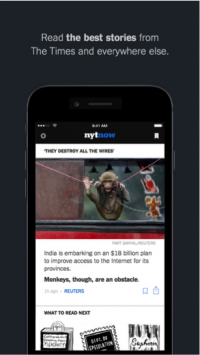
Launched in March 2014 as a $2 per week paid app, NYT Now re-launched in May as a free app. Led by editorial lead Cliff Levy, a team of 10 editors “are selecting the most important stories around the clock” according to the app homepage, with a morning and afternoon briefing of approximately five to 10 articles.
They also curate stories daily from other providers ranging wildly from trusted providers such as BBC News to the not-so-trusted BuzzFeed to the completely non-journalistic-based Medium, linking out to all of the siloed sites. There is normally one ad per daily digest. The feeds contain a combination of text-based articles, videos and graphics creating a rich and visual interface.
My take: This is similar to Yahoo News Digest where editors pick the news for me, which totally annoys me. I have no ability to dislike articles or topics to customize my feed, nor do I agree with their manual selection list. For example, one of today’s five NYT “must-read” articles is on a zebra getting eaten by vultures in Tanzania. I also disagree with most of “the best reads from other sources,” which included Janet Jackson and skinny jeans. This is where it’s such a shame that journalism isn’t better married with technology to add customization and continual refinement of content displayed based on user-submitted preferences.
Newsify
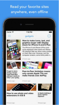
Newsify is a free mobile app developed by Ben Alexander that aggregates using Feedly’s RSS technology to create a mobile newsreader. A $2.99 upgrade enables readers to remove the top ad banner. The app has been featured by Apple as “New and Noteworthy” and “What’s Hot” in more than 100 countries. More than 7,700 people have rated this app as 4+. Their rank history, according to AppAnnie, fluctuates greatly between 100 and 400, currently at 361. Content is grouped into 17 topics such as “news” and “cooking” with a range of sources within each. For instance, there are 50 feeds within “news” ranging from The New York Times to Gothamist and SFist. Readers can also search for other publications not listed and enter other RSS-feed URLs to track. The interface of each article shows the first paragraph of content before linking back to the original source.
My take: Newsify has a simple front-end UX suitable for RSS aficionados albeit not as sexy as Feedly’s app. But it still doesn’t multivariate content aggregation to deliver the holy grail of a customized — and most important painpoint for RSS — consumable news-reading experience.
News360
Roman Karachinsky co-founded the company with Nina Grigorieva in June 2010 and now serves as CEO. “The News360 concept was originally developed by Karachinsky and colleagues in his native Russia, where he raised venture capital with a $1.5 million grant from Skolkovo, a Russian government Silicon Valley-style program. The company later moved to the U.S.” Today, News360 has 25 employees and is based in San Francisco.
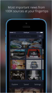
News360 content is organized into 34 topical sections ranging from the typical “news” and “tech” to the odd-ball zombies and Greek culture. Users can also search for other topics: a search for “mobile” gave me 3,875 topic recommendations to follow. Users cannot customize which news sources are included, nor am I ever aware of the full list of providers included within. The site homepage says it provides the “most important news from 100,000+ sources at your fingertips” but nothing allows me to validate this. Each article presents several introductory paragraphs before giving the user the option to “continue in reader” — meaning the full article is pulled into the News360 interface — or continue scrolling down, which would push you into the source publication’s interface. The main user interface or UI leaves a lot to be desired. My selected topics appear in an expandable left-hand navigator. Upon selecting a topic, articles appear one at a time in the windowpane with endless scrolling. (I stopped after 25 tech articles having no idea whether there were 30 or 300.)
According to Karachinsky: “With 5 million users on iOS and Android, the News360 app uses AI technology to learn what each user is interested in, and creates a uniquely tailored stream of stories, just for them. As you read, our personalization platform understands your habits and behavioral patterns, and keeps adjusting News360 so that the more you use it, the smarter it gets.”
The app has been rated 4+ by more than 11,000 users in the Apple app store and is currently ranked 108 in U.S. news apps by App Annie. The site claims that 200 million stories are served on the platform each month with an average reading time of 58 seconds.
My take: Users cannot select or de-select which news publications they want included in their interface as News360 is only customized by news topics. Also, News360 is not consumable as there is no indication of “doneness” and it is only available via mobile channels.
