
A map of power outages in Louisiana.
Creating a map visualization that can auto-update data over time

Making public data more accessible with Tableau Public and GitHub actions
Sophia Anderson is a 2025 RJI Student Innovation Fellow partnered with NPR stations WWNO and WRKF. The RJI Student Innovation Fellows will be sharing their innovative work throughout the summer through Innovation in Focus.
Stephan Bisaha from Gulf States Newsroom made a scraper that accesses public data from the Entergy energy website every five minutes and records it in a spreadsheet. From this input, we created a map that shows power outages in Louisiana which can be filtered by time. Entergy is the largest provider of energy in Louisiana and shares data about how many users have lost power. This is especially important during storms, so their website is built to show live data reflecting how many customers are without power at the current time.
Our goal was to feed the data from the scraper into a map where users could see power outages over time, starting in October 2024 when we first started collecting data and continuing indefinitely. This meant that we needed to find a tool that could auto-update a map at whatever interval we wanted and allow us to show change.
We followed guidance from Jonathan Soma’s tutorial for creating a website that displays scraper data. The data in the map was generated using Python code that was automatically run through Github every ten minutes. There were some significant differences between what we needed for this project and how Jonathan did his, so I’ll explain our process.
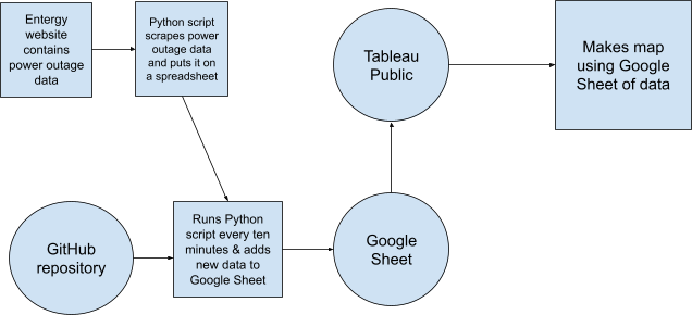
This is the structure of our project. The Python script Bisaha created feeds data from the Entergy website onto a spreadsheet. We then take that same Python script and use a GitHub repository to run it every ten minutes and add the same data to a Google Sheet. We upload that Google Sheet to Tableau and turn it into a map.
Setting up a GitHub Repository
Bisaha was using a Python script to access data from Entergy’s website. We saved that script and the most recent snapshot of data (in the form of an excel spreadsheet) to a folder and we created a repository on Github with these files.
We named the repository “entergy-repo” and selected Python as the language it contains. We turned on GitHub actions for the main branch so that we could set it up to automatically run the script as often as we wanted.
Here are the steps
- Go to Actions
- Choose simple workflow
- Click Configure (you may have to search for simple workflow under workflows)
Customizing the repo
We made a couple of key changes to how an auto-updating repo would normally work. First, we decided to host the data in a Google Sheet instead of a csv file. This makes it much easier to access and clean or check the data when needed. We can manually change column headers and wipe rows without having to use code to do so. Second, we changed the code to append the data to the end of the sheet every time it ran, instead of creating a new file each time.
If you watch Jonathan Soma’s tutorial, you’ll notice that he creates a website to host his data visualization. We didn’t need a GitHub pages site to host a website with our visualization. We can just share the visualization directly, which works better for our newsroom’s purposes.
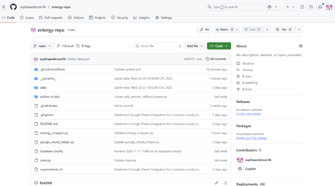
This is what our repository looks like where you can see how we made these changes (access it here).
Click on each file for a line-by-line explanation:
- entergy_scrapper.py: This is the main Python script that operates the entire repository. It pulls the data from the Entergy website, reformats it, and adds it to a Google Sheet.
- google_sheets_helper.py: This is the Python script that sets up integration with Google Sheets.
- louisiana-county: This is a csv file that is stored as a backup. If the script ever fails and the data can’t be uploaded to the Google Sheet, it is uploaded here.
- main.py: This is a Python script that creates four categories of data (broken down by location). It also prints messages to indicate the beginning and end of the data gathering process.
- requirements.txt: This file contains all the packages that need to be downloaded to successfully run all the scripts.
- Within .github/workflows is a file called update.yml. This is the Python script that makes all the other scripts work. It determines how often the data is updated.
Auto-updating a Google Sheet
There are some key steps to make sure this works. First, make sure the name of your Google Sheet is consistent throughout all your scripts. In order to link to a Google Sheet, you have to set up a Google Cloud authorization key.
You can do this for free by setting up a Google Cloud account. We don’t recommend doing this from a Google account linked to your company or university because your account may have built in restrictions that limit this part of the process. You can set up a Google Cloud account from any email address. Note: if you have trouble finding any of the settings mentioned in the following steps, you can always search for them within Google Cloud.
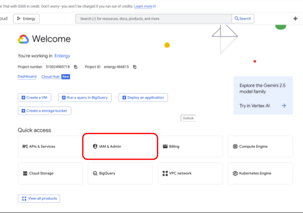
- Go to https://console.cloud.google.com/
- Create a new project by clicking on IAM & Admin. You can also search for Create a Project
- Once you’ve created and named your project, go to APIs and services and then Library. Search for Google Sheets API. Click on it and choose Enable
- Go to APIs and Services then Credentials. Choose Create Credentials and choose Service account. The only information you need to add is the name, everything else is optional.
- Go to the Keys tab, choose Create new key and choose the JSON format. The key will download. Name it “credentials” and save it to the same folder on your computer as the rest of the files in your repository. Do not upload it to your repository.
- Share your Google Sheet with the email in your credentials JSON (give edit access). To find the email, open the JSON in Notepad or a similar app on your computer.
Now you’ll create a GitHub secret to store the information on your JSON credentials. This is more secure than uploading the JSON to your repository.
- In your repository, go to Settings, Secrets and Variables, then Actions
- Under Repository secrets, choose Create a new secret
- Copy and paste the full contents of your credentials JSON into the secret and save it
Note: Sometimes copying and pasting a file like this will add extra spaces or characters that you can’t see and cause your code to fail. We solved this issue by converting the JSON into one line using this converter. We copied and pasted the converted one-line JSON into the secret.
Then we added this to the code. This code in our main.yml file names the credentials:
- name: Scraping today's data

        env:

          GOOGLE_CREDS_JSON: ${{ secrets.CREDENTIALS }}

        run: python "main.py"
And this code in my entergy_scrapper.py file accesses the secret containing the credentials.
creds_json_string = os.environ.get('GOOGLE_CREDS_JSON')

if not creds_json_string:

    print("Error: The GOOGLE_CREDS_JSON environment variable is not set.")

    sys.exit(1)

try:

    creds_dict = json.loads(creds_json_string)

    gc = gspread.service_account_from_dict(creds_dict)
creds_json_string = os.environ.get(‘GOOGLE_CREDS_JSON’)
Making the data visualization
We decided to use Tableau for the data visualization, largely because Datawrapper and Flourish don’t have the capabilities to sort data by date and time on their free versions. Tableau has a free version called Tableau Public that you can download to your desktop. It allows you to add a slider bar to sort data on a map by the date. This is the essential function we needed for this project.
First, we linked the Tableau account to the Google Drive so that we could create a visualization from the auto-updating Google Sheet (see how-to here).
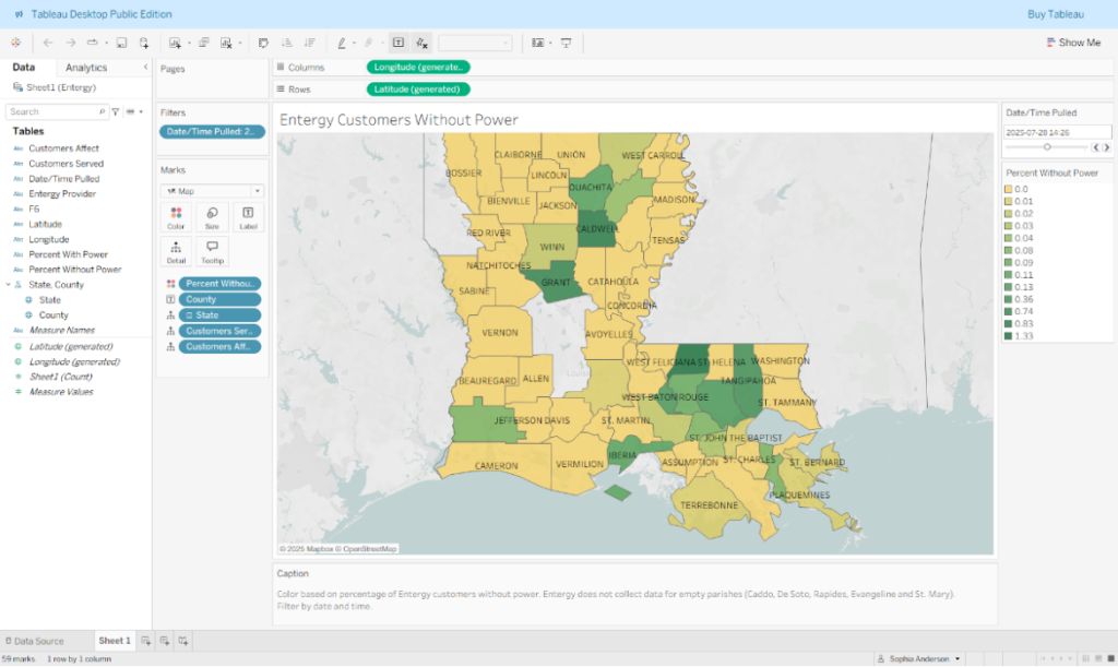
Within Tableau, we then assigned the Customers Without Power field to color, so that the chloropleth map would assign color based on how many customers didn’t have power. We added a slider filter so users can choose the date they’re looking at. View the finished map here.
Here are more specific steps in order:
- Connect to Google Sheets when you first open Tableau Public Open the Tableau Public
- Sign into Google Drive and select your Google Sheet
- Click on “sheet 1” to open a worksheet and start working with your data
- Make sure geographic data is defined by right clicking on State and County on the left hand side of the dashboard
- Double click on County to create a map. At the dropdown menu under Marks, select Map.
- Click and drag the Percentage without Power tile into the box that says Color to color in the regions
- Click and drag the Date/Time Pulled tile into the Filters box. Choose to filter by All Values
- Customize the data that shows up when you hover over a region by clicking on the Tolltip tile
- Add a caption by going to Format > Title and Caption
- Click File > Save to Tableau Public to publish it

Sign up for the Innovation in Focus Newsletter to get our articles, tips, guides and more in your inbox each month!
Cite this article
Anderson, Sophia (2025, Aug. 20). Creating map visualization that can auto-update data over time. Reynolds Journalism Institute. Retrieved from: https://rjionline.org/news/creating-map-visualization-that-can-auto-update-data-over-time/