Free tools for interactive digital storytelling
Interactive maps and data visualizations are great visuals to add to any online news package. These can be created using code, but there are also many online tools that your newsroom can use to improve digital storytelling for very little or no cost.
Here are three to consider:
Flourish
Flourish is a free interactive data visualization tool that offers a variety of templates to work with. The templates range from simple line and bar charts to maps. The best part of Flourish is the endless options with no coding involved in the creation of graphics.
For the Mankato Free Press, I created an interactive marker map of sculptures for the 10th annual CityArt Walking Sculpture Tour. Every year, new sculptures are installed and kept up until the next year. I received the sculpture names, artist information and the coordinates of each sculpture to start making the map. I put the information into the corresponding columns and began formatting the way I wanted the map to look.
On the day of installation, Free Press photo editor Pat Christman took photos of each sculpture for me to add to the map. I created versions of the photos cropped into circles for the icons, and uploaded the .png files for the icons and the .jpg files to the Flourish spreadsheet.
This interactive marker map of the sculptures allows readers to look at the locations before heading out for a walk, or enjoying a virtual walk from home if they can’t make it to the installation itself.
Click here to see the full story for the Free Press.
TimelineJS
Another free and easy-to-use tool for newsrooms is TimelineJS. TimelineJS is an open-source tool that allows users to create interactive timelines.
You can start by downloading the Google spreadsheet available on the TimelineJS website. After filling in the information for the timeline, follow the steps on the TimelineJS website to create the timeline.
According to the website, tips to creating a successful timeline include:
- Keep the timeline short.
- Use stories with a strong chronological narrative.
- Write about the event as a larger part of the story.
- Include events that lead up to bigger events, too.
In addition, TimelineJS supports media from Twitter, Flickr, Youtube, Vimeo, Google maps, SoundCloud and more.
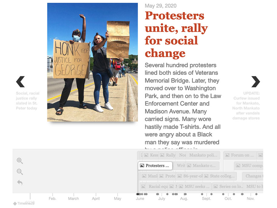
I used TimelineJS to create a timeline of the Free Press’s coverage in the year following the death of George Floyd. It was a great way to combine images over the past year along with documenting the changes in Mankato and the coverage in the region during that time.
If your newsroom is looking to build something similar to what I created, I suggest beginning with pulling all of the links to stories you want to include in your timeline. Put them into the Google sheet with the date and story headline, write a new description or summary for the timeline.
If you want to hyperlink the stories into the timeline (and you should!), a regular hyperlink in the sheet won’t work. I added some HTML around the headlines to include hyperlinks. Here’s an example:
<a href= "Insert the link here" target="\_tab">Headline</a>In the timeline, this will look like a clickable headline that will navigate to the link.
Check out the full package in this article from the Free Press.
Datawrapper
Datawrapper is a great tool for creating basic graphics like line charts, bar charts, tables, heat maps, locator maps and more.
In Datawrapper, you can paste your data, upload a .XLS or .CSV file, link a Google sheet or link to an external source. Once you have uploaded your data, Datawrapper will automatically create a chart. You can click through different options if you want to change the automatic one.
Next, you can change the settings of your graphic including the color, annotations, access labels and more. It’s easy to use for simple graphics, and even allows you to do a colorblind check on your creation.
!function(){“use strict”;window.addEventListener(“message”,(function(e){if(void 0!==e.data[“datawrapper-height”]){var t=document.querySelectorAll(“iframe”);for(var a in e.data[“datawrapper-height”])for(var r=0;r<t.length;r++){if(t[r].contentWindow===e.source)t[r].style.height=e.data["datawrapper-height"][a]+"px"}}}))}();Although Datawrapper doesn’t allow for a lot of customization of the overall design and layout, it’s a great simple tool for newsrooms to create data visualizations. There is also an option to export your work as a static graphic, or a .png file, if you want to use a static graphic for online or in print.
Flourish, TimelineJS and Datawrapper are three great tools for your newsroom to choose from the next time you want to add interactive graphics to a story or your website. And when you create your next visualization, remember to use the alternate text for screen readers tools in Flourish and Datawrapper to make your work more accessible to all your readers!
Annie Jennemann is the RJI Student Innovation Fellow at the Mankato Free Press in Mankato, Minnesota. This summer our student fellows will be sharing dispatches from their fellowships in newsrooms across the country as a part of Innovation in Focus.
