Photo: cottonbro | Pexels
A guide to social branding on any newsroom budget
With tools like Canva, Projector, and Adobe Spark, newsrooms of any size can create brand guidelines
The views expressed in this column are those of the author and do not necessarily reflect the views of the Reynolds Journalism Institute or the University of Missouri.
If you work in a newsroom, chances are you’ve spent a lot of time thinking about the mission or values of your newsroom. You’ve wondered about how your stories further those goals and you also know all the ins and outs of what makes your organization unique.
But how do you translate that to your readers?
For starters, your journalism should align with your mission and values. When users read your stories on your site or through a newsletter, they should be able to identify what your organization stands for.
But it doesn’t stop there. The look and feel of your organization also further your mission and values by giving readers a clear and accessible way to engage with your content on social media accounts. Branding establishes trust and makes it clear who your company is and what it stands for. It helps readers know what to expect every time they engage with your content, regardless of platform.
Having a document with all of your visual elements is a great way to ensure your brand’s identity will be maintained, regardless of who’s working on a project. While many newsrooms have style guides, which ensure copy is consistent across all mediums, many guides neglect the social and visual aspects of branding.
Here’s how to make a simple social media branding guide for your newsroom so that your brand looks the same on all social media posts:
What should I include in my brand guidelines?
It depends. While you can certainly get extremely specific in your guidelines and focus on things like logo placements and sizes, it’s important to at least have the basics. Simple things such as colors and fonts can be the basis of your brand guidelines because let’s face it: no one wants three different shades of blue used on your Instagram account.
Fonts
It’s important to be consistent with fonts. Social media graphics should reflect the fonts used on your website and vice versa. A branding guideline can get specific to indicate the size and font style, but most importantly the name of the font and how to access it is crucial.

Colors
Since you may have people in your newsroom working across various social media design platforms, your brand colors must be communicated. Instead of simply listing the color (for example, red), it’s better to include both the HEX or RGB color (#A12A09; RGB (161, 42, 9)). If there are secondary colors that your brand uses, these can also be included in a style guide as well as an explanation of when they should be used.
Logo
There is probably a short-form version of your logo that serves as your social media avatar and a longer one that appears on your site and other communication. Which logo will appear on your social media posts or graphics? Having clear guidance of this in your branding guidelines will ensure consistency.
Where should I store these guidelines?
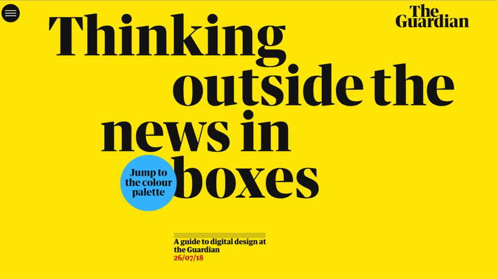
The most accessible option is the best option. If these guidelines are to be implemented by various teams in your newsroom you can put them in a shared drive folder. Be sure to include links to design software used (Canva, PhotoShop, etc.) and information on how to download things like fonts. In addition, websites like AirTable offer premade templates to store brand assets. Some newsrooms, such as The Guardian, put brand guidelines on a public-facing website.

How often should I update these guidelines?
You should revisit your guidelines as often as you revisit your mission and values. Just as you do not want your organization to be stagnant, you also do not want your visual identity to stay dynamic. Plan to revisit these guidelines at least once a year to audit what went well and what can be improved.
Who should make and be aware of these guidelines?
While your designers, social, and audience team members are probably the primary users of these guidelines, there should be weigh-in from other parts of the newsroom. For example, if you plan on adding watermarks to staff photography on social media, photographers should weigh in as well. These guidelines work best when created in conjunction with as many stakeholders as possible.
Now that I have these guidelines, where can I make designs?
Having a set of guidelines makes the design process run smoothly. If you do not have in-house resources for design, various websites offer free and low-pay options for designs. Canva, an online graphic design website, offers a suite of templates for newsrooms that are editable for your newsroom’s logos, fonts, and colors. Social media design site Projector also offers free templates for various social media platforms. Adobe Spark is another option, with an emphasis on video design.
