
2024 Buckeye Flame Pride Guide
Four engaging mapping tools and how they stack up

Building a more interactive and community-focused pride guide with The Buckeye Flame
We partnered with The Buckeye Flame, a nonprofit news organization in Ohio dedicated to reporting on LGBTQ+ news, to take a new audience-focused approach to their annual Pride Guide.
Check out their 2024 guide here.
For the past two years, The Buckeye Flame has published a guide with a growing list of Pride events throughout the state. When we talked with Ken Schneck, editor of The Buckeye Flame, we realized that the Pride Guide was not in a format that made it easy for readers to find events near them, especially as the list expanded each year.
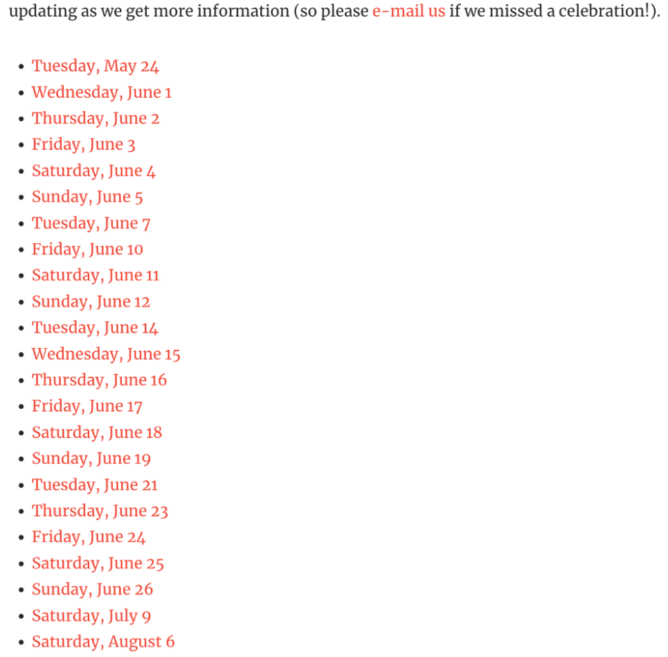
The first year, the Flame sorted the events by date in a list. The hyperlinked dates at the top of the article jumped readers to the related events lower on the page with the time, location and a brief description of each. The biggest benefit was that readers could find all the events in one page, but this format required a lot of scrolling.
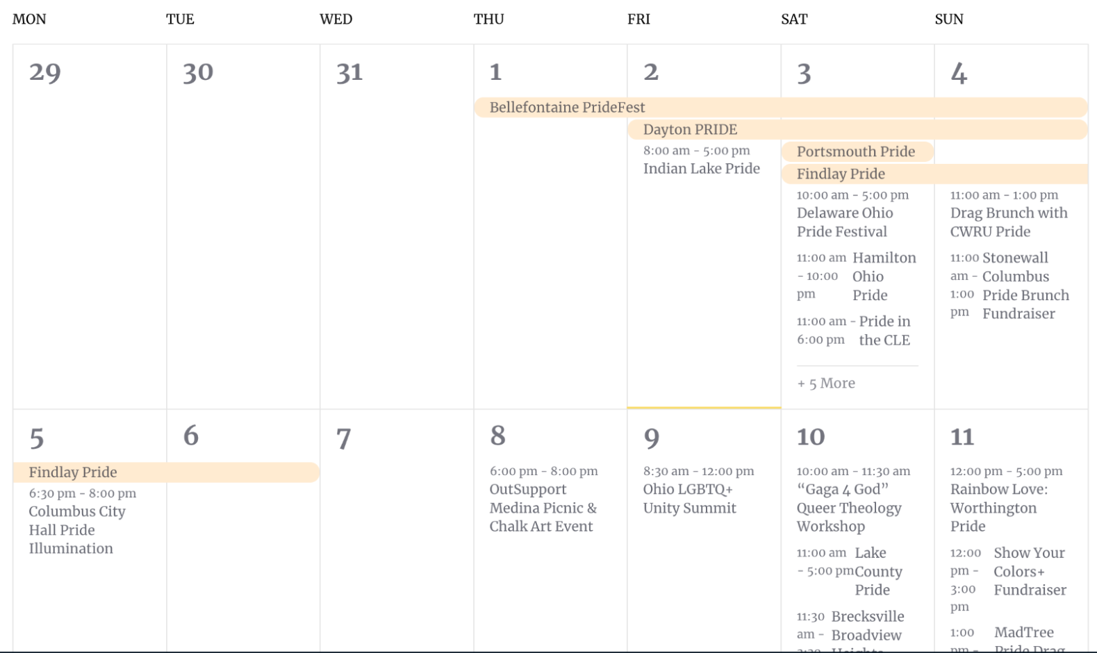
The 2023 Pride Guide looked a little different, presented in a calendar view. This design was simple, and readers could add events to their personal calendars. However, not all the events were listed on one page, and past events seemed more difficult to find. The Flame’s editor also wished he could do more with visuals.
This year we wanted to help them find a way to combine the benefits of each design into something more user-friendly for both the readers and The Buckeye Flame.
Creating the interactive map
We decided to test four different interactive map tools to compare how each one fit our goals.
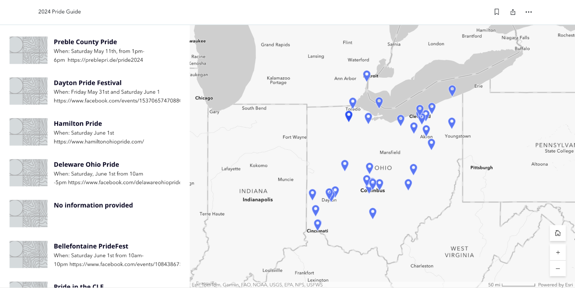
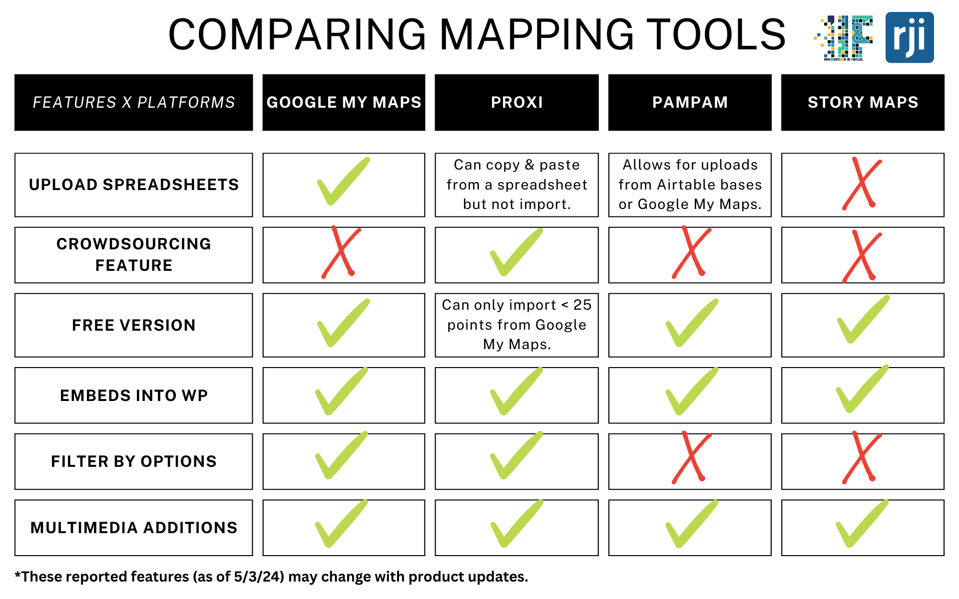
Google My Maps
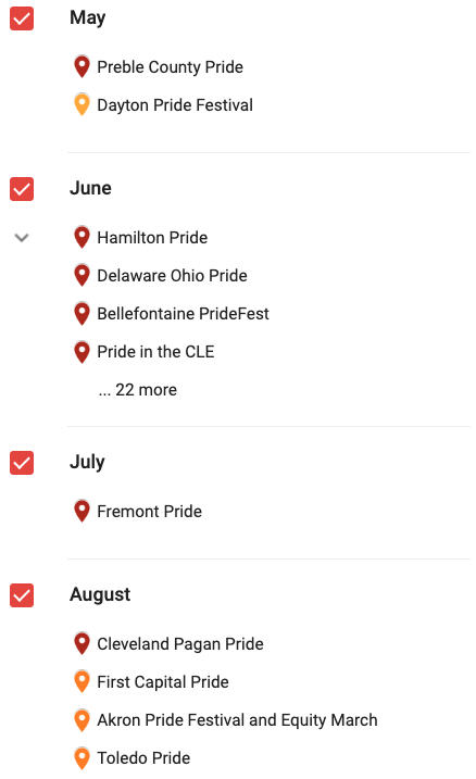
We appreciated the ease of uploading points, either by searching the address directly or by uploading several points at once via Google Sheets. Google My Maps allowed for customization, such as changing the color of the pinpoints or adding pictures and extra information to each point. There is also an option to create layers within the map, which can filter the points by categories. For example, we used layers to filter the points by month.
It took about two hours to upload each point individually, when uploading around 75 points. We didn’t upload a spreadsheet only because Google needs full addresses or latitude/longitude to automatically map each point.
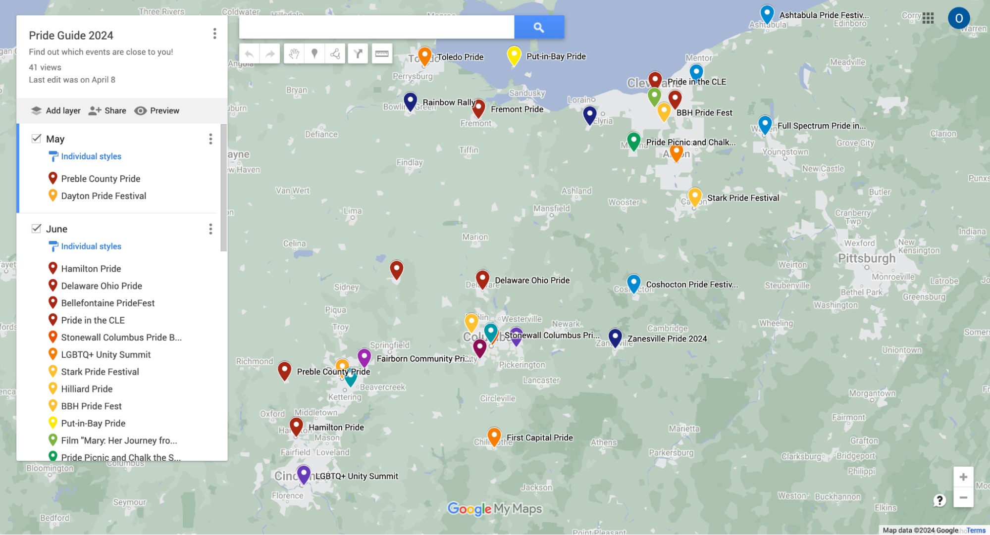
While Google Maps was straightforward to use, especially when already working within the Google suite, it wasn’t the most visually appealing when embedded into WordPress.
StoryMaps
This map took us around 2 hours to manually upload 75 points. There was no option to batch upload points. While this tool would be visually appealing for a map with fewer points and more multimedia elements like video, photos or audio, it wasn’t the best option for this project.
Since we didn’t have photos available to use for each event, the map looked a little empty and bland.
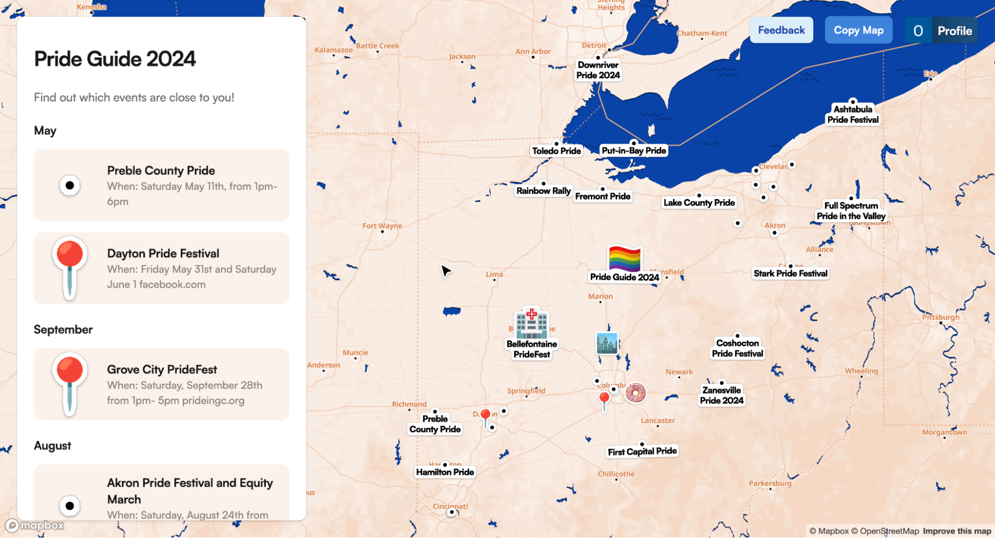
PamPam
This mapping tool was definitely one of the most visually appealing options, however it didn’t meet all of our needs for this specific project. It was easy to batch upload the points by uploading a previously made Google My Maps, and it automatically assigned some points emojis, which were fun and sort of accurate.
We noticed that you could just click and drag the points on the map, and it was difficult to get them back where you wanted them if you did that by mistake. But one perk: PamPam and Proxi were the only ones we tested that encouraged collaboration with the option to invite people to edit the map.
PamPam would likely be a useful tool to create a walking guide because it’s easy to create different routes connecting points in the map, but it wasn’t the best fit for the Pride Guide.
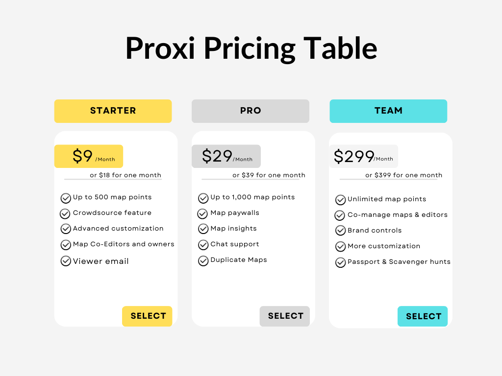
Proxi
Proxi was by far our favorite and ended up being what we ultimately used for this project. Along with being visually appealing with different design options for the background map and points, it was easy to batch upload points, either from Google Maps or from copying and pasting a spreadsheet. The tool also required the least amount of editing, it provided two options to edit your points: a spreadsheet view and directly in the map.
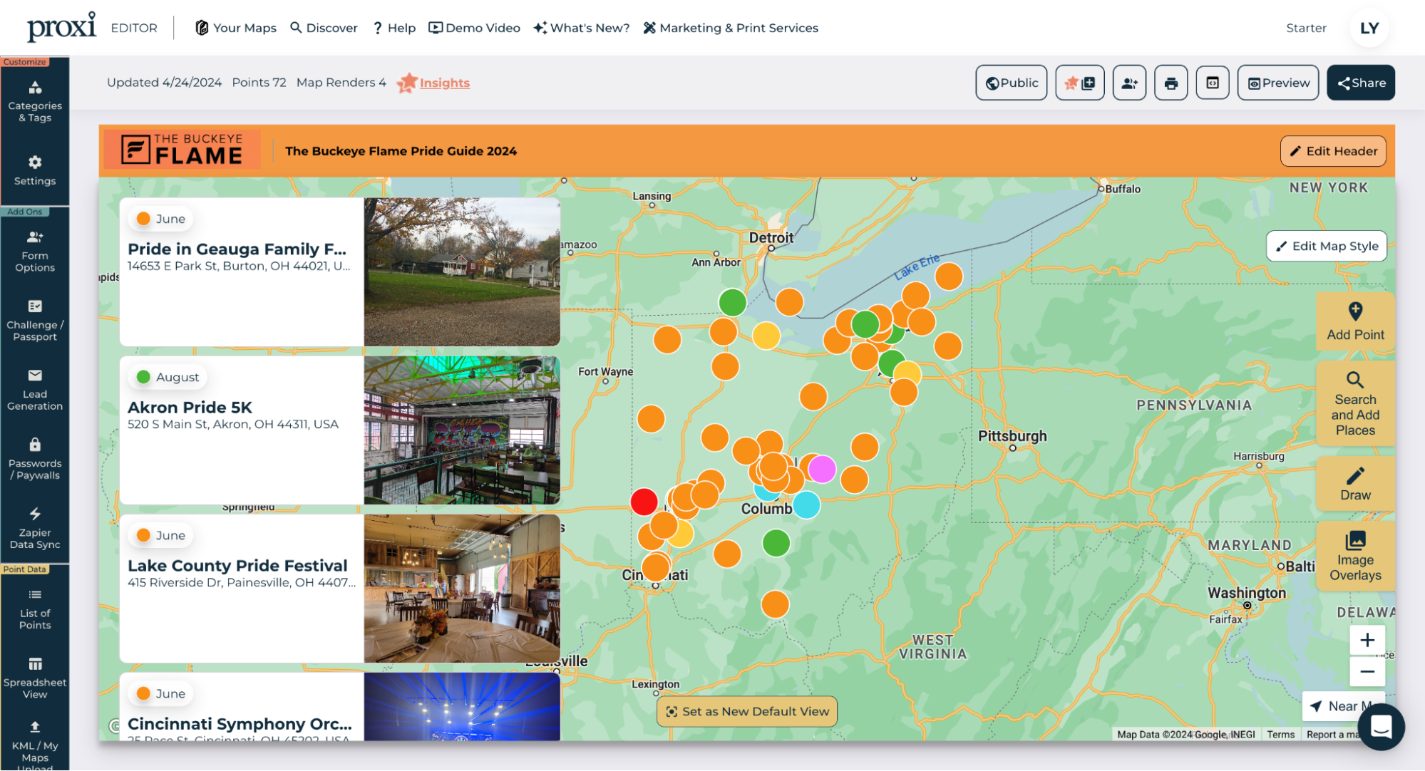
The software requires each point to have a category, and it allows the map viewers to filter the points by those categories. For the Pride Guide, this allowed us to filter the events by month. Next year, the Flame may add other filters like “nonprofit” or “bar/restaurant.” The viewer can also filter points by distance from their location.
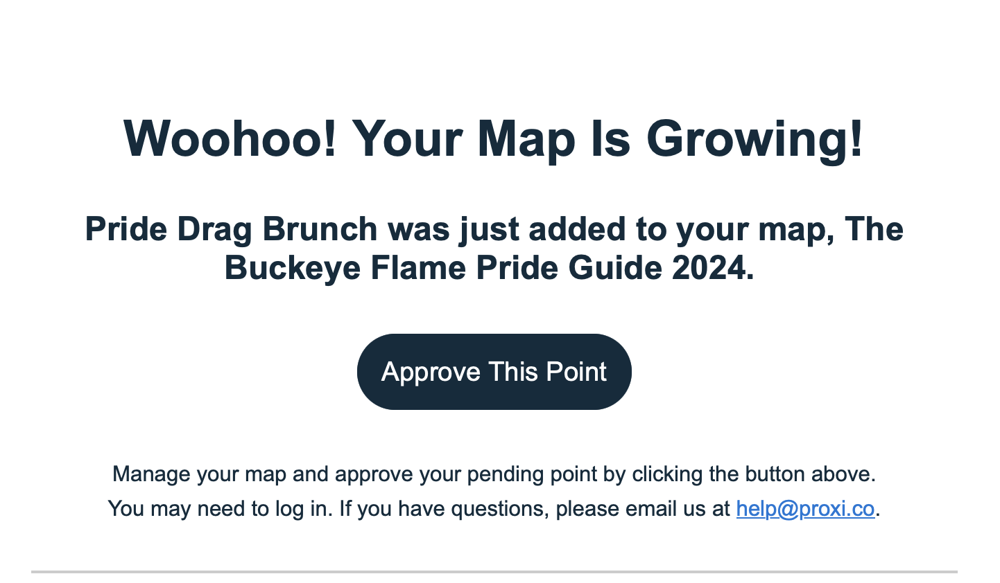
One of the biggest interactive benefits is the tool’s built-in forms to crowdsource for additional points. Readers who want to add points can simply suggest more event points. The editor of the map receives email alerts when new points are suggested, and can approve them to make them live on the map.
Within 24 hours of sharing the map, readers added 10 events through Proxi, and the map received more than 1,500 views.
However, it was the only tool that we had to pay for in order to include all of the events we needed. With the free version, the map could only upload fewer than 25 points from Google My Maps. We decided to pay for the starter plan, which was $9 a month for a year or $18 for one month. The starter plan includes the crowdsourcing feature along with the ability to include up to 500 map points per map.
The Pro plan, which costs $29 a month for a year or $39 for one month includes similar features but also allows for map insights such as a data summary of users’ behavior on the map.
A final plan, the Team plan is $299 monthly for a year or $399 for one month. The biggest difference in this plan is the ability to have six users rather than the one that is allowed for the previous two plans.
Proxi offers a 50% discount for nonprofits and educators on annual plans.
The Buckeye Flame will continue their membership with the Proxi starter plan for the year. They plan to create other maps with it, such as a map of all LGBTQ+ nonprofits in the area.
They also noticed that during their experience in creating the map, they’ve been able to note which Pride events have been canceled or haven’t been scheduled yet. This has led to future story ideas they otherwise might have missed.
Additional options within WordPress
The Buckeye Flame also used the accordion feature in WordPress to organize each event by location and date, so those who may not feel up to interacting with the map can easily find the pride event they’re looking for by location or date.


Sign up for the Innovation in Focus Newsletter to get our articles, tips, guides and more in your inbox each month!
Cite this article
Dolan, Olivia (2024, June 3). Four engaging mapping tools and how they stack up. Reynolds Journalism Institute. Retrieved from: https://rjionline.org/news/four-engaging-mapping-tools-and-how-they-stack-up/