
The Innovation in Focus team drafted a map using Proxi in which community members can contribute points about places they find joy or find helpful resources. inewsource plans to incorporate this into future outreach.
Going beyond traditional surveying to map community assets

Highlight community resources and stakeholders through interactive mapping
At inewsource, a nonprofit news organization based in San Diego, the team prides itself on staying closely connected to their community — listening to people and institutions to discover who’s making a real difference. As the newsroom has expanded their coverage into the North County area, they wanted to learn more about who the local changemakers were. They were also interested in identifying organizations that they might partner with on events or hosting Documenters training.
With this in mind, we set out to answer the question: how do we identify those stakeholders? With a simple spreadsheet and Proxi, an interactive mapping tool, we identified some early strategies and tools to answer this question.
Resources to replicate this experiment
- Tools
- Templates and guides
Referencing the original goals
Based on several conversations with inewsource’s managing editor Jamie Self, these were the goals we outlined:
- Test new and creative strategies for engaging community stakeholders and learning their information needs.
- Build an asset map that outlines key stakeholders, organizations and services for that community.
With these goals in mind, we identified a few ideas to help them achieve this:
- Start with an internal directory tool, to pinpoint who those stakeholders were and keep a running record of them.
- Use a digital tool that could increase engagement with community members and stakeholders to learn more about North County and beyond.
Make surveying fun, visual and interactive
We started our search by looking at interactive mapping tools that could foster engagement within the community, whether that’s using tablets at in-person events or online. The idea was to encourage community members to help us map the organizations, places and people in their networks.
We started off with four different tools, but they didn’t align with our original goals as we refined them. Here’s why:
- Maptionnaire showed strong potential at first because it combined all the benefits of a survey/form tool while allowing responders to place pins on a digital map. However, the cost ($5,500 per year for five surveys) was not accessible.
- Maptive offered a free trial for the first 10 days and included examples of using the tool for asset mapping, but it didn’t allow for community members to contribute.
- GoFMX also seemed promising, but its setup proved too time consuming for our project timeline. This tool was more suited for mapping the internal structure of a building than a community.
- ZeeMaps offered a free version and the ability to include community-contributed points. However, the user experience was not very straightforward, and the news organization would have had to write out instructions on how to contribute a point.
We ultimately chose Proxi because of its ability to be molded into a directory based on community input and more affordable price than Maptionnaire: $33 per month for three months, including a free trial and a 25% discount for nonprofits. (See another use case and some more specific steps to using Proxi in this past Innovation in Focus project with The Buckeye Flame).
The intention was to use the map as a survey tool that was more fun than the average form, while gathering information about local organizations inewsource should know about. With traditionally low response rates on audience surveys sent via newsletters, we hoped a mapping tool could make the survey more fun and incentivizing to engage with — and also allow readers to see their results almost immediately.
Designing the map and choosing categories
To determine the scope and design of the map, we started by building a spreadsheet in Google Sheets with some initial nonprofit and community organizations in North County.
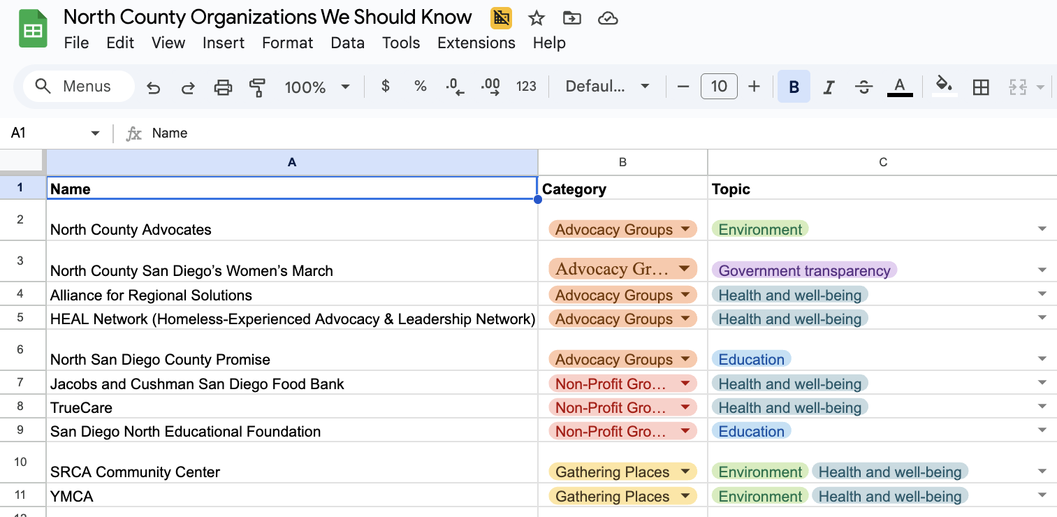
Once the spreadsheet had some data, we worked with Self to identify three broad categories of organizations: advocacy groups, nonprofit organizations and gathering places. For the map, we renamed these categories to be more approachable and user-friendly.
- “Advocacy Groups” turned into…A place to get involved
- “Nonprofit Organizations” turned into…A place to find helpful resources.
- “Gathering Places” turned into…A place to find community
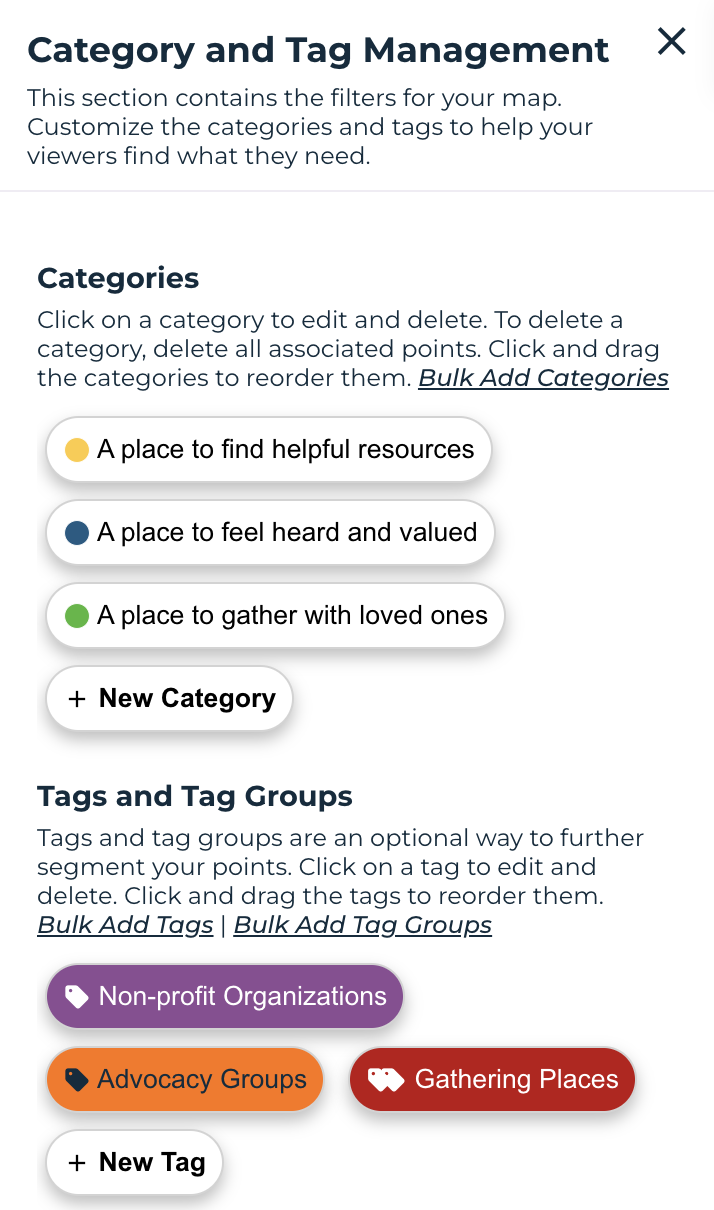
This screenshot shows the categories in the Proxi tool for community members to click on whilst pinpointing an organization or individual.
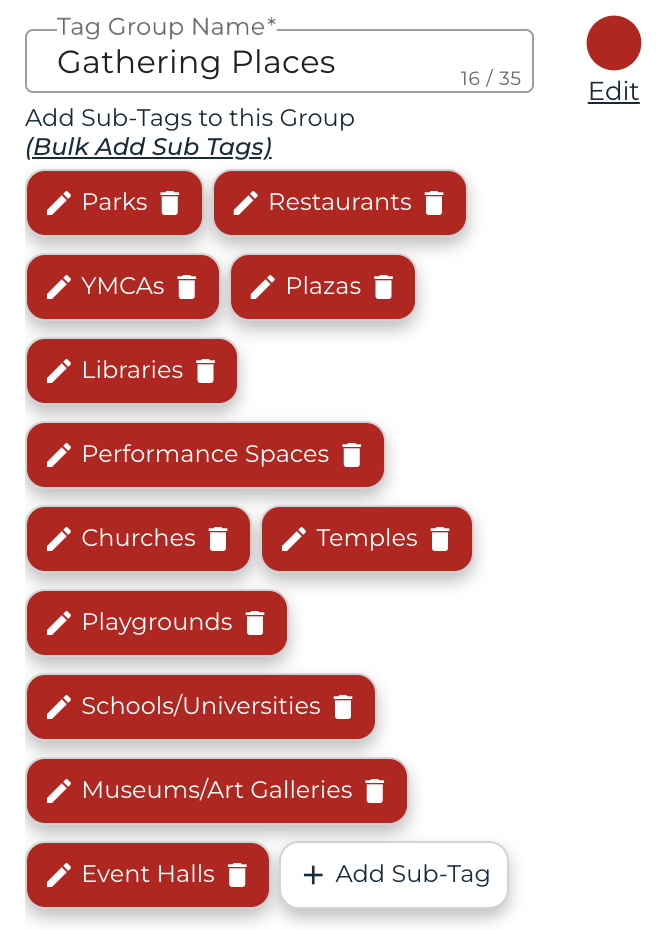
- Within the categories, after a member of the community finds a place/organization/person to pinpoint on the map, they can add a tag for a more thorough understanding of what the resource is.
- For example, under “Gathering Places” they can choose from categories like parks, restaurants, playgrounds, churches, museums, etc.
- Individuals can also add photos, links and brief synopses to the resource.
Internal documentation for asset mapping
Now that we had a draft map, we turned our focus internally to build out the spreadsheet of potential partners and collaborators in North County.
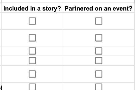
After adding a few examples of organizations in North County, Self and a reporter for inewsource, Katie Futterman, helped us shape the spreadsheet by adding more specific topics and beats associated with each organization, as well as a way to track whether we’ve partnered with that organization already. Futterman added that this community-focused approach helped her go beyond her sourcing with officials and public information officers.
Next steps
While we originally planned to test the map as an in-person activity at a large member event, we ultimately determined it might work better with a smaller audience. inewsource is hosting an event later in December at a brewery where they hope to test the map using iPads or tablets. The news organization also hopes to incorporate it into end-of-year messaging and embed it on their website.
Key takeaways
The key takeaway in developing these tools was ensuring they were interactive, reliable for future use and accessible to everyone in the newsroom — something any team member could easily contribute to and draw from. By allowing people in San Diego to add their own organizations, leaders and groups to the map, we can gain a clearer picture of who’s driving change and making an impact locally.
Sign up for the Innovation in Focus Newsletter to get our articles, tips, guides and more in your inbox each month!
Cite this article
Bowman, Taylor (2025, Nov. 3). Going beyond traditional surveying to map community assets. Reynolds Journalism Institute. Retrieved from: https://rjionline.org/news/going-beyond-traditional-surveying-to-map-community-assets/