Helping voters see what and who is on the ballot in local races
An automation and AI experiment for local voter guides
Voters everywhere are bombarded with campaign fliers; appeals for support via text, email and phone; and a confusing array of options for getting information each election season. In an effort to inform readers about who and what is on the ballot — from the presidential race all the way down to state legislative contests and city council positions — journalists have to wade through hundreds of names, office titles, occupations, descriptions of measures and propositions. We at Bay City News set out to improve that experience for readers — and for our news team.
We wanted to centralize information from the greater Bay Area on an easy-to-use dashboard before, during and after Nov. 5 Election Day and use AI tools to make the process more efficient. That would be a huge help for Bay City News Foundation, a nonprofit news organization that runs LocalNewsMatters.org and is affiliated with the regional Bay City News Service, which provides a wire service for media partners at TV, radio, print and digital outlets in the San Francisco Bay Area.
But it could also be a game-changer for every local newsroom struggling to find time, people, money and technical expertise — especially as staffing continues to shrink amid dwindling revenue and budget cuts.
Here are three challenges we encountered as we worked through the project:
Challenge #1
How could we gather information from 13 counties and more than 250 races and measures in an efficient way that did not require a huge manual lift by already-strapped staff in a small newsroom?
First, we did some research. Some services such as AP, Ballotpedia, the Knight Election Hub and Perplexity helped with the top level races, but local news outlets were on their own for the down ballot races and measures at the county and city levels.
Based in the SF Bay Area, we also looked at other regional media who typically produce ballot previews: KQED, San Francisco Chronicle, Bay Area News Group and CalMatters. They had similar challenges, it turns out: not enough staff to do the full ballots, uneven responsiveness from county offices about election plans, and very different platforms and APIs for each county of interest, making it hard to apply a uniform tool or code to pull results.
Typically, most of this work is laboriously done by hand as information is either typed in or cut-and-pasted from PDFs and websites into a more user-friendly format. But what if AI and other digital tools allowed us to automate this work?
The rapid development of tools such as ChatGPT and Claude.ai (whom we nicknamed “Claudia”) meant we could experiment with prompts to convert data into different formats, generate code and iterate on formatting. This is new territory for us as a small newsroom without a robust tech team, so we used a combination of experienced engineers to scrape the data and our own staff to build the dashboard.
Challenge #2
Could AI and data-scraping tools efficiently pull information even if each county presented their ballots with different formats, platforms and non-uniform data?
We split our project into parts:
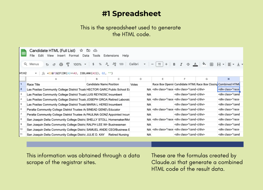
- Use data scraping or enhanced AI to pull from each county’s online ballot information and move that data into a spreadsheet. We wanted to select only the key fields such as name, occupation and office for the races and only the measure title and description for the ballot propositions. It took some trial and error with perfecting prompts to produce complete and accurate results that did not add unnecessary information or did not drop certain fields or mangle names with accents.
Of note: each of the 13 county websites was handled separately. If the county had a ballot displayed as a PDF, this was downloaded and placed into a Claude.ai prompt. If the county had an HTML website displayed, the HTML for the ballot page was downloaded into a Claude.ai prompt. Or if the entire webpage could be copied and pasted into the Claude.ai text input box, this was fastest and also worked. Several counties had a csv file available but this could have too much information so it was not always useful. Because each county had a slightly different layout of their ballots, the prompts had to be tailored to each county.
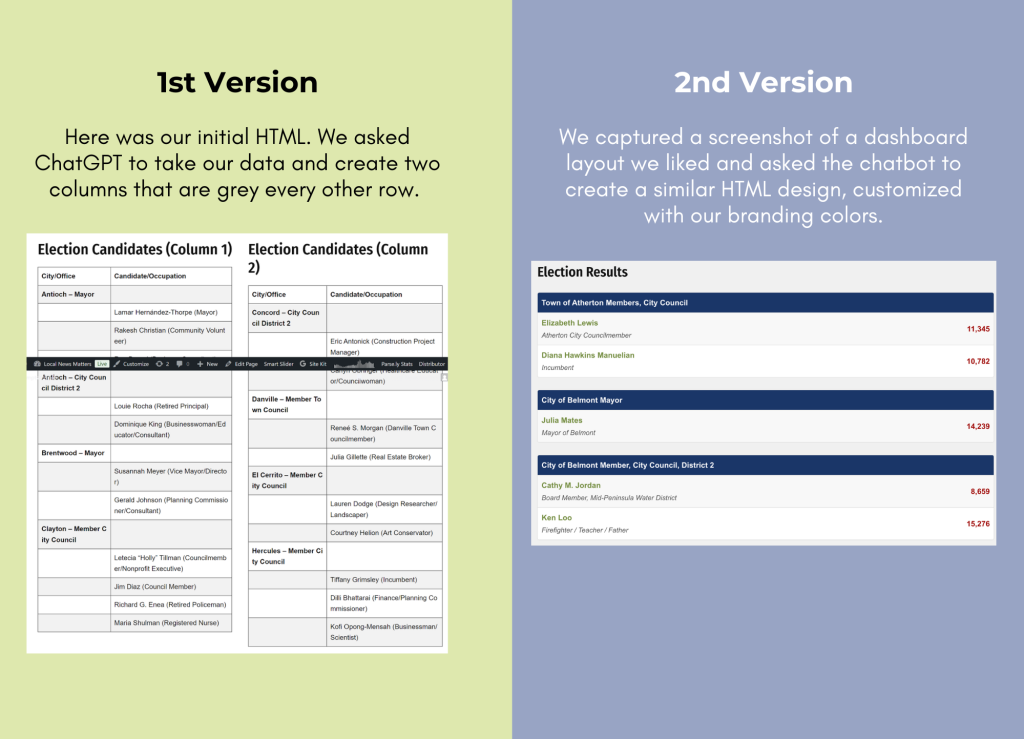
- Once we had done that step, we could apply code created by ChatGPT or Claude.ai to the spreadsheet data to create a user-friendly dashboard on our Civic Engagement Hub. We wanted readers to easily find — through scrolling or search — the races and measures that mattered to them. Staff reviewed all the data at each stage to be sure it was right.
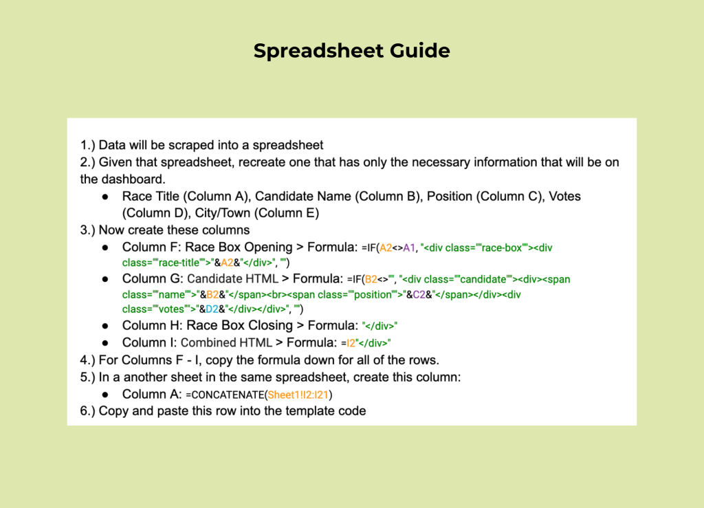
Here’s a guide (above) outlining the specific content we included in our spreadsheet to generate the combined HTML for all the race boxes. This guide reflects a compilation of all the finalized steps we developed through the AI bot. It was a joint effort between a human (Ciara Zavala, an intern with no previous computer coding skills) and our AI helper, Claudia.
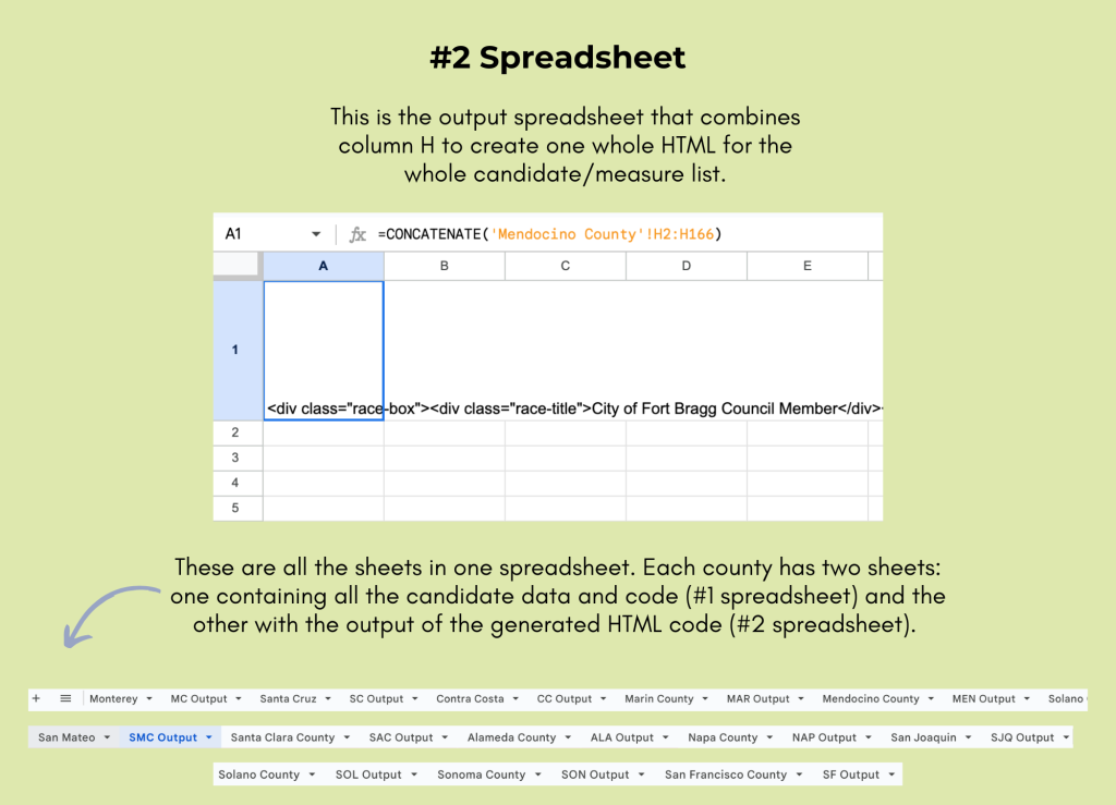
When it came to utilizing AI, it didn’t handle the automation directly. Instead, AI provided us with coding formulas that we applied to the scraped spreadsheet data. These formulas essentially generated the necessary code, wrapping it in a way that produced an HTML output. This HTML then populated the dashboard on our site. By leveraging AI in this way, we were able to bypass the need to hire a coder, effectively only spending about a day and a half to get the HTML code correct instead of manually coding everything. It took approximately 18 prompts to finalize the correct template code and spreadsheet formulas, followed by 25 additional prompts to troubleshoot and resolve all errors or corrections.
Through this process, we discovered a key lesson: understanding limitations. Initially, we tasked Claude.ai and ChatGPT with generating an HTML from our scraped data. While they could handle small datasets, they struggled with larger ones.
We quickly realized this approach of having to repeatedly prompt them to generate an HTML wouldn’t be efficient for the fast-paced demands of election night. We decided to ask Claudia for recommendations on the most effective workflow. Her solution? Use spreadsheet formulas to code and generate a single, consolidated HTML code for all candidates (typically 200–300 per county) and measures (about 20 per county).
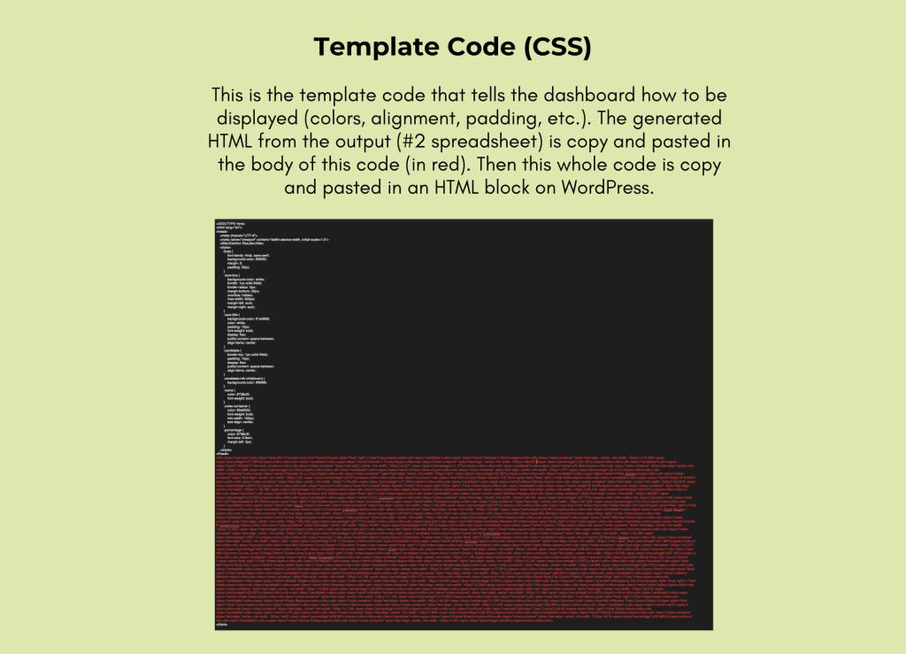
Also we discovered that while AI couldn’t directly access our spreadsheet links, it could analyze screenshots of the data. It was capable of creating a CSS template to style the HTML but couldn’t integrate the generated HTML into templates automatically.
In addition, most of our coding queries directed to Claudia often timed out during lengthy or complex tasks, even with the paid version ($20/month). It was almost as if she needed a break, much like a human who needs rest to recharge. Each time this happened, we had to wait for it to reset, start a new conversation and re-explain the project details from the beginning. This was particularly frustrating because forgetting to mention any aspect could impact Claudia’s responses. Being as specific and thorough as possible was crucial when communicating with her.
Even when we thought we had a final version, there were small glitches that required us to tweak the code and troubleshoot errors such as misspelled names, missing accents or hyphens, duplicated races and random alignment issues. Identifying the source of these problems — whether from the scrapers, spreadsheet formulas or template code — was a tedious process. One wrong comma in the code or formulas could do a lot of damage.
Challenge #3
How could we best present this information so voters could easily find what they needed on LocalNewsMatters.org, a WordPress site hosted by Newspack.
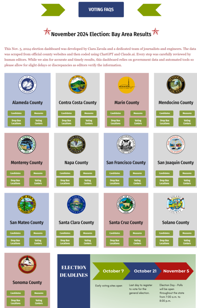
One challenge we encountered was WordPress’s finicky behavior with sizing, buttons and layout customization. To address this, we created a four-column block, meticulously designing the layout for one county first.
We opted to separate measures and candidates into two distinct buttons. This ensured that neither ballot type was buried at the bottom, reducing unnecessary scrolling. To further enhance usability, we added a search bar, allowing users to quickly locate specific races, candidates or occupations, as well as links to drop box locations and voter centers.
Once we were satisfied with the look, we replicated that design across all 13 counties. To enhance each county’s unique identity, we added an image of the county seal to its block. Additionally, we alternated colors to create a dynamic and visually engaging design.
Ta-da! The results of our teamwork can be seen in two places: our “Civic Engagement Hub” and our “Experiments in AI” sandbox.
Next up (Article #2): Trying to scrape html data live on election night. Not so easy.
Cite this article
Rowlands, Katherine Ann; and Zavala, Ciara (2024, Dec. 12). Helping voters see what and who is on the ballot in local races. Reynolds Journalism Institute. Retrieved from: https://rjionline.org/news/helping-voters-see-what-and-who-is-on-the-ballot-in-local-races/


