
Integrating data visualization into a reporter’s workflow

Finding tools and methods that work for your newsroom
At WWNO and WRKF, partner stations in New Orleans and Baton Rouge and members of the Gulf States Newsroom, we are working to create an efficient workflow that will allow busy reporters to incorporate data into their stories in a way that’s easy for readers to understand and interact with.
With the Gulf States coalition, including WBHM in Alabama, Mississippi Public Broadcasting and NPR, WWNO and WRKF work to ensure that underrepresented communities in the gulf area receive coverage focusing on the environment, healthcare, criminal justice and the economy. The goal of this project is to help incorporate more data into that impactful work.
Planning a data viz toolkit
To get a better understanding of how individual reporters work and what their needs are, we started by creating data visualizations for stories which reporters were already working on. This also allowed us to experiment with lots of different data tools to find the best ones to recommend they utilize.
After meeting with newsroom staff to ask about their experiences working with data, these are the most frequent obstacles staff reported:
- The biggest constraint is time, the news cycle moves so fast and their first priority is recording their stories for radio
- They don’t feel they have the time to experiment with tools and teach themselves how to use them on their own
- They’re not sure who would check their data work or edit these aspects of their stories
The staff who do have experience working with data visualization tools said that they’ve used Datawrapper and Flourish, but in a fairly limited capacity. Athina Morris, the newsroom’s digital content producer, said that these tools are a good place for reporters to start before we move on to teaching anything more complicated. The end goal is to create a toolkit for reporters to create their own data visualizations and present it to the newsroom at their annual retreat in mid-July.
These are the priorities for this toolkit so far:
Create templates of the most frequently used types of data visualizations
While most tools have built in templates like maps of the country or pie charts that users can fill in with data, making templates specific to the newsroom will save reporters a lot of time in the future. These will likely include maps with the boundaries of local school districts, graphs and charts already filled in with the demographics of the NOLA and Louisiana populations, and an interface for readers that reporters can fill in with current legislation.
Create an FAQ guide for Datawrapper and Flourish
Neither Flourish or Datawrapper have robust customer support features, so asking questions about specific issues can be time consuming. There are some issues reporters might run into frequently that aren’t addressed in the public tools’ how-to guides, so this toolkit will clarify those potential problems and offer solutions.
Eventually introduce some new no-code, free data visualization tools
For reporters whose skills go beyond Datawrapper and Flourish, or those who want to try and learn new platforms, the toolkit will include a summary of some more advanced alternatives.
List some ways to scrape, organize and standardize data sets
Sometimes the hardest part is knowing where to start, especially when your data is in an uneditable PDF or includes extraneous information. There are plenty of ways to get data from its original form into something you can directly upload to Flourish or Datawrapper and turn instantly into a graphic. The tool kit will include tips for a range of skill levels.
Document a workflow for creating and editing data visualizations
After more discussions with reporters and editors, we’ll be able to solidify an editing and fact-checking process that makes data visualizations feel like an integrated part of the reporting process.
Determine the best ways to integrate data projects into WWNO’s website using Grove’s interface
WWNO’s web developer has been able to insert the script coding for interactive maps from Flourish directly into Grove. Eventually we’d like to get more creative and make visualizations that move or zoom in along with the user’s scrolling to be engaging and interactive.
Data visualizations created
We are doing a story on changing reading standards in Louisiana, which means that many third graders are at risk of falling below and being held back. We wanted to show which students received the highest and lowest scores, broken down by school and location.
The data came from the Louisiana Department of Education. Jefferson Parish is the largest school district in the New Orleans area and the subject of a feature by one of the education reporters, so we chose to feature elementary schools in this parish.
First, we isolated the schools in Jefferson Parish from the DOE’s spreadsheet of data, input each school into a map on Google Earth to get their coordinates, and fact checked the addresses using the school directory.
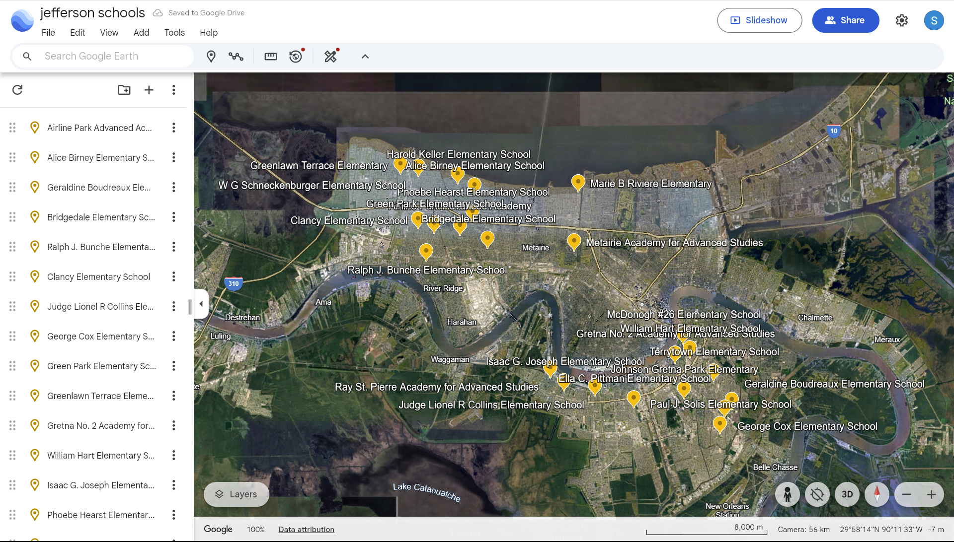
We exported the coordinates as a KML file, converted that data to a CSV file, and uploaded it into Flourish. (The only way to export coordinates from Google Earth is as a KML file, unfortunately, and Flourish only accepts data in the form of CSV, excel or GEOjson. To convert the coordinates there’s lots of free online tools, but I used MyGeoData.) In Flourish, we created a color scale with five categories to show the range of reading assessment scores for each school.
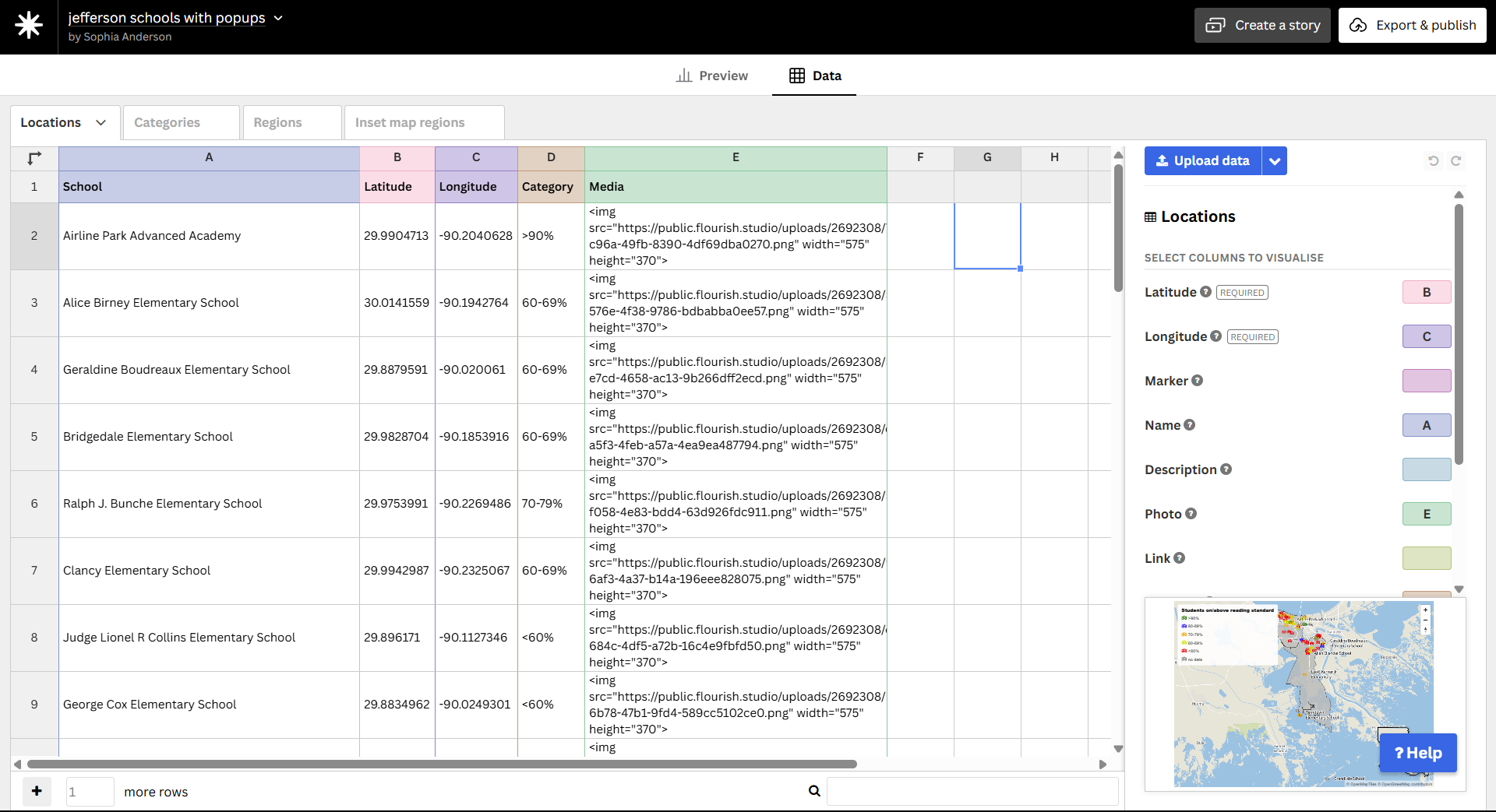
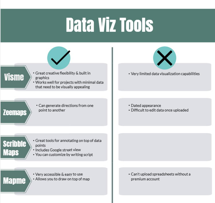
The data also included a further breakdown of the reading scores by demographic for each school. Using Visme, a free tool similar to Canva but with more data visualization capabilities, we created a dashboard for each school showing the scores by demographic. We wanted readers to be able to get as much information about their school and their student as possible.
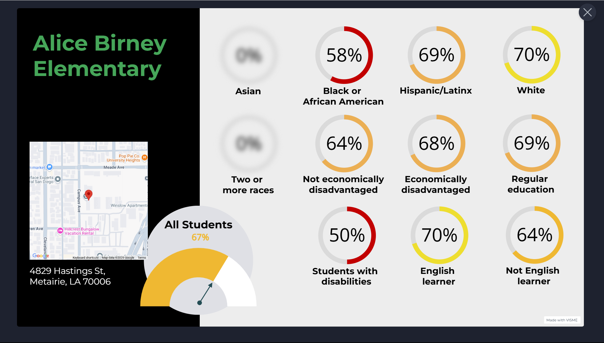
By using some basic HTML and using Flourish’s popup/panel feature, we integrated files of these dashboards for each school. When users click on a school on the map, the dashboard with more information will pop up.
Put this code in the “Media” column of Flourish:
<img src="https://public.flourish.studio/uploads/2692308/7338c798-c96a-49fb-8390-4df69dba0270.png" width="575" height="370">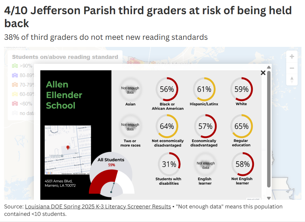
The file name goes in the first set of quotation marks, and you can set the dimensions in pixels where it says width and height.
Additional data viz tools tested
Apart from using Visme to make the data dashboards, we’ve evaluated additional tools as potential for future projects.
Inspiring data projects we hope to emulate
To inspire future visualizations, I looked at several visual data projects. Part of the plan this summer is to interview data journalists in graphics departments at these newsrooms and ask them about their process.
ProPublica’s Supreme Connections Project
I love how this tool is completely customizable by the user, and allows them to filter the data by the organization, category or justice. The use of headshots is good for readers who might know public-facing justices from their faces but not their names.
ProPublica’s Air Pollution Project
These maps are visually striking without sacrificing readability. The way the map reveals more information on each hotspot as you zoom in is very effective.
ProPublica’s NYPD Discipline Project (Can you tell I love ProPublica)
The sliding scale was a great way to allow users to sort so much data. Hyperlinking each police report improves credibility.
“Built to keep Black from white” NBC
The way the map automatically moves and goes from 2D to 3D as you scroll is something I’d really like to replicate.
“Crime reporting behaviour of victims of unlawful police in Germany” Daria Babco’s senior thesis
This display is visually stunning — and probably more aesthetically editorialized than is appropriate for NPR — but the use of shading to show proportional data is very effective.
Additional resources
- ProPublica’s “Introduction to Data Visualization” presentation
- This guide to sharing interactive maps

Sign up for the Innovation in Focus Newsletter to get our articles, tips, guides and more in your inbox each month!
Cite this article
Anderson, Sophia (2025, June 26). Integrating data visualization into a reporter’s workflow. Reynolds Journalism Institute. Retrieved from: https://rjionline.org/news/integrating-data-visualization-into-a-reporters-workflow/