
Training a newsroom on data visualizations

Creating an accessible, comprehensive guide to data viz for reporters at all skill levels
Sophia Anderson is a 2025 RJI Student Innovation Fellow partnered with NPR stations WWNO and WRKF. The RJI Student Innovation Fellows will be sharing their innovative work throughout the summer through Innovation in Focus.
Our main goal for this fellowship was to create a toolkit for WWNO reporters to simplify the process of creating data visualizations. WWNO doesn’t have a designated member of staff who handles data projects, so it falls to each reporter to integrate data visualizations into their stories.
Checking in on original goals
Based on conversations with staff at the beginning of the summer, these were the goals we wanted to achieve with the toolkit:
- Create templates of the most frequently used types of data visualizations
- Done! Datawrapper has these, but we made them for Flourish.
- Create an FAQ guide for Datawrapper and Flourish
- Done! We also made a guide to Google Sheets and a troubleshooting guide for reporters trying out Python for the first time.
- Eventually introduce some new no-code, free data visualization tools
- Check! While Datawrapper and Flourish remained the best options for the newsroom, we included one new option: Tableau Public. This version of Tableau is free and has tiered capabilities that are helpful for a newsroom that has reporters with different data skillsets.
| Pros | Cons |
| Allows you to connect to Google Drive for direct access to dataVery precise system for assigning data fields to visualizations Excellent free version Options for every skill level | Less intuitive dashboard compared to Flourish or Datawrapper Doesn’t automatically fill in visualizations for youSlightly harder to visually customize |
- List some ways to scrape, organize and standardize data sets
- Done! This was the largest part of the toolkit. I split it into the following sections: converting PDFs into spreadsheets, eliminating duplicate data, checking limitations of data and standardizing messy data. I showed ways to do this with a variety of tools, including Python, Adobe Acrobat, Tabula, large language models (AI), and Google Sheets’ built-in tools.
- Document a workflow for creating and editing data visualizations
- Check! To make things easier for editors to look over data work, we included a section on documenting all the calculations and filtering reporters do when turning data into a visualization.
- Determine the best ways to integrate data projects into WWNO’s website using Grove’s interface.
- It was very easy because Grove allows you to insert visualizations as links or as HTML.
Key takeaways
The most important things we considered while making this toolkit were to make it accessible for everyone, to link to as many external resources as possible, and to structure it how we know reporters will use it.
To minimize confusion, we made no assumptions about reporters’ knowledge bases when making the kit. That’s why every term is defined (from file types to data types) and every resource is hyperlinked. Ideally, you should be able to use this kit if you’ve never worked with data before.
Next, we linked to lots of external resources that explain things from different perspectives. I had the privilege of attending IRE during my fellowship, so I included lots of resources I learned about at that conference.
Lastly, the guide is structured to answer questions and meet needs. Parts of it can stand alone based on what a reporter is looking for. It includes troubleshooting for as many of the common problems reporters might encounter as we could think of. Also, any time a reporter asked me a question this summer, I added that in as well, along with the solution.
Extra features
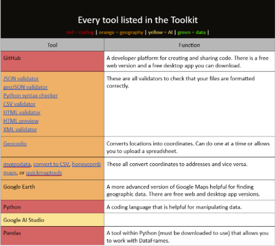
To avoid reporters getting stuck on certain steps due to knowledge gaps, we added an index of terms at the bottom of the kit. We also made a list of every external tool recommended in the kit, with a link and short explanation of how to use it.
We documented each set of visualizations we made in case they need to be modified or replicated. This section helps explain how we transformed data into the final maps and charts that were published.
Addressing feedback
After compiling the guide, we gave a presentation to the newsroom to walk them through the toolkit and answer questions. The two biggest adjustments we made based on feedback were adding a section on using AI and changing how the table of contents was formatted.
Since the toolkit is long and might be overwhelming, we wanted to reduce the need to parse the entire document when looking for a piece of information. We figured that most users will be referencing it when they have a question, so we formatted the table of contents to label each section based on what the user is looking to do.
For example, “I need to…”
- I need to get rid of duplicates in my data.
- I need to check if my file is properly formatted.
- I need to convert a PDF into something I can use.
The table of contents links to the page where the information is stored.
Secondly, we added a section discussing the potential uses of large language models to organize data, as well as the pros and cons of using AI in journalism. This was thanks to a question one of the reporters asked during the presentation.
Reporters wondered about using AI to sort large bodies of data that might otherwise be hard to handle. The toolkit’s section on AI contains good rules of thumb for what AI can reliably do (and what it can’t do), how AI has been historically used in responsible reporting, reports on the ethical and environmental concerns about AI, and a list of tools to try that aren’t ChatGPT.
In data journalism, AI can be helpful for combining long lists of data while identifying duplicates. It can also reorder columns or rows based on criteria you give it so you can match one data set to another.
We used Google’s AI Studio this summer to combine data from three separate Google Sheets and label the data based on what sheet it came from. This is the prompt we used to achieve that:
Take this data and compare it to the following lists.

[insert list of all the schools in a particular school year]

List 1:

[copy and paste all the schools listed on public school sheet]

List 2:

[copy and past all the schools listed on charter school sheet]

List 3:

[copy and paste all the schools listed on private school sheet]

Create a CSV file with school names in one column, and the type of school in the other column. If the school is repeated in List 1, add public to type column. If the school is repeated in List 2, add charter to type column. If the school is repeated in List 3, add private to type column. Some schools may be on more than one list. Return as a CSV.
There are also AI tools built into platforms that can be very helpful for troubleshooting. When we were writing code for another RJI project that added auto-updating data to a map, GitHub’s copilot AI helped identify bugs in the code and reformat issues.

Sign up for the Innovation in Focus Newsletter to get our articles, tips, guides and more in your inbox each month!
Cite this article
Anderson, Sophia (2025, Aug. 21). Training a newsroom on data visualizations. Reynolds Journalism Institute. Retrieved from: https://rjionline.org/news/training-a-newsroom-on-data-visualizations/