Tracy Clark’s take on 15 news aggregation apps: Part 3

NewsRepublic
NewsRepublic was founded in 2008 by CEO Gilles Raymond. In March 2012 it received a Series A $3 million investment and in October 2013 it received a Series B $6 million VC funding.
As explained on an earlier version of their site, “NewsRepublic is a global news app that lets you be your own news editor: build your own news channels and get alerted — in real time — on topics that are the most relevant to you. Keep up to date on everything about your favorite football team, the latest tech news from the Silicon Valley or follow a specific company, brand or politician. You can track the latest hot topics from national or world news – News Republic will explore hundreds of selected and trusted news sources and news agencies in addition to global and local media and blogs.”
NewsRepublic has 31 employees and the app is offered in six languages. Its technology is based on a proprietary multilingual TagNav Semantic engine with syndication of more than 1,000 media partners worldwide including AP, Reuters, Tech Crunch and The Guardian. NewsRepublic offers 50 percent of ad revenue to publishers.
The latest usage numbers I could find are from 2013: their collection of apps (News Republic, Appy Geek Appy Gamer GlamLife and Sports Republic) have more than 15 million active users and that their “proprietary news engine generates more than 10 million page views per day of licensed and trusted content, and has generated billions of news article views to-date.” NewsRepublic is currently ranked 261 in U.S. news apps by App Annie.
My take: I really like that the full content is displayed within the app versus linking me out like so many other aggregators. The homepage does a good job of combining all of my interests into one feed and splitting them out by section. The downside is sheer volume of content — the sports category now has 7,587 articles to read! They should be utilizing keyword preferences to make each section more consumable to each end-user. Also, I can’t choose unique topics to curate content against such as running. I have to search from a predefined list of topics. It’s also not clear how I can choose which publishers I prefer in my feed.

Shuffle
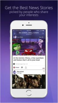
Shuffle was co-founded by Alex Skatell and Phil Musser and launched on December 5, 2014, by Media Group of America. Coined “your personal news dealer,” Shuffle “uses Courier, an algorithm to map news consumption, distribution and satisfaction, to learn how and why news and information is shared, what makes news high-quality, and who is the right audience for that information.”
The interface is a unique set of “cards” that readers flip through just like the Tinder dating app, either swiping left to dislike an article, or swiping right to like. The news is chosen for me based on five attributes: personal interests, what my friends are reading, what’s trending in my area, timely news and most popular news.
My take: The UX is a good way at making news reading feel like a fun game, but I don’t like that I have to make a decision on every single article. I don’t have a preference on some but I don’t want to signal one way or the other not knowing how it will change the algorithm. Honestly, most of the time I don’t like what many of my Facebook friends are reading, and popular news doesn’t necessarily equate to necessary news to me, so I’m not sold on the combination of all five attributes. Also, they link back to the original publisher’s site. I’m not a fan of linking me across the Web and into siloed paywalls. In a NiemanLab article, it notes they have secured partnerships with 50 publishers so I’m not sure how that affects the linking versus pulling content into its own app.

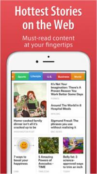
SmartNews
Founded in 2012 in Japan by Ken Suzuki and Kaisei Hamamoto, SmartNews “analyzes millions of articles every day to discover and deliver the top trending stories influencing the world right now.”
In March 2015 SmartNews announced a $10 million funding round at a pre-money valuation of $320 million, having raised $50 million total. According to TechCrunch, they have “10 million downloads and 1 million monthly active users in the U.S.” and are using this money to expand its presence in the U.S.
SmartNews gives 100 percent of advertising revenue to its publishers and feature partners such as USA Today, Quartz, AP and TechCrunch, stating that 80 of them receive more than 1 million page views per month.
My take: Their funding and strong user base proves they are on to something, but I am not a fan of this app. The colorful tabs at the top remind me of USA Today and a traditional newspaper organizational structure. Why employ univariate aggregation and force a user to go through one section at a time when you can use multivariate aggregation and display only the relevant articles applicable to me in one strong UX? Even though I can select publications to pull in as a separate tab, I cannot decide which publishers’ content is shown within each topical tab.

Trove
Trove re-launched in January 2014 from its original social reader app in 2011 and “promises smart news curation and aggregation.” It was developed by what was formerly called the WaPo Labs team, now referred to as the Trove team post-Amazon acquisition (Trove was not included in the sale). TechCrunch coined them the “Flipboard competitor” primarily because their users curate topical-based “troves” that other users can then follow to discover content, similar to Flipboard’s magazines.
According to The New York Times, “At its most basic, the app highlights recent stories from 15,000 sources that have been ranked for both their authority and popularity by Trove’s half-dozen human editors, led by Sandy Sugawara, a former assistant managing editor at The (Washington) Post. Its algorithm can also give a lift to topics that are popular among your Facebook friends and Twitter connections if you give it permission to tap into your social networks.”
My take: I’m glad to see them do a mixture of algorithm-based aggregation and manual content selection by editors. I tried this app for awhile but I found myself more of a lean-back reader than an active lean-in contributor/follower. I felt as though I had to invest a lot more energy than I was willing to truly maximize the experience. I tried creating a trove on “news aggregators” and while it gave me some relevant articles such as the Google News Lab announcement, it also has tons of irrelevant articles from oddball sources listed. Granted, perhaps my topic is much harder to scrape the Web for versus something simple like basketball. Also, I sometimes question the value of a stranger’s selections as to whether they truly found the best of the best. I know this is a great way for users to become known as subject-matter experts or SMEs on a topic, but I trust advanced technology better to comb the depths of the Web to find what I truly want.

Yahoo News Digest
Like Facebook, Yahoo was also late to market with its news digest app, which launched in January 2014. The technology is based on the $30 million Summly acquisition and provides quick snippet summaries of 8 to 10 “must read” articles twice a day at 8 a.m. and 6 p.m. but times can be adjusted. If a user scrolls down past the read indicator another 15 to 30 articles appear. Currently there is no support to customize which articles or topics are included. But reported future product enhancements will include localized news and customization options.
The summarization technology is very similar to Circa’s “atomization” philosophy. Summly’s algorithm does a portion of the work but it is still up to manual editors to choose the news and finalize the summaries prior to publish.
Currently Yahoo News Digest offers four editions — U.S., U.K., Canada and International. In 2014 they reported that 40 percent of users return daily, and users stay in the app for an average time of two and a half minutes per session. According to App Annie, the app has consistently been rated in the top 20 for U.S. news, as high as No. 2 this past December and currently at 19.
According to Summly founder Nick D’Aloisio, the app is “very holistic, concentrating on the big things that are happening in the world right now. It’s intentionally designed to be very different. The stories are not necessarily what you want to know about, but what you should know about” — meaning they choose the articles displayed just like editors at a newspaper.
Summly had been working on a version for the Apple Watch for nearly a year now, selected by Apple as a launch partner. “It is about summarisation, short consumption, digest and even more abstraction,” D’Aloisio told the Financial Times in 2014. His Apple Watch strategy: “Getting in and out as quickly as possible.”
My take: This app is perfect for people who quickly need to know the headlines. The design is far superior to any other news app, in my opinion. That being said, it drives me crazy that they think they know what news is most important to me, similar to newspapers and nightly newscasts. If I had it my way I would remove all celebrity, entertainment and sports articles, as those are not newsworthy to me. I strongly suggest they add topic and keyword customization to personalize these twice-daily digests.
NOTE: Not included in this more-detailed analysis are other news aggregation apps I am aware: Etsuri, Feedspot, Headlines, Newscron, Niiiws, NOD, Outlit, Prismatic, Quickne.ws, Skimmin, Sky Grid, Reverb, Taptu and TheNeeds.
