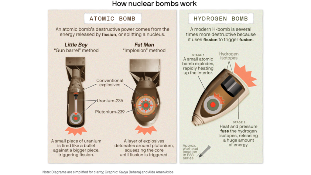
A screenshot of an infographic that Kavya Beheraj made for an explainer article about how nuclear bombs work.
Explaining complicated ideas, processes with digestible and impactful graphics
A conversation with Kavya Beheraj, Axios
Now a data visualization editor at Axios, Kavya Beheraj often transforms complicated and comprehensive stories into digestible and impactful graphics. Examples of her work include a recent visual explainer of how a nuclear bomb works for Axios or the 3D interactive model to map the surface features of Venus.

Beheraj spoke with our Innovation in Focus team about how she approaches visualizing complex ideas and shared her practical tips for small teams wanting to think more creatively about their data visuals.
Lytle: How do you decide when a visual is going to be helpful in telling a particular story?
Beheraj: It comes down to: Does the graphic clarify something that is hard to do in words? Because if we have a chart that just has like two points on it, it might as well be bullet points. It doesn’t need to exist. If you’re trying to show something visually, then it needs to be useful beyond what words can do alone.
The way that Axios does it is we are newsletter focused, so we do a lot of static graphics. It has to work static first. That imposes some interesting limitations. Of course, we want to do the fancy scrollytelling graphics, interactive things, but people reading it on their phones in an email won’t get any of that experience. So how do we translate something like that to folks who are just looking on their phones and tiny screens?
Lytle: If journalists want to create an explanatory visual but they work in a small team or lack resources/data training, what advice do you have to get them started?
Beheraj: The most helpful thing for me when I was figuring out how to get stories from data is to just treat it like any other source, like the way that you would interview a source is the same way you want to interview the data itself: Where did it come from? How is it collected? What are the limitations that come with it?
Lytle: When it comes to visualizing the data, do you have any favorite tools that you use?
Beheraj: You can make some really excellent graphics in Datawrapper, and it has a lot of different chart types and mapping capabilities. Another great tool is RAWGraphs. This is a tool where you can make a visualization and then export it as an .svg file or something that you can then style yourself using Adobe products or Figma.
There are lots and lots of free tools. I think I was born and raised in Google Sheets. And I think that’s where I also started getting interested in coding. There is an Apps Script, and you can make little scripts in Google Sheets. One little script I use all the time is changing state names to AP style.
Lytle: You recently worked with an illustrator and reporter on the explainer about nuclear bombs. Can you tell me more about collaborating on a project like this?
Beheraj: I think what made it really helpful was just going through a lot of drafts. I made a five-minute rough draft, giving a lot of different options. Maybe two different options for “this is kind of my vision, my first best guess for what the graphic could look like. Does it make sense? Is this kind of what you’re looking for?” And I got the okay from them.
Then, I went to my data viz team to get a different perspective. It’s important from the reporter’s side to make sure that the content is right and that it will match the tone of the rest of the piece. But from the data viz side, does this hold as an analysis? Does this make sense as a graphic? Even paper and pencil drafts are good.
That’s part of the collaboration process: Making sure that you get various eyes early and often.
From there, the illustrator came up with a visual style for the entire takeover. So I had to match the data viz to that style and make sure it felt cohesive. I’m not an artist. I’m not even a graphic designer, but having that kind of direction for what kind of visual style you are going for, that helps so much in making the little design decisions.
Lytle: What advice do you have for starting research on a topic like that, which can be complicated?
Beheraj: For me, it was pulling together parts of visuals that I liked, other explainers, and trying to figure out what I see highlighted over and over. Then going to trusted sources like Encyclopedia Britannica and making sure I understood the process in a little more detail so that I could simplify accurately. The most important step was actually after I had made the first draft of the graphic, sharing it with more subject matter experts to make sure that I was getting the science right. Those are often our reporters, but sometimes you need to look outside of staff to get some really specific knowledge. In this case, my editor’s husband had a lot of knowledge about nuclear bombs and was an expert in it in some ways, so he helped double check the language and the science. And there’s so much value in also showing stuff to people who don’t know anything at all, and making sure that they understand it.
Lytle: How do you think about accessibility when creating graphics?
Beheraj: When we make static graphics, for example, we use a tool called ai2html and it’s a script in Adobe Illustrator that lets you export graphics as SVGs and turn it into HTML.You can make a graphic in Illustrator and then just publish it as an image on your website, but then it’s not accessible. No one can see what the text is because it’s just an image. By turning the text in a graphic into HTML, then it can be read by screen readers.
In terms of design, we do a lot of simulating for different types of colorblindness to make sure that the colors still work. We choose our color palettes pretty carefully for that. We also write alt text for every single graphic we make and share it with our social team so they can attach it to images if it goes out on the web.
Lytle: Any other advice or tips you’d like to share?
If anyone is even mildly interested in data viz the Data Visualization Society is awesome. They have tons of workshops, they have a whole part of the community focused on newsrooms, and they offer tons of resources.
Editor’s Note: This interview has been edited for clarity and brevity.

Sign up for the Innovation in Focus Newsletter to get our articles, tips, guides and more in your inbox each month!
