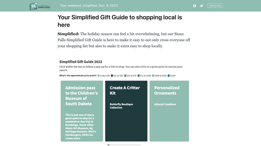
Sioux Falls Simplified created a scrolling gift guide with community-contributed suggestions.
Building interactive visuals for newsletter engagement
How a newsletter drew participation through a holiday gift guide
The Innovation in Focus team partnered with Sioux Falls Simplified to explore new ways to engage readers through newsletters. Founder Megan Raposa told us she wanted to check in with her subscribers and gauge how actively they were engaging with her content. She also wanted to support local businesses after hearing about dipping sales in small businesses this winter.
Enter: our community-contributed gift guide.
Megan shared a Google Form in her weekly newsletters from Nov. 15 to Dec. 2 — as well as on Facebook and Instagram. We originally planned to build an interactive Google Map gift guide that she could embed in future newsletters, but due to the amount of online-only gift ideas and the excellent photos and anecdotes that people submitted, we ultimately built a clickable carousel using Flourish.
The community participation and resulting interactive not only resulted in encouraging engagement metrics, but opened up more opportunities to increase membership and authentically reach out to potential sponsors.
Well, how’d it go?
From Nov. 15 to Dec. 2, Raposa received 47 submissions with items of varying price ranges. Almost 80% of the contributors included a photograph. Nearly every responder included a description, such as who this would make a good gift for or what color/varieties were available.
Here’s what we included in the form to prompt those responses:
- Tell us about the item
- Where it can be found (store name and address)
- Price range, with multiple choice selection
- An optional anecdote question: “Anything else we should know? (Suggestions on who this would make a good gift for? Were there other colors/options/variations available?)
- Contact information of the submitter, with the clarification that email addresses or names wouldn’t be used in the guide
- Photo of the item
It was a priority to request a photo or video of each item, and this made it easier to pivot from a map to an infographic. The anecdotes from the “Anything else we should know?” question helped make the gift guide feel more like a participatory community driven project.
Raposa included the carousel in her newsletter beginning with the first week of December. The gift guide was the top clicked link in the newsletter the week of Dec. 6. Raposa has since included the guide in several newsletters and shared it to her social media pages.
Two other strategies also helped gather more than four dozen responses: an incentive and direct outreach. Sioux Falls Simplified offered the chance to win a $50 Downtown Sioux Falls gift card for anyone who submitted an idea. She also shared the form with a downtown boutique association and a Facebook group for women-owned businesses.
Creating the most useful version
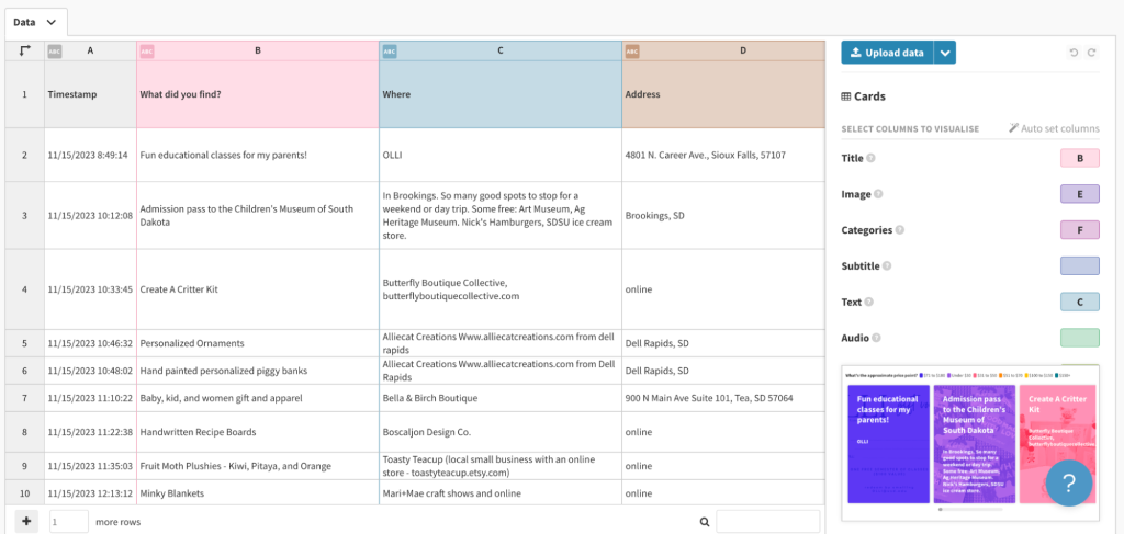
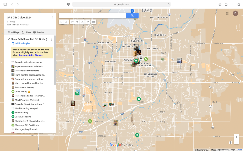
After receiving the submissions, we looked for the best visual method to display this information. To start, we uploaded the spreadsheet of form responses to Google My Maps, which required minimal editing to create each clickable point on the map. From there, readers could get a pop-up with a photo and description of the item, price point and anecdote (if provided). While this achieved our goal of visually displaying the locations and items, we found it wasn’t likely the most useful visual since several of the responses were online shops and not tied to a physical location.
We then experimented with the carousel template in Flourish. This carousel allowed us to create a scrollable list of items color coded by price point. Readers can click on each item, where they will find location information (including store address), approximate price and an anecdote about the item. We also included the photos as background images to each card.
Flourish is a no-coding data visualization tool, and we found it simple to upload our spreadsheet of Google From responses and customize the graphic. Uploading images was a little more time-consuming, though. Because the default in Forms was to create a Google Drive link, we needed to download all the images to our device, then right click on the image column to upload each file. This creates a Flourish link for each image. Since there doesn’t seem to be a way to bulk upload images, it might be easiest to provide your own image URLs that aren’t based on Google Drive.
Raposa also wanted to hyperlink each card in the carousel, so readers could click and go directly to buy that item or learn more. To do this, we found this tutorial on Flourish helpful.
Ultimately, this carousel proved to be a simpler, more effective version of the visual we attempted with the map. We were able to pull it together quickly and include both online and brick-and-mortar suggestions.
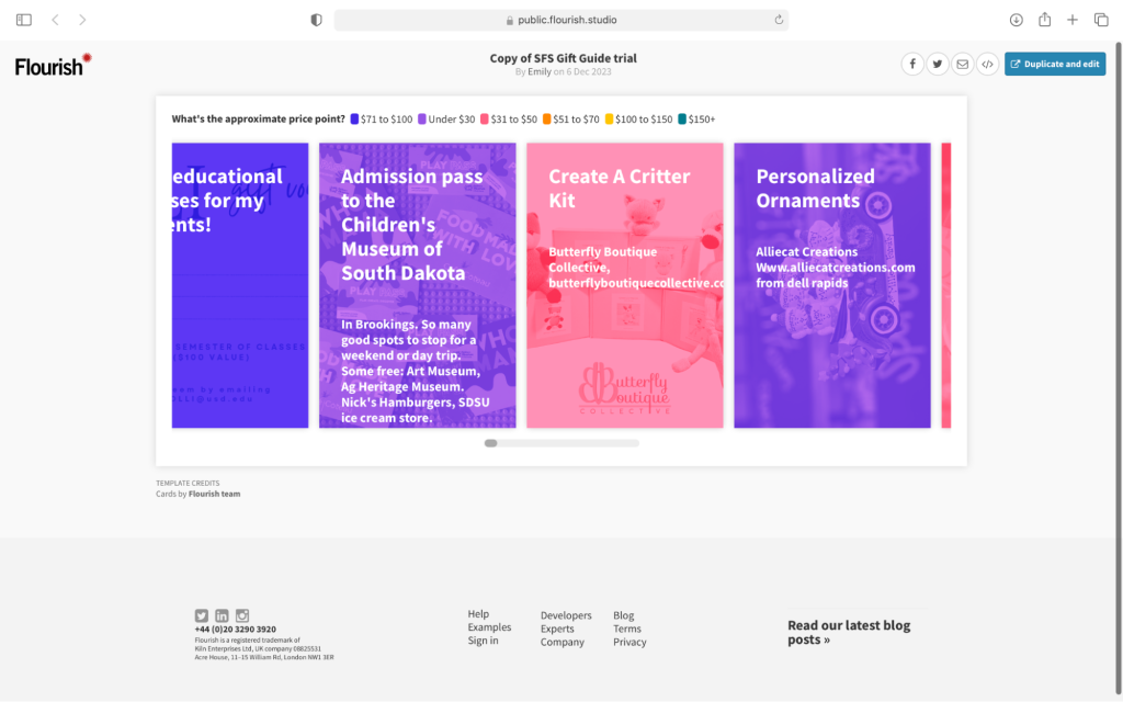
Since newsletter platforms like Ghost or Mailchimp prevent us from embedding interactive graphics, we hyperlinked an image of the graphic in the email.
The follow up
While our original goal was to try a new way for community members to participate in the Sioux Falls Simplified newsletter — and measure that engagement — we found two unexpected opportunities for follow up.
Since Raposa collected email addresses through the form, she plans to reach out to each contributor to thank them for their submission. In this follow-up email, she plans to link the guide and share how they might become a Sioux Falls Simplified member if they aren’t already.
The guide also introduced Raposa to some new businesses that she has yet to connect with. She plans to reach out to these new contacts to begin building a relationship and eventually share opportunities for small business advertising packages.
Lessons for next year
Raposa said she saw this project as a success for Sioux Falls Simplified, and she plans to do it again next year, especially since this project required little legwork and provided opportunities for direct engagement with community members and business owners.
Her goal for next year is to begin the project earlier, perhaps in October, to boost submission rates, as well as invite smaller surrounding communities to participate. She may also reach back out to readers in January to ask them whether they used any of the gift ideas or if they received any other great local gifts — getting a head start for next year and measuring the impact of the 2023 guide. Her next goal is to collect more than 200 responses, which will help her measure engagement even more.

Sign up for the Innovation in Focus Newsletter to get our articles, tips, guides and more in your inbox each month!


