
Screenshot of Bexar County, Texas, Community Dashboard
Empowering local newsrooms with comprehensive community dashboards

Han Vu is a 2023 RJI Student Innovation Fellow partnered with the American Press Institute in Washington, DC. The RJI Student Fellows will be sharing their innovative work through Innovation in Focus.
Data holds great power for newsrooms to better understand their communities, but accessing and understanding it can be daunting. To aid local journalists in delivering meaningful news to their readers, I created a community dashboard using Census Bureau data.
This idea stemmed from my work with the Source Matters tool as a RJI Student Innovation Fellow partnered with the API Product Strategy team. Source Matters is one of API’s proprietary tools that supports local newsrooms in tracking sources for more fair and inclusive journalism.
The dashboard’s ultimate goal is to consolidate essential community indicators — like demographics, socioeconomic factors and others aligned with Source Matters’ metrics — in one place. This resource will serve as a convenient reference for local journalists whenever needed.
The primary aim in building it was to keep the dashboard simple, highly functional and easily replicable and updateable so that any other newsroom or journalist can create their own version. Then they will have the flexibility to update it annually when the Census Bureau releases new data.
With the support of the team, I also pitched ideas to two newsroom partners during individual meetings to gauge their interest and usefulness. The feedback was inspiring, and I began constructing the dashboard using freely available resources.
How we decided what to include
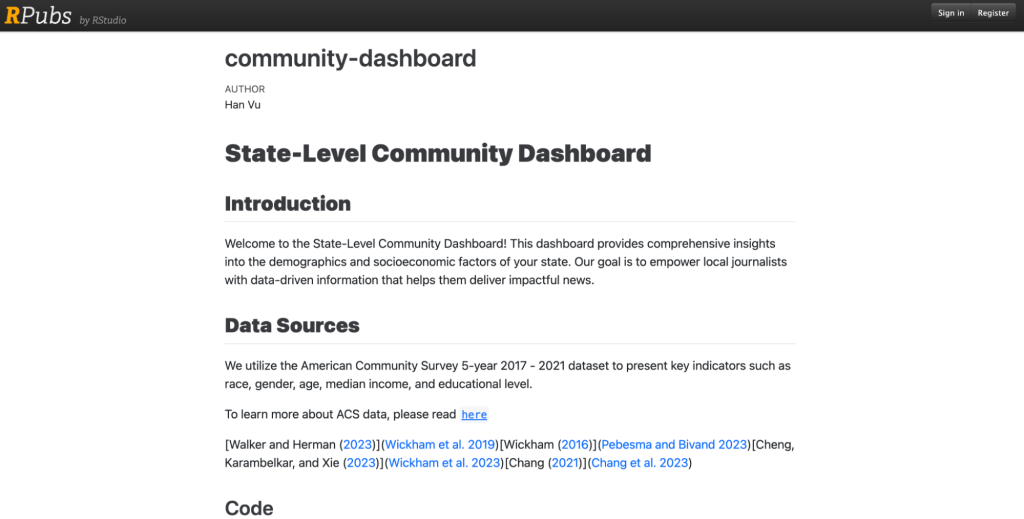
Selecting the appropriate indicators for the dashboard proved to be a challenging task. We wanted to strike a balance: incorporating enough data to be informative but not overwhelming the free resources or users. We chose to use the most current dataset, the American Community Survey 5-year 2017 – 2021, due to its reduced margin of error compared to 1-year data. This comprehensive dataset contains a wide range of social, economic, housing, and demographic information at various geographic levels, even down to the smallest block groups. However, navigating nearly 40,000 variables in this dataset poses a significant challenge.
For those interested in delving deeper into Census data and the tidy-census package, we highly recommend exploring Kyle Walker’s book and following his blog and GitHub page for the latest updates and workshops.
Furthermore, API let me participate in a workshop focused on analyzing and mapping 2020 Decennial Census data, enhancing my skills in this area.
Building the first dashboard
As we built the dashboard, I carefully selected variables that hold great significance: race, gender, age, median income and education level. These variables align with the information Source Matters newsroom partners are tracking. I also utilized Decennial Census data to create a line chart that visualizes the community’s aging trends from 2000 to 2010 to 2020. This chart offers valuable insights into the changing dynamics of the community over the past two decades.
For the visual aspect of the dashboard, we incorporated a variety of graphics, such as choropleth maps, bar charts, and population pyramids to represent age and gender distributions simultaneously.
With additional guidance from a free book on the Shiny app by Hadley Wickham, I developed three distinct dashboards: the Connecticut Community Dashboard, designed at the state level, the Bexar County Dashboard, focusing on the county level, and a simpler version featuring aligned metrics to Source Matters.
After seeking feedback from the team, I reached out to local newsrooms to gather input on potential improvements and the specific indicators they would like to see incorporated into the dashboards. This iterative approach ensures that the final product is highly useful and meets the specific needs of the communities it serves.
How to make your own Community Dashboard
For those who want to create their own dashboards, here is a comprehensive step-by-step how-to. Depending on your preference, you can opt to make it at either the state or county level by downloading the respective GitHub repository. This approach allows for flexibility and empowers you to tailor the dashboard to your specific needs and geographical focus.
This is for the state level.
This one is for the county level.
To fully utilize the documentation, having some basic knowledge of R is beneficial. However, don’t worry if you are new to R, as I have also created Quarto documentation for both the state and county levels. Simply access the resources provided: link for state level and link for county level.
With the provided script, you can easily customize the dashboard to your desired geographical location, adjust the year if needed, and modify variables to suit your specific requirements. Once you have made the necessary changes, run the script.
To deploy the dashboard, you will need a Shinyapp account. Once deployed, your community dashboard will be ready for use. Enjoy the insightful data visualization and analysis at your fingertips!
If you wish to acquire additional insights or personalize your preferred geographic region, the mentioned free resources will be highly advantageous for your learning and customization.
Challenges and opportunities for improvement
Using free resources does have some drawbacks. For instance, the Shiny app server may occasionally be unresponsive, displaying error messages even after successful deployment, or the application might encounter issues under heavy user load, affecting its stability.
Another challenge lies in obtaining feedback from local newsrooms, the intended users. Constructing a dashboard that aligns with their needs necessitates their input. However, capturing their attention amid busy schedules and tight deadlines remains a work in progress for our team. We are planning to include a question about the need for a community dashboard in an upcoming survey of active Source Matters users. If you have any feedback or interest in Source Matters, please feel free to reach out to me or the API team.