
Making Census data accessible for reporters with varying data literacy

Your guide to variables, visualizations and more
Ellie Lin is a 2023 RJI Student Innovation Fellow partnered with the Sacramento Bee in Sacramento, California. The RJI Student Fellows will be sharing their work this summer through Innovation in Focus.
When people think of Census Bureau data, they often think of the decennial census: the 10-year survey that measures population conducted during “every year that ends in 0.”
The Census Bureau collects data much more frequently than every 10 years. They have over 130 surveys and programs they conduct each year. That amount of data can be incredibly useful for a newsroom to understand their community, but it can also be daunting if you’ve never worked with census data before.
This summer, I’m partnered with the Sacramento Bee as their dedicated data visuals reporter. We are focusing primarily on reproducibility, or the ability for another reporter to use and navigate data. The goal with reproducibility is that anyone, regardless of their data literacy level, could access and understand processes — and potentially recreate them.
My first project this summer was a data-driven story on how the Sacramento area has changed since 2020. We used the Census’ vintage 2022 population estimates by county to write the story.
Here’s how we did it:
Accessing the data
We found that the quickest and most efficient way to access census data is through Kyle Walker’s tidycensus library in RStudio. Tidycensus harnesses the Census’ application programming interface (API), allowing the user to create custom calls to their massive data bank.
A custom call allows the user to pull the pieces of data they want into RStudio. A user can pull Census data like population of one race, median income, or even things like means of transportation to work by industry. Those numbers are housed in variables; alphanumeric values that represent the population data you want to access. Similarly, in a custom call, a user can pull Census data at a certain geography. They can pull numbers from a nationwide level, a statewide level, down to school or voting districts.
These custom calls to the API are useful for multiple reasons, the primary one being that you can quickly and easily assemble data specific to the interests of your newsroom or your story. Most data on the Census Bureau website comes in preformatted tables, which can be slightly more difficult to navigate. If your end goal is visualization, as ours was, that preformatting can add lots of extra cleaning steps. Custom calls to the API can also make some forms of visualizing a lot faster – especially mapping.
We ultimately weren’t able to use the API for the data in this project — because the specific data we needed was not supported through the Census API — and instead accessed this data through the Census Bureau’s tables. Tidycensus has since been updated to include the ability to call Population Estimates data using the Census Bureau API.
We used and cleaned the tables of premade data at a state level and broken down by county. This ended up being a much more lengthy process than if we had been able to use the Census API, as we wanted to get the figures specific to the four-county region the Sacramento Bee covers and had to do so by filtering through Google Sheets.
This process revealed that there isn’t a beginner-friendly, centralized guide to setting up R, RStudio, the tidyverse library and the tidycensus library for the first time. So we decided to create one.
If you’ve never been exposed to census data and are looking to use the API, here’s a quick guide for getting started.
- Download R and then RStudio. Yes, the order matters. You can download base R (the basic software to access the programming language “R”) here. You should ensure to download a version of R that fits your computer’s operating system. Similarly, make sure you install a version of R that’s 3.3.0+, as RStudio doesn’t run on anything earlier than that. Once you’ve downloaded R, download RStudio.
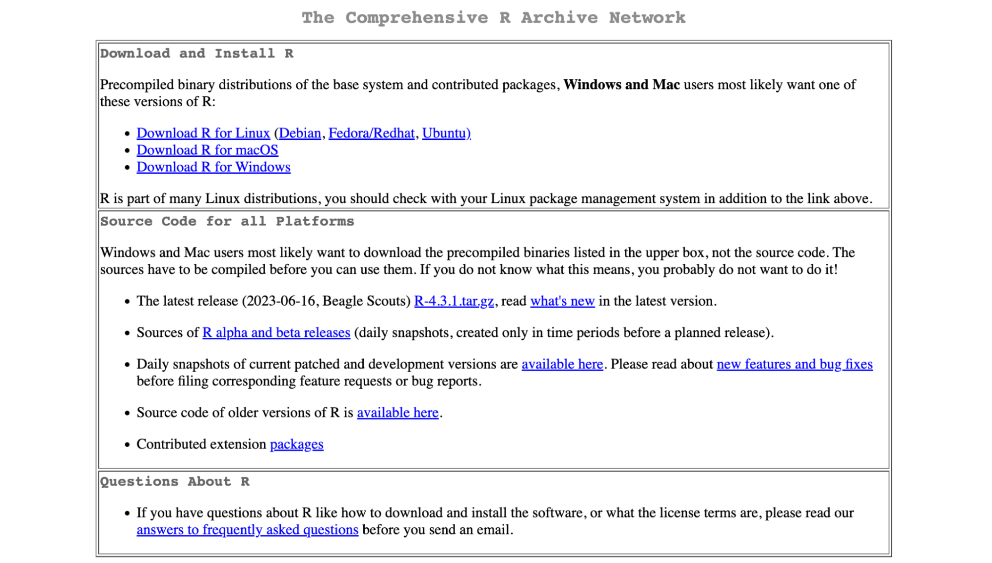
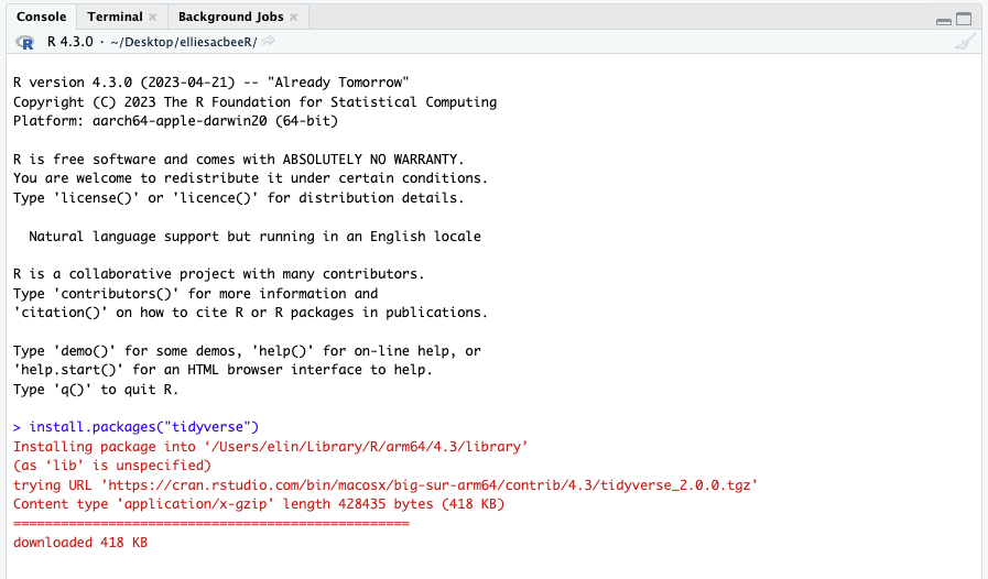
- Once R and Rstudio are downloaded and installed, you’ll need to install packages. There are a lot of R packages, but tidyverse is a really beginner-friendly one for manipulating data. The packages included in the tidyverse will help with cleaning and using the data you pull from the census. Tidycensus has a similar code grammar and structure as tidyverse, but that’s the package that’ll allow you to access the Census API. To install, open the console tab in RStudio and use the command “install.packages(“tidyverse”)” and “install.packages(“tidycensus”).”
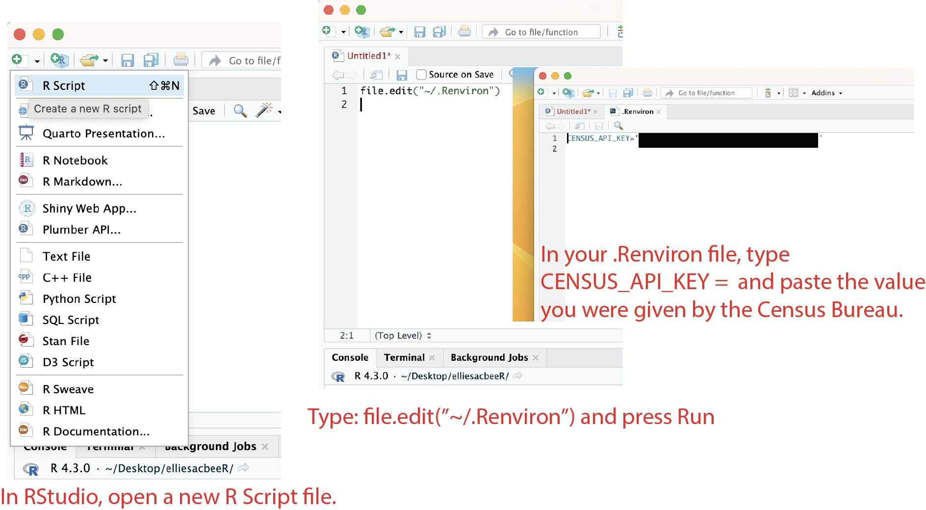
- To use the Census Bureau’s API, you’ll need to request an API key. This is a deceptively difficult part of the installation process. You can request a key here, but getting a key and activating it occasionally doesn’t work: the link to authenticating the API can return an error message. Using a different email to request a key is sometimes a good method of troubleshooting.
- In order to start working with the Census API, you need to load your API key into R, but there’s a bit of debate about the best method of doing so. It can be a security risk to have your API key directly in your code if you plan to upload or share the code online. I stored my API key in my .Renviron – a file users can access to store environment variables – to avoid having it in my code following this tutorial.
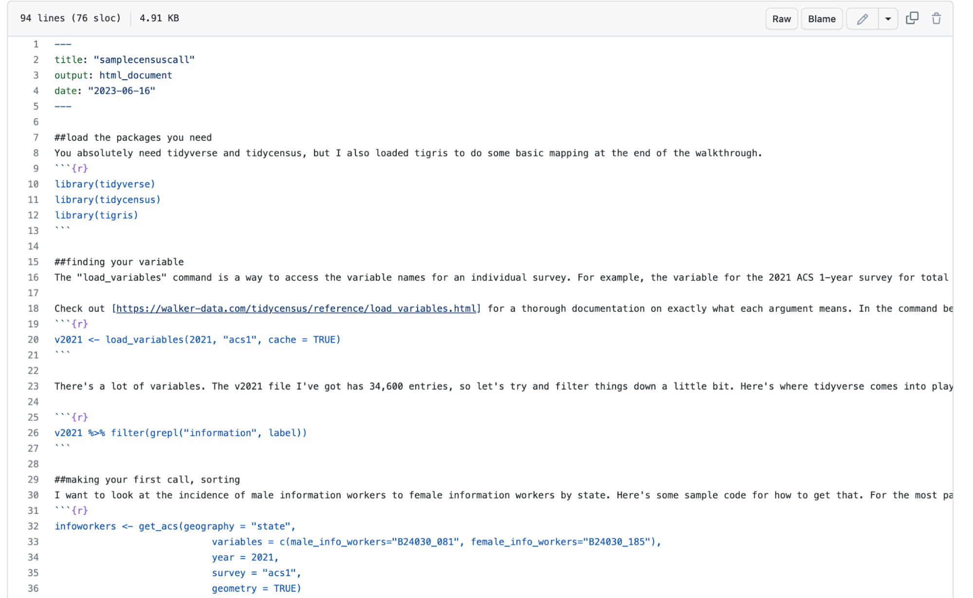
You should now be ready to access the Census Bureau’s API. Here’s a bit of sample code to get you started, written in an R markdown file.
Thinking through the data
Even a smaller survey that the Census Bureau conducts still contains massive amounts of data. The press kit for the “vintage 2022 county population by characteristics estimates tables” is massive, and sifting through it for the story took a while.
One way we narrowed down the vintage 2022 population estimates was to look at statewide population trends and compare it to the four-county region that The Sacramento Bee covers. For example, the statewide population declined, but in three out of four counties in our coverage area population increased.
Depending on coverage focus, you could do something similar. One massive benefit about using tidycensus is that you’re able to narrow down data points to specific geometries/geographic areas.
Visualizing
After inspecting the 2022 vintage estimates, we picked out a few throughlines that seemed significant to Sacramento and the surrounding area’s population: median age nationally and statewide, rate of Hispanic respondents and growth by race.
In the code provided, I gave some examples on how to map the data you acquired using ggplot2. Those are some really simple ways to map to just get you started thinking about translating your data into a visual medium. However, you may want to use other visualization services such as Flourish or Datawrapper.
The Sacramento Bee used Datawrapper for this project for two reasons.
- We wanted to have interactive tooltips for some of the charts, which is more compatible with our CMS if done through Datawrapper.
- The data was so large, we knew there was a need to create a wide array of visuals to accurately tell the story the numbers were reflecting. I created 31 charts for the story – 26 of which ended up being used in the article. Datawrapper allowed for me to easily duplicate and alter the charts I had previously made.
Twenty of the charts were population pyramids; a demographer’s tool to visualize and describe the age of a given population broken down by gender. Population pyramids were some of the most helpful to tell the story behind this data: throughout the story we were talking about age, population size, and demographic data, and here our visual that showed all of that information in one place.

Sign up for the Innovation in Focus Newsletter to get our articles, tips, guides and more in your inbox each month!