
Wok and scroll: the process of designing an animated information graphic

Four tips on expediting your next animated adventure
Ellie Lin is a 2023 RJI Student Innovation Fellow partnered with the Sacramento Bee in Sacramento, California. The RJI Student Fellows will be sharing their work this summer through Innovation in Focus.
Working with the data visuals team, we focus a lot on charting, mapping and numbers. On a new visual project, though, we were asked to flex a different muscle: creating an animated infographic for an investigative story. The story shed light on some restaurants’ resistance to California’s transition to induction cooking. The final product was an embedded scroller in the story that explained how induction cooking works and how it can work with a wok.
Here are some tips we learned to make your next animated infographic adventure a little smoother.
1. Give yourself a set period of time to read everything you can
When designing for a concept you’re unfamiliar with, it can be easy to immerse yourself in researching the concept before you begin to design. I’m not a physicist nor an engineer: electromagnetic fields and induction heating are not concepts that I innately understand. I spent hours researching to ensure I wouldn’t get anything wrong. It’s never a bad idea to do as much reading as possible, but one thing we struggled with was balancing the amount of time we needed to research and the deadline to complete the animation.
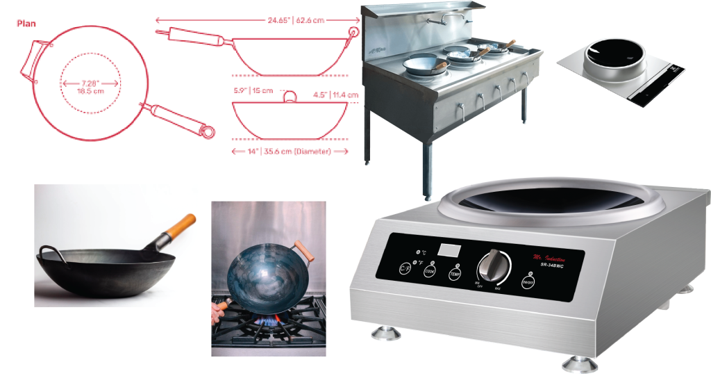
From this process, we learned to set soft deadlines for research. Though we spent a lot of time researching, many projects have a much shorter timeline than this one. If you have a shorter timeline, spend two hours maximum reading and watching videos on the concept. Download reference images that will be useful and then just start. For this project, I used technical drawings, detailed descriptions from patent filings and a dearth of Youtube videos.
2. Drafting is your friend
We had a lot of time to create a visual for the story because the story was being reported on as we were designing. The extra time allowed us the opportunity to come up with lots of different ideas of how to best visualize an induction wok.
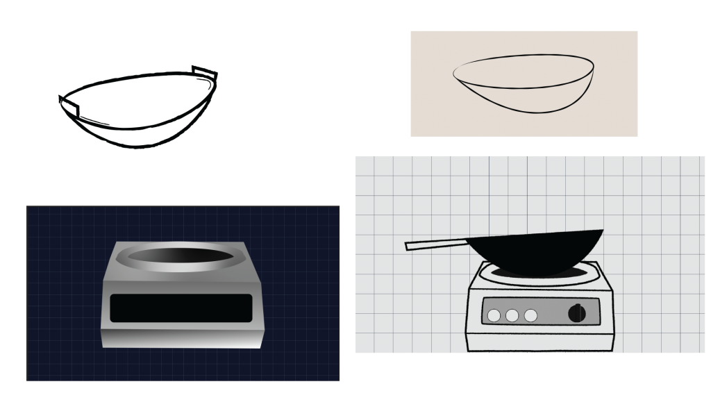
While drafting the woks, we played around with designs in both 2D and 3D. We experimented with color — our final product was going to be a scroller and keeping a limited palette would help with web implementation by keeping its file size low. We drew dozens of induction cookers and woks in programs like Adobe Illustrator, Blender and Adobe After Effects before settling on a final design.
One helpful thing to do while drafting is to show the design to as many people as possible. Getting people who are just as unfamiliar with a concept as you to look at your visual can only improve the quality of the explainer. You also might avoid bad design — during the drafting stage, a fellow intern remarked that one of the drawings of a wok looked like a contact lens, so we pivoted to one that looked more like a pan.
3. For scrollytelling, structure your animation around copy and not the other way around
One of the biggest things we took away from this assignment is the order in which you create a visualization. It was my gut instinct as a visually oriented person to design first, create copy later. That instinct led to a bit of tedium after my editor looked at the first draft of the visual I presented and suggested I restructure the copy. Restructuring the copy meant restructuring the animation.
Animating by creating keyframes is fun. Having to restructure an animation–especially when you’re dealing with several non-precomposed elements–is less fun. The tedium of restructuring an animation with several keyframes and trying to avoid any messes while doing so can be avoided if the copy comes first. Especially for animations in which there is copy as you scroll, orienting your visual around the copy first is a good practice.
To precompose or not to precompose, that is the question
After Effects, like a lot of the Adobe Suite, is layer oriented. A composition is a grouping of layers. When you have several layers in a composition, it can be difficult to balance your screen real estate between the timeline and the preview. The solution to having a lot of layers in a composition is precomposing the layers, which is like grouping them. While precomposed layers can make it easier to manage screen real estate between the timeline and preview panels, we ultimately didn’t precompose the layers that moved because it was simpler when creating compositions for both desktop and mobile.
4. Reread and source (if you can)
If you have enough time, it’s always a good idea to return to some of the initial research material to double check your work. Our mission throughout the creation process was to illuminate how wok cooking can work with induction. We went back to some of our original research and moved some of the induction cooker parts around to more clearly communicate how the cooker worked.
Similarly, running the visual by an expert can provide additional room for improvement. Sourcing doesn’t necessarily have to mean finding a quote: it can also be an affirmation from people who are familiar with the concept you’re trying to explain that it makes sense. We ran the visual by a mechanical engineer who helped illuminate some of the finer details about induction cooking.