
Web Vectors by Vecteezy
These journalism tools show how data and reader service go hand-in-hand

Want to know if your chicken could be contaminated with salmonella? There’s a (news) app for that
When we first started formulating the vision for the Detroit Development Tracker, a tool that will let residents monitor information about real estate development projects in the city, I went looking for similar products created by local media outlets. (Email me if you know one I’m missing!) I haven’t found many direct comparisons to our project. UrbanToronto has a lot to offer as a model — though our tracker will rely on Detroit open data, reporting, research and crowdsourcing.
There are a number of land-use tools built by for-profit companies, like Regrid and Chicago Cityscape. And some lucky cities have robust government open data initiatives that provide a similar service, like the collection of datasets on offer from New York City’s Department of Buildings.
However, what I was most eager to see for guidance and inspiration are data tools built by media outlets, with the particular constraints, lens, audience and goals of our industry affecting what makes them successful.
Here are three of the data tools that helped clarify our vision for building the Detroit Development Tracker to serve users:
ProPublica’s Chicken Checker
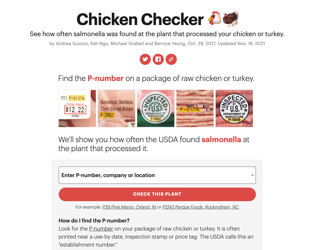
ProPublica is probably the gold standard when it comes to building service-focused data tools, or “news apps,” connected to their reporting. The Chicken Checker tool lets readers look up salmonella cases at the plant that processed a particular package of chicken. The landing page prioritizes the lookup function, then simply explains what salmonella is, how poultry gets contaminated and the health impacts. The page further includes an overview of poultry plants broken down by state so someone who’s interested can see salmonella at any plant, even if they aren’t referencing a particular package of chicken. It also includes a clear call to action for users to help with additional reporting, and a link to the related ProPublica investigation.
When you view a particular plant, the page begins with the most relevant information: Was high-risk salmonella found more often, about as often, less often or never on chicken parts or whole chickens (in the timeframe of Aug. 2020-Aug. 2021)?
It includes a visualization that shows how the plant compares to all other plants, then details about what instances of salmonella mean for your likelihood of getting sick, whether the plant meets the USDA standard, results of USDA testing and outcomes for particular strains of salmonella. If you’re not holding a package of chicken wings, it might be a little dry – but if you are, it’s automatically very resonant (and maybe a little scary).
The Chicken Checker tool landed at the top of my design inspiration list because of its clarity in how and why to use it, as well as its functionality, straightforward connection to the larger stakes and strong calls to action for how someone can contribute to the project. With emojis, simple formatting and text, images and a clear color scheme, they prioritize ease of use for individuals – so someone could quickly look up a plant on their phone at the grocery store – without skimping on the essential health and safety information.
Texas Tribune’s Government Salaries Explorer
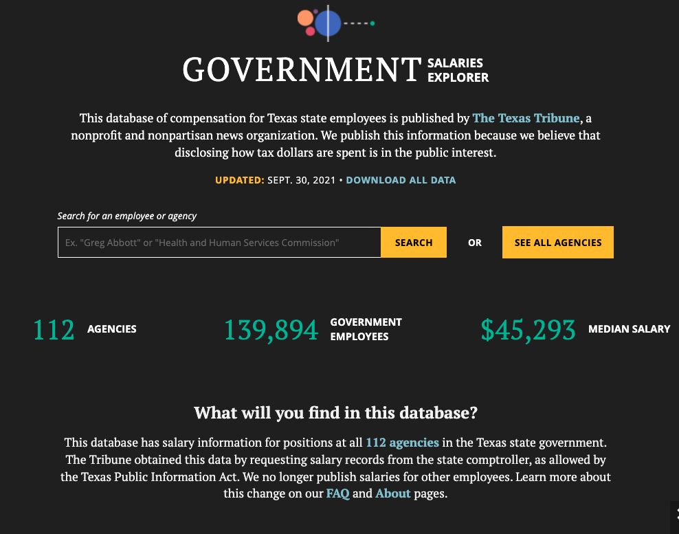
Texas Tribune’s Government Salaries Explorer breaks down and analyzes information that is in the public interest with an easy to use lookup tool on top of the dataset. It starts with a defined mission: “We publish this information because we believe that disclosing how tax dollars are spent is in the public interest.”
You can quickly search for a particular employee or agency if you know what you’re looking for, download all data or see a list of agencies. The standout feature is a scrolling visual guide that walks you through the data and how to understand the graphs more easily than a simple legend would, while also explaining how Texas’ government is structured.
The tool frequently makes use of comparisons to contextualize individual salaries. You can view individuals or a list of all positions in a particular agency, and agencies include median salaries by gender, race and length of employment. The About and FAQ pages are linked copiously throughout the tool’s pages, with clear explanations on methodology, how they accessed the information and answers to common concerns about what information is or isn’t included. A story announcing the explorer’s 2020 relaunch offers transparency about design and data decisions — including large sections they took out of the explorer — and clarifies how often it is updated (four times a year). The top of each page in the tool also includes a last updated line.
Texas Tribune’s explorer appealed to me because of the careful and clearly articulated intention behind what is included and left out. There are dozens of potential uses for a state resident, and the explorer leaves “what comes next” up to individuals rather than offering examples or attempting to guide readers. The explanatory sections are instead focused on prioritizing reader understanding of the data in context, key with large datasets and lots of numbers.
The New York Times’ Is It Better to Rent or Buy? Calculator
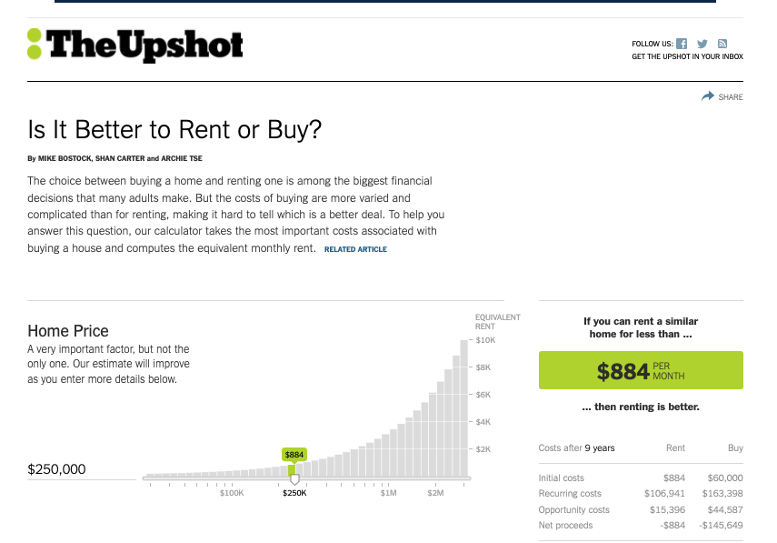
This housing cost calculator from The Upshot was published in 2014, and it isn’t entirely clear how it’s been updated since. But it still appears on the first page of Google results for “Should I rent or buy” for a reason. The seemingly simple question potentially has a different answer for everyone who asks it, with a complicated list of local government, personal finance and market factors that affect each other. The interactive calculator handles this challenge by having users input their own data.
It lets you move sliders on a long list of considerations, including home price, how long you plan to stay, property taxes, rental security deposit and many more. The quick answer you want – “If you can rent a similar home for less than $[amount] per month, then renting is better” – is displayed with a contrasting color on a sticky sidebar, and updates automatically as you adjust your costs. Explanatory text about how to read the charts, defining the different costs, explaining how different expenses affect the outcome and the methodology is short and direct, no easy feat for a tool that essentially distills the whole housing market, whether you live in Boise or New York City. The calculator page also links to reporting about deciding between renting and buying a home for additional context, and explicitly lists its sources.
While it’s very different from what we aim to do with the Detroit Development Tracker, the Rent or Buy Calculator stood out to me for its effectiveness in solving a universal question while including the unique information needed. And it is actionable even if you don’t know all the variables: It might not predict the exact dollar amount you should spend on rent if they’re missing, but it helps you understand which costs are especially pertinent. More importantly, it shows you what specific questions you need to answer to make the decision, and functions as a guide to making an informed housing choice.
In all three of these examples, the mission, context and how to use the tool is clearly laid out without getting in the way of its use. The user is prioritized, as well as transparency about who made it and how (essential for a data tool produced by journalists). These three different approaches to those considerations are guideposts to us as we complete the design of the Detroit Development Tracker in the next couple months.