
Tools for public service journalism: Tips and tricks for Glitch, MapBox and more

By Rebecca Greenway, University of Missouri journalism student
This month for Innovation in Focus, we experimented with a few of the tools that are being used in public service journalism to help visualize and represent data. Here are a few tips and tricks for MapBox, Tableau, and Canva:
1.) Choose a reliable and consistent data source
MapBox can be set to update automatically from your datasets, which is great in helping keep the map up to date but also means the numbers you’re pulling from must be consistently reliable with little oversight. However, this doesn’t mean you can’t get creative with where your data is coming from. For example, this New York Times article analyzed movements from cell phone location data to track the effectiveness of COVID-19 shelter-in-place mandates. Buzzfeed visualized the same public mandate using data from traffic cameras. You can also pull data from multiple sources to make visuals in both Tableau and MapBox, giving you the flexibility to have multiple sources of information all converging in one interactive resource.
2.) Think about context and get additional eyes on your project
You should have several people unfamiliar with your project take a look before publishing and tell you what their takeways are. While you may know what your project is attempting to deliver, outside viewers may draw alternative conclusions from the information you present and how you present it.
For example, during our “COVID-19 Finding Data & Context panel,” ProPublica’s Caroline Chen pointed out that when newsrooms visualized data using the number of positive tests in a region, some viewers concluded an inaccurate amount of people in their community testing positive for COVID-19. This was incorrect because it is reccomended to have 2-3 tests done ona a person to confirm a negative result is a true negative. With an editor or fresh set of eyes on a project, you will be able to spot needed context like this and improve clarity for those your project serves.
3.) Design consciously
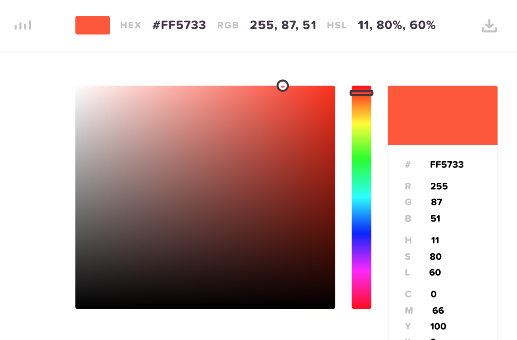
Bright colors may mistakenly evoke an emotional response you don’t intend depending on your interactive project’s subject matter. Mapbox suggested a color picker tool to determine an appropriate, neutral palette for a project. There are also helpful resources to choose a color that can be understood by the color impaired.
4.) Customize, customize, customize
While PSA alerts are broadly sweeping, newsrooms have the opportunity to customize their projects to best absorbed by their various audiences adjusting colors, usability and preferred platform by demographic data. In this way, newsrooms can add value-added with its audience analytics by making sure the data they are delivering is directly relevant to those looking at it.
5.) Focus on what is important to your audience
On each of the platforms there are many features that were unavailable even a year ago. These are often features that you didn’t know you wanted. For example, who thought of making your map dance as a user speaks? Our final piece of advice is to think about the problem or story you are trying to tell and keep your piece specific to that. Los Angeles Times’ Casey Miller, a data journalist who helps the newsroom track earthquakes, wildfires, and other disasters through automated tools like Quakebot and Fire Map said, “There’s something to be said for having a very specific set of things that need to get done, then figuring out how to do it right.”
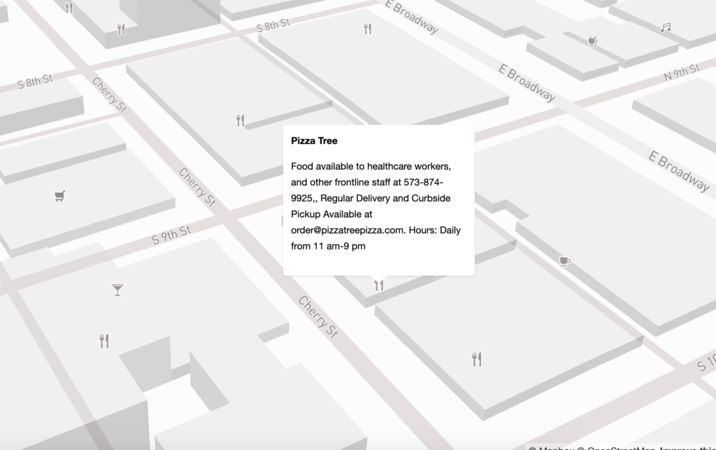
To check out our pilot using MapBox, head over to our project where we’ve mapped businesses and their adjusted hours and services throughout the city of Columbia, Missouri.