
Two different slides on Lake County News’s data story demonstrate Flourish’s ability to both house visualizations and text content within the same package. The HTML code of finished Flourish stories can be copied into a website’s code or CMS.
Using Flourish stories to build a visual data experience

How we crafted a complete package on changing health outcomes in Lake County, California
Laine Cibulskis is a 2023 RJI Student Innovation Fellow partnered with Lake County News in California. The RJI Student Fellows will be sharing their innovative work through Innovation in Focus.
After collecting, cleaning and analyzing mortality and population data in Lake County, California, it was clear health outcomes are worsening. We created the full data driven story, stocked with visualizations and text explanations, using Flourish’s “stories” feature – as well as other tools and templates like a guide from the Financial Times and a color blindness tool.
We chose Flourish because of its ability to create an entire data story within a singular platform and its access to dozens of visualization templates. It was also helpful for reporters lacking coding skills but still looking to creatively and effectively tell stories with data.
Going from data sheets to Flourish visualizations
One resource that helped us think creatively about the visuals was the Financial Times’ guide to visualizing different kinds of data. It was shared on a Flourish webinar I attended about data storytelling. It describes different types of visualizations, when they’re typically used, example uses and multiple individual visualizations under each category.
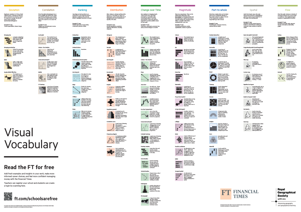
Looking at both the change over time and magnitude categories gave us some inspiration and direction before storyboarding. We found that pictograms could be powerful, and a bar chart combined with a line graph would work for causes of death that had both raw numbers and rates.
For us, it was easier to gather ideas from the chart before diving straight into Flourish. But if you’re still stuck, Flourish has some great resources to help navigate each visualization template, like their webpage detailing each template, complete with overviews and examples.
The most useful part of Flourish itself, though, was the example data that comes pre-loaded into each visualization template. Instead of haphazardly guessing how to format our data, we mirrored the formatting already given and deleted what wasn’t necessary.
Using Flourish stories
Once we created all our visualizations and imported them into slides, quite a few features came in handy in the story editor.
The ability to insert text-only slides into a story was essential for breaking up data-heavy slides and adding context to our story. As our story focused on negative health outcomes, we added a text-only slide to explain how wildfires can impact health. It was also essential for creating an introductory slide to the project and a couple of final slides to add a link to the county’s comment, note some positive trends and explain why we did this reporting.
Although the simple inclusion of the feature was great, the formatting was limited. Unlike most other presentation creating software, Flourish gave little room for size adjustments and font changes for text. We could change the text color, but every slide was locked into the same three sections with decreasing font sizes.
On a blank text slide, the same three sections of text formatting cannot be changed. Images can also be added to text-only slides. Once an image is added, the arrangement of the text and image can be modified, but the sizing and font remains the same.
The captions feature was also helpful for adding context to each visualization. We used it to explain measures like adjusted death rates, add additional information on increases in rates, state trends clearly and give extra context on those trends.
Flourish also has the ability to list linked citations for every visualization’s data sources, which we used on each graph to attribute and give credibility to the trends displayed.
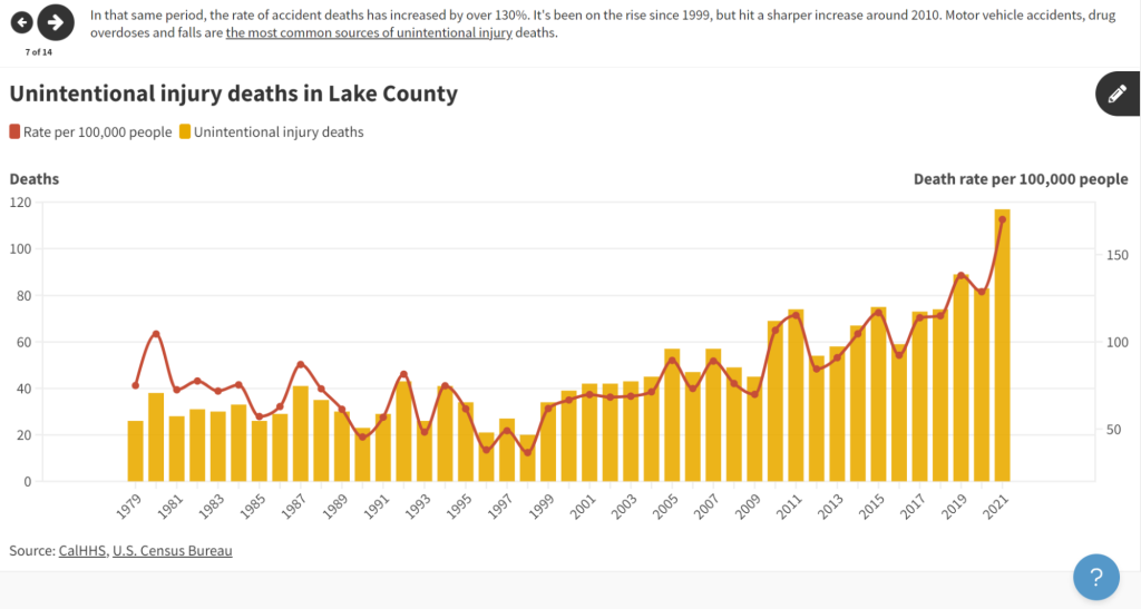
We also used the annotations feature to point out specific points on our line graphs, which made the trends central to the heart of the story clear.
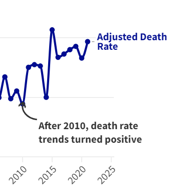
With a click on the pencil-shaped editing button on the top right of a visualization slide, one can select the exact area that needs an annotation, customize the arrow type and add text to the annotation. Annotations are not available for all visualization templates.
Other helpful tools
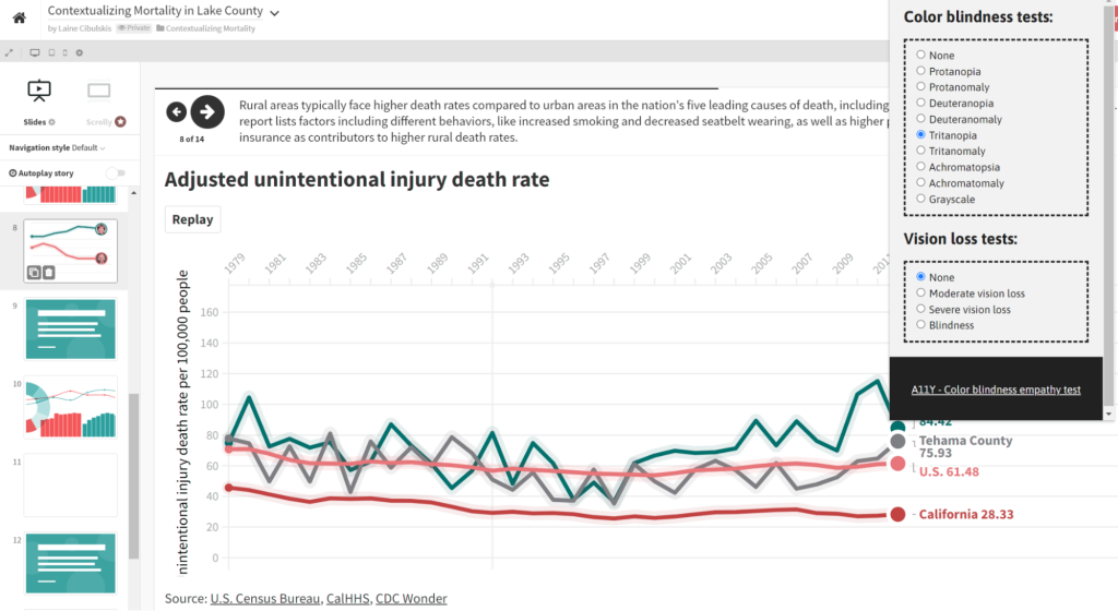
Accessibility cannot be an afterthought, especially when it comes to data visualizations. A11Y’s colorblindness tool was essential in making sure the colors of more complex visualizations wouldn’t bend together for viewers with different types of colorblindness.
And if you’re thinking about changing the background color of a Flourish story, this contrast checker from WebAIM can help ensure visualization colors stand out enough from the background.
Within Flourish, there’s also an option to add alt text when customizing visualizations outside of the story editor.
Final takeaways
Everything we needed for this project was free, but Flourish also has an enterprise version that includes a scrollytelling format, additional visualization templates and company-specific branding.
Ultimately, Flourish worked great for creating a singular story package, complete with visualizations and text. It also includes an option to download the HTML code of a story along with a published link. It’s ideal if you’re looking to tell a story with data and have no coding or more advanced experience.
Lake County News’s Flourish data story will be published on lakeconews.com in early August.