Tag: Data visualization

Pre-reporting for data journalists
A brief intro to exploratory analysis In a recent paper, a pair of statisticians took a stab at outlining “the most important statistical ideas of the past 50 years.” Among them: “counterfactual causal inference, bootstrapping and simulation-based inference, overparameterized models and regularization, multilevel models, generic computation algorithms, adaptive decision analysis, robust inference, and exploratory data … Continued
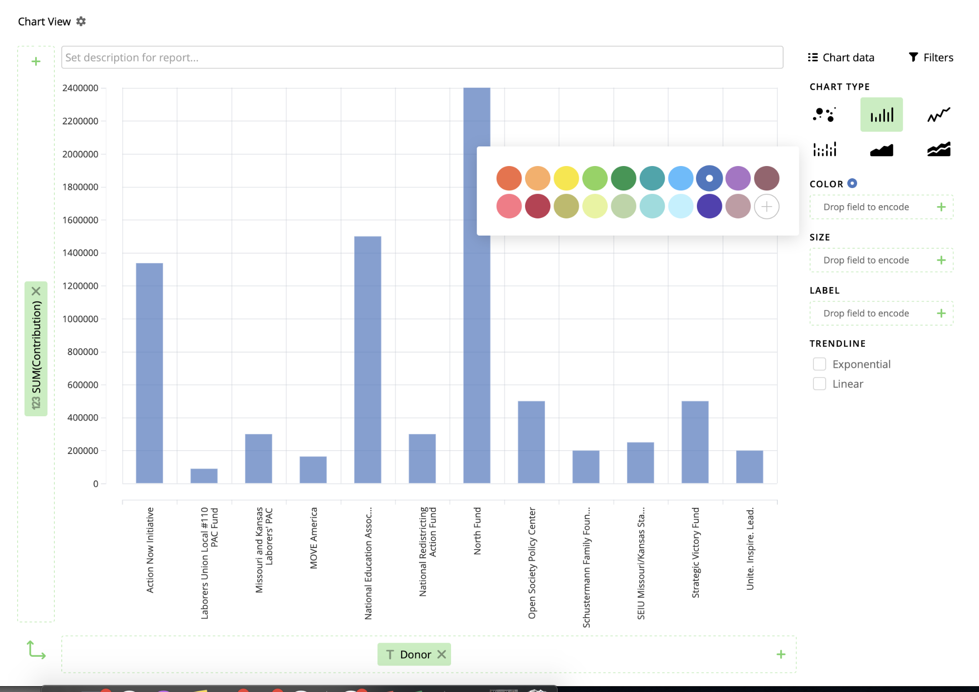
Inject, Pinpoint and Vizydrop: Tips and tricks
We tried multiple tools to help find, develop and illustrate a story for KBIA For my last Innovation in Focus piece for the year, I wanted to try a few new tools while I was reporting on the passing of Amendment 3 for KBIA with a group of three other journalists. You can read and … Continued
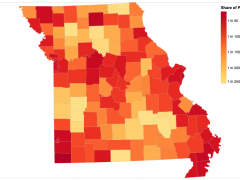
Mapping COVID-19 cases in Observable with Vega-Lite
Choropleth maps show how data varies across a geographic region, a visualization technique used often to present a wide variety of data, including economic data, election results and, more recently, the prevalence of COVID-19 cases and deaths. I recently created a choropleth map that pulls live county-level COVID-19 case data from the Missouri Department of … Continued

Build a real-time dataviz bot (for free!)
When it’s not busy playing host to cryptocurrency scams, Twitter remains a widely adopted platform for the distribution of bite-sized information. For that reason alone, it’s well-suited to sharing real-time data—especially via charts and graphics.

Data-driven storytelling: An essential part of telling stories
Allison McCann, data reporter with Vice News Tonight on HBO, speaks about the power of data-driven storytelling to provide important context and depth to journalism.

Postscript: A WordPress plugin for data visualization and multimedia
The first plugin from the Storytelling Tools project is now free in the WordPress directory.