Tag: Data visualization
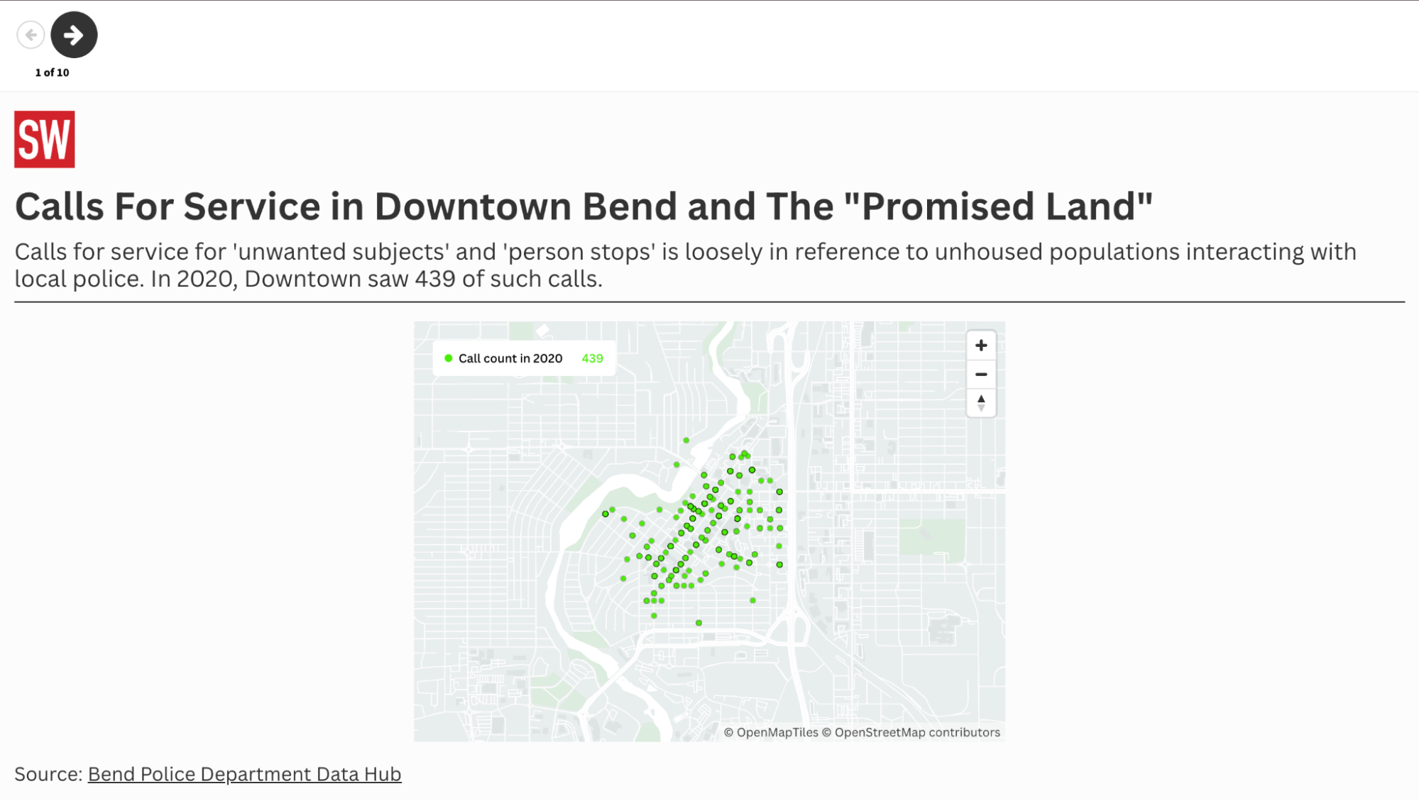
Fact checking police claims about crime with data maps
Identifying the influx of one local police department’s calls for service.
Integrating data visualization into a reporter’s workflow
Finding tools and methods that work for your newsroom.

Explaining complicated ideas, processes with digestible and impactful graphics
A conversation with Kavya Beheraj, Axios.
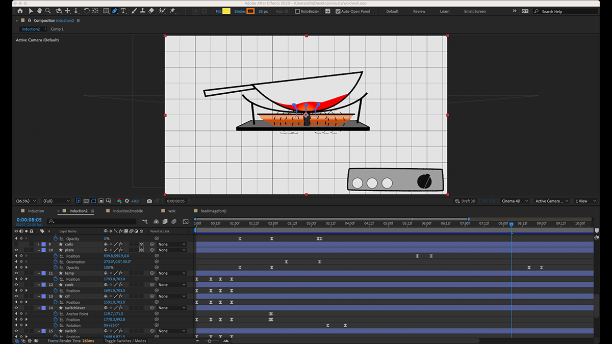
Wok and scroll: the process of designing an animated information graphic
Four tips on expediting your next animated adventure.
Making Census data accessible for reporters with varying data literacy
Your guide to variables, visualizations and more.

Contextualizing public health data at Vox
Dr. Keren Landman discusses science literacy, dataset red flags and general tips for science communication.
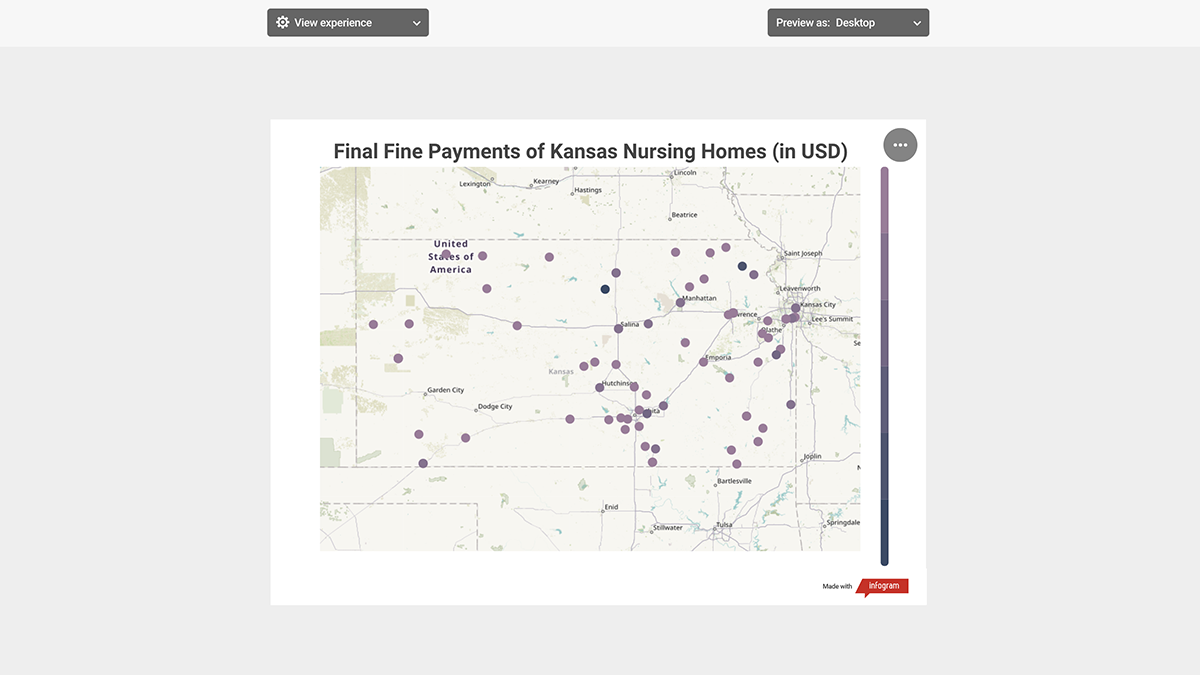
Utilizing no-code tools for snappy data visualizations
How Infogram, Chartblocks and ChartExpo stack up.

The people behind the data points
Weihua Li of the Marshall Project balances the severity and humanity of incarceration through data.
Free tools for interactive digital storytelling
Interactive maps and data visualizations are great visuals to add to any online news package. These can be created using code, but there are also many online tools that your newsroom can use to improve digital storytelling for very little or no cost.

Journalists are creators now, and that’s a good thing
The views expressed in this column are those of the author and do not necessarily reflect the views of the Reynolds Journalism Institute or the University of Missouri. Journalism’s hostility is understandable, but our denial is not.In 2009, the former editor-in-chief at Thomson Reuters, David Schlesinger, described journalism as one of the great self-declared professions. He wrote, … Continued