How newsrooms can visually navigate internal data
Track audience growth with simple, easy-to-read graphics from built-in platform data
Julia Wilson is a 2022 RJI Student Innovation Fellow partnered with La Voz in Arizona. The RJI Student Fellows will be sharing their product work throughout the summer in Innovation in Focus.
In a newsroom of any size, data-driven graphics can assist staff in understanding how to grow their audience and reach new segments of their community.
For the Arizona Republic’s Spanish-language sister publication, La Voz, we are trying to reach a younger and more local audience. Through the built-in audience metrics data from social media sites like Facebook and Instagram, we can see the detailed demographics of our followers with help from our social content system, Social News Desk.
We are developing a more involved social media approach than in the past and we plan to compare the current data on a week-by-week basis to see how our audience outreach evolves. Social News Desk, typically used to coordinate social posts across multiple platforms, can also generate detailed performance metrics on individual posts and platforms as a whole. Social News Desk allows for our team to gather critical metrics and visualize them through creative sites like Canva.
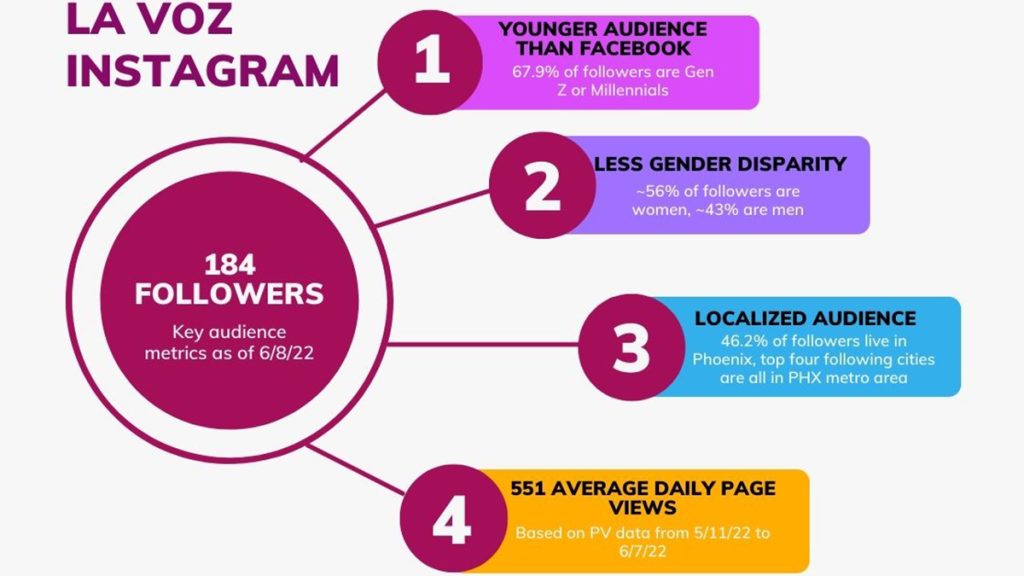
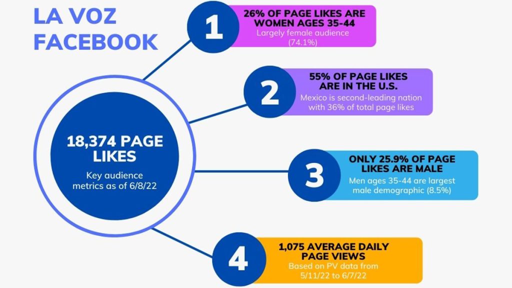
These graphics, created using a Canva template, display important demographic information about followers of La Voz’s Instagram and Facebook. Our team wants to form a strong connection with our audience in the Phoenix metro area and our data shows that we are on the right track. We are also working to cater our content around which posts gain the most traction on readers’ feeds.
I was tasked with creating graphics covering the audience demographic data to show our team where we started at the beginning of our new social media strategy and to have a reference to compare our data in several weeks.
We found that our Instagram and Facebook audiences differed more than we had expected. On Facebook, followers tend to interact with our content covering Mexico at a far greater rate than on Instagram. From the demographic data collected, we found that 36% of people who like the La Voz Facebook page live in Mexico. Over half of our Instagram followers live in the Phoenix metro area, so we know we are on the right track on that platform.

With La Voz’s mission to connect and gain trust with our targeted audience in mind, we sorted and gathered data solely on basic demographic traits like gender, location and age. With four to five data points and brief context, this can easily build a data visualization template. The chosen template allows for the information to be colorful and visually appealing, but not to the point where the graphic seems busy or hard to follow. Though these graphics are most beneficial for the members of our social media team, they are reader-friendly enough for other reporters in our newsroom to understand the mission and who they are reaching.
Every week, our social media team reviews how our audience reach has changed through the data reports available in Social News Desk. We will revisit the graphics every two months to see if any adjustments on content or outreach need to be made. When we see posts on certain beats perform better than others, we know that content is what we need to promote more.
