
A snapshot of what would be on test A. Displayed are top of the page snapshots of both desktop and mobile versions.
From feedback to functionality

The innovative wireframe design that is redefining news consumption for our new site, and yours
In the ever-evolving landscape of digital news, understanding reader preferences is crucial to staying ahead. We are working to reimagine the traditional article page by transforming it into a dynamic, all-encompassing page, similar to the function of the homepage when that was how readers came to our content. Gathering invaluable insights into what features and layouts resonate most on article pages will help us meet our audience where they are now.
I began with launching a website survey targeting readers, both non-subscribers and subscribers to get their opinion on the article page. I formulated the survey with questions to help me better draw conclusions for my wireframe.
Armed with this feedback, we developed a wireframe for the article page that integrates the best elements of a homepage directly into each article, aiming to enhance user experience and engagement while bringing us a step closer to our final resource.
Best practices for reader surveys
Surveying has many intricacies, especially when ensuring that the survey isn’t overwhelming or too distracting for readers. To set up a subscriber-specific pop-up on sltrib.com, our Marketing Director, Elias Cunningham, helped me implement segmentation targeting users who are logged in and have access to our website via our subscription service. This segmentation checks whether the reader is logged in and has an active subscription.
From there, Elias configured the survey to trigger once every three days for the user unless it’s been interacted with; if someone clicks the survey, they won’t see it again. Additionally, the survey was set to trigger only 15% of the time against a control of 85% without the pop-up, preventing oversaturation of the on-site experience. I used the same segmentation process for non-subscribers or users who are not logged in, ensuring that both groups received a tailored survey experience.
To ensure our survey was designed effectively, we followed best practices that align with expert recommendations. For example, we made sure our questions were clear and concise, which is essential for minimizing respondent confusion and improving data quality. Additionally, we included a mix of question types, which helps in capturing both quantitative and qualitative insights. By targeting a diverse audience, we enhanced the reliability of our results. Finally, we used data analysis tools to accurately interpret the responses, ensuring actionable insights for our wireframing process. For more detailed guidance, you can refer to the survey best practices we used here.
Survey analysis
A key aspect of analysis is determining the statistical significance of the results. This involves assessing whether the observed patterns in the data are likely to be genuine or if they could have occurred by chance. Confidence intervals and margin of error are commonly used metrics to evaluate the reliability of the survey findings.
When conducting a survey, it’s crucial to understand the significance of your sample size in relation to your total audience. For instance, in a recent discussion between The Salt Lake Tribune’s Director of Audience Analytics, Ian Swenson, he highlighted that at the start of my survey with 251 responses at the time, that it only represented about 0.016% of the total readership of 1.54 million visitors that month.
While this might seem like a small fraction, the sample of this size still would have provided about 90% confidence with a 6% margin of error due to the principles of statistical sampling.
- The confidence level indicates the likelihood that the survey results represent the true opinions of the entire audience. In this case, the 90% confidence means that if the survey were conducted ten times, similar results would be expected nine times out of ten.
- The margin of error, which is plus or minus six percentage points, reflects the range within which the true values are likely to fall. This is calculated based on the sample size relative to the total audience; even with a small sample size, the law of large numbers allows us to estimate population parameters with a known degree of accuracy.
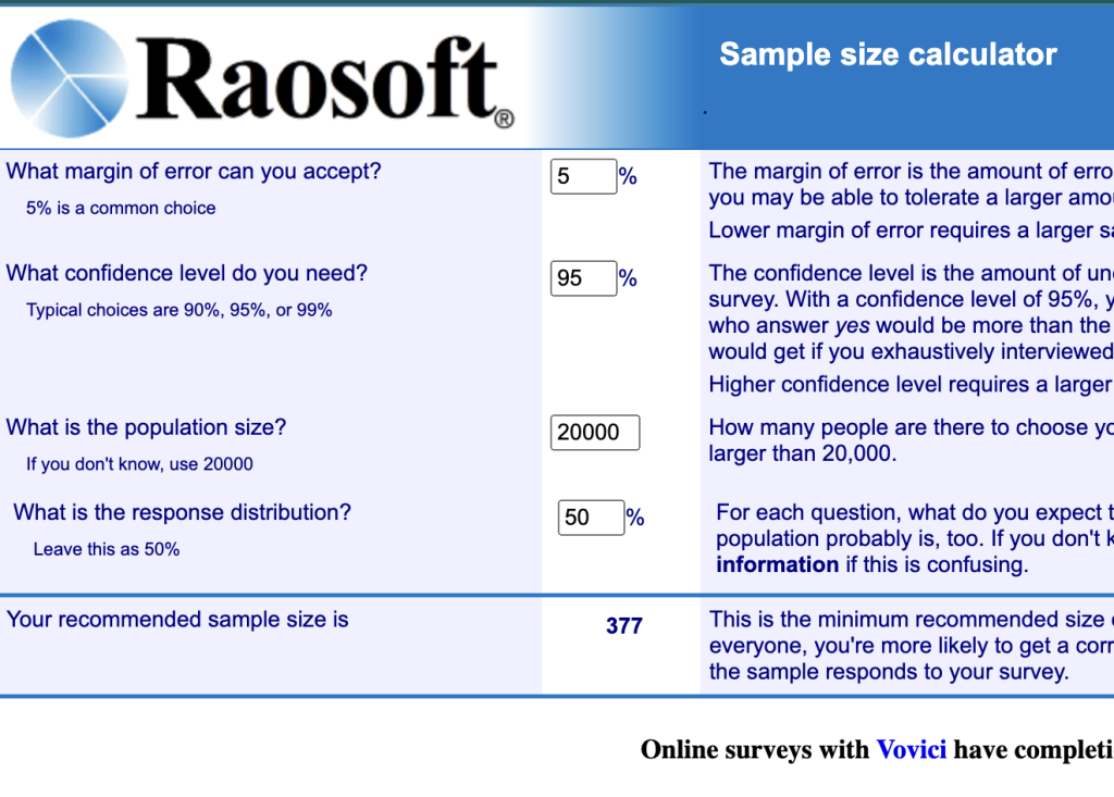
Newsrooms can use a sample size calculator, such as the one available at Raosoft, to determine these percentages and confidence rates. By inputting their audience size, desired confidence level, and margin of error, they can understand the necessary sample size for reliable results.
Our result fell slightly below the scientifically accepted standard of 95% confidence and a 5% margin of error, but it was deemed acceptable for publication. However, we decided to extend the survey to reach approximately 400 responses, bringing the results closer to the standard and ensuring more accurate findings.
In the end, I received 416 responses over the course of 10 days, for a 95.8% confidence level with a 4.8% margin of error.
Proper data analysis also involves visualizing the results through charts and graphs to make the findings more understandable and to clearly communicate the key insights to stakeholders. By following these steps, you can effectively analyze survey data and derive meaningful conclusions that inform decision-making and strategy.
Wireframing 101
After gathering and analyzing the survey data, I used the insights to inform the design of the article page wireframe (a basic blueprint or diagram that shows the structure of a website or app’s user interface (UI) and functionality) on Figma.
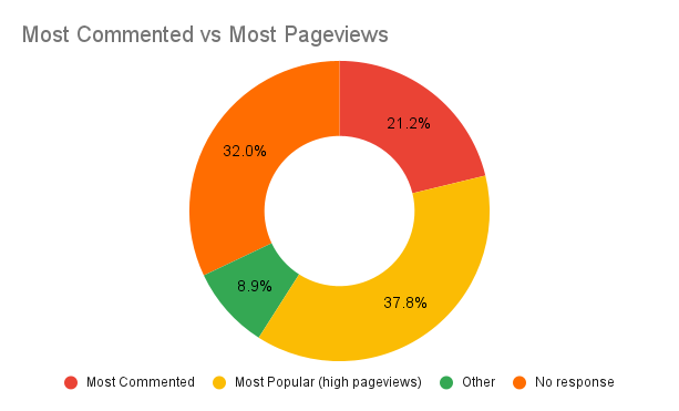
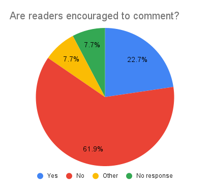
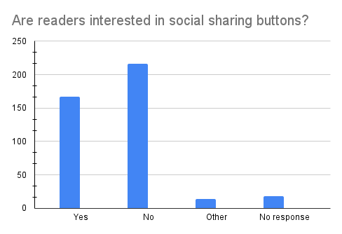
The survey responses provided an understanding of what our readers prioritize, such as the types of content they find most engaging and the features they value in a news website. I also had a better understanding of what they don’t want to see. For example, I was surprised by the large number of open-ended responses related to comments and how readers would rather not see comments on articles due to potential hateful remarks.
Aside from reader preferences, I wanted to also include key features in my wireframe that are found within the homepage, such as sponsorships, donation asks, and newsletter signups, and advertisements.
All these findings guided the structure and layout of the wireframe, ensuring that the design was aligned with the preferences and behaviors of our audience while also keeping in mind newsroom revenue streams.
You can see my wireframe on Figma here and follow the progress. My plan moving forward is to A/B test key features such as engaging articles versus most popular articles, different ways to ask for donations, different displays on newsletter signups, and a deeper look at sponsorship opportunities.
Cite this article
Partida, Alex (2024, Sept. 10). From feedback to functionality. Reynolds Journalism Institute. Retrieved from: https://rjionline.org/news/from-feedback-to-functionality/