
Building interactive maps to more equitably serve community

Bloomfield Info Project created community level maps to establish baseline tools to guide coverage decisions
To help shape their community coverage and ensure they were being equitable and accessible to everyone in their coverage areas, The Bloomfield Info Project needed a way to quickly and accurately access demographic information about different parts of their community.
We helped them build a set of interactive maps that provide specific information about the rates of poverty, education, median income, and transportation times. We needed maps that could support multiple layers – with enough detail to differentiate counties, neighborhoods, and even down to the street level. We chose to go with Tableau because it met the needs and criteria for the project.
Identify what tool serves your needs
There are many options for tools and services that specialize in map making, like StoryMaps, Flourish, and Datawrapper. These platforms are capable of making most types of maps, like national/global maps presenting a certain amount of information, but not all of them excel at making small-scale maps.
Tableau ended up as our choice because it was able to handle the highly detailed maps we needed to make that covered specific communities. We were able to choose to make county-level maps and lay the groundwork for more complicated future projects.
Tableau was the best fit because:
- We wanted to make small-scope maps, like county-level maps
- We wanted to present street-level data on the map
- We wanted to make maps with different layers
- We wanted the option to create origin-destination maps and 3D maps
Cleanse the data
Whatever tool you use, the first step is to make sure your data is accurate and clean.
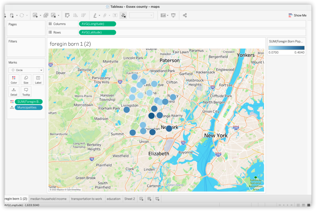
The smaller the scope, the harder it is to collect data, and the more impact errors and inconsistencies it can have. I made an Essex county map, so I had to find street-level and municipalities-level data. The data I collected includes median income, poverty rate, and foreign-born rate in 23 municipalities across Essex county. The data was collected from Census Reporter, the U.S. Census Bureau and other local municipal data. After cleaning and organizing, the data are presentable and fit for the map.
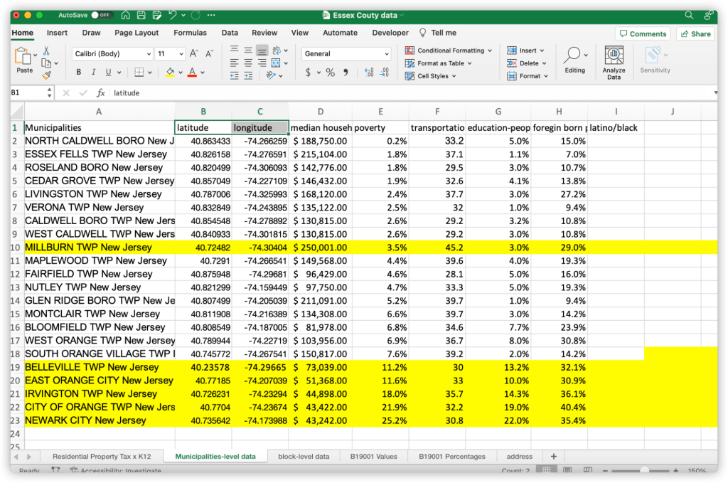
Tableau can identify the locations, so I marked the latitude and longitude for each municipality. It can be very time-consuming to mark every latitude and longitude manually, especially if shapefiles for municipalities aren’t readily available.
There are two effective ways to get the information to speed up this process:
- Use Excel Custom function to auto-populate latitude and longitude
- Add the Excel add-in by embedding these codes to excel. For more instructions, please view here. This method is a bit easier if you are using Windows OS rather than Mac. If you have to cleanse a large amount of data, I recommend this method.
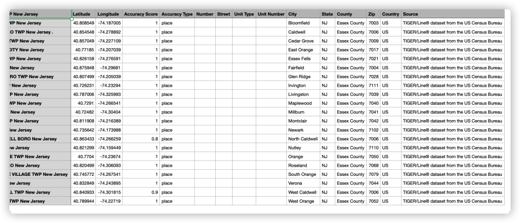
- Use Geocodio to automatically convert addresses to latitude/longitude online.
- Although it is not the most effective, it still saves a lot of effort. You can upload spreadsheets, corresponding to its format, to Geocodio, and then they will send you a spreadsheet that contains all latitudes and longitudes via email. Here is what I got:
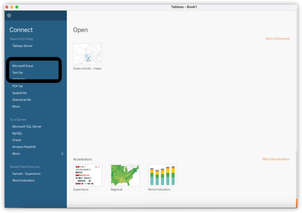
How to make a map with Tableau
First, open Tableau and connect to your spreadsheet.
- Second, drag Longitude and Latitude into Columns and Rows. You will see the map and the locations take shape on it.
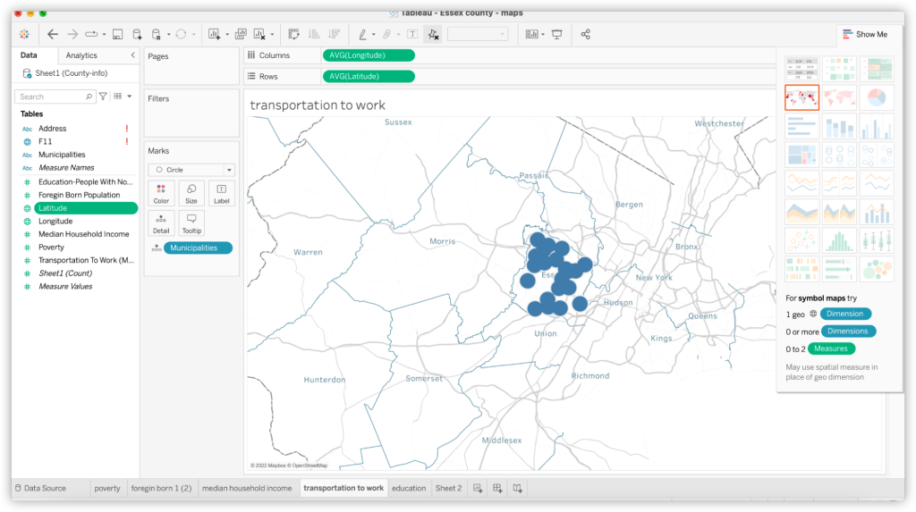
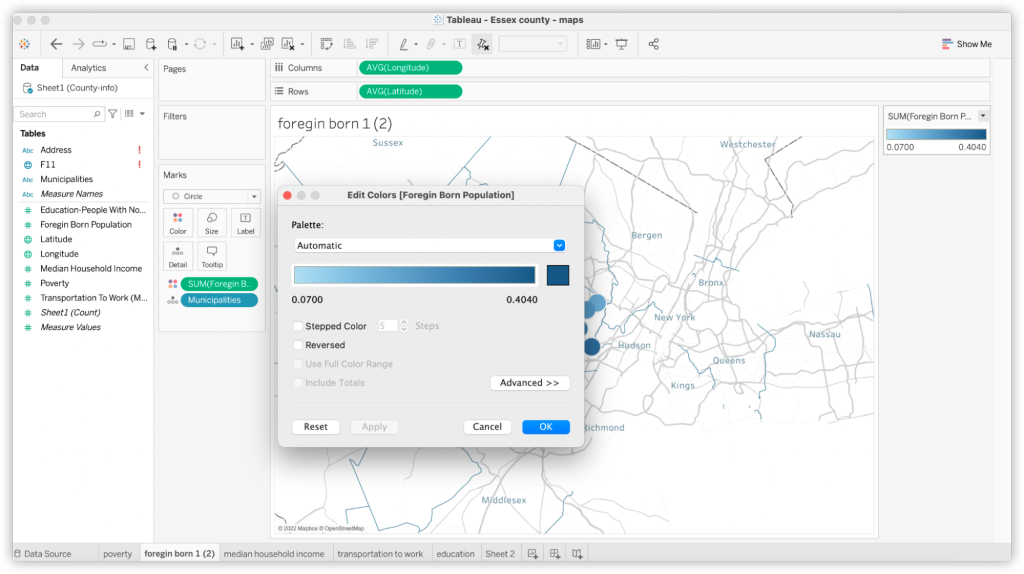
- Third, add data to the map and make it a visualization. For example, I wanted to show the foreign-born rate in different municipalities. You can identify specifics like this by color or size. Let’s assume we use color to identify the difference. You have to drag the foreign-born rate to the color icon. Then, you can see that light blue means low foreign-born rates, and dark blue means high rates.
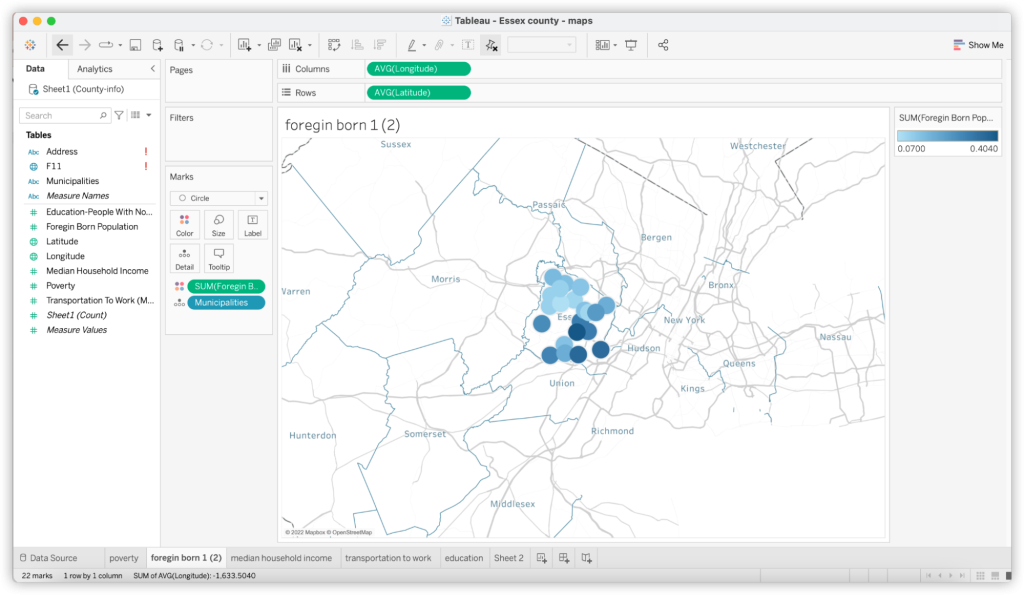
Of course, you can also click the color spectrum on the right and edit the color or title.
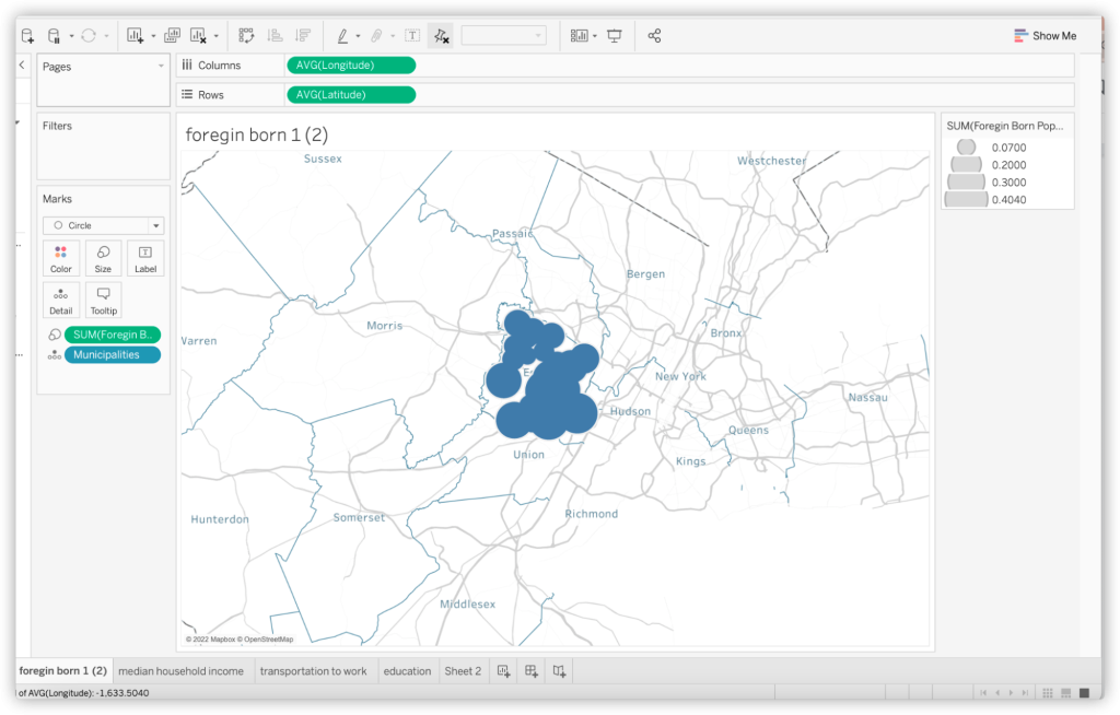
You can also identify the difference by size. This uses the same method, but remember to drag the data to the size icon. Because it is a small county-level map, color marks are clearer to show the difference. In larger-scope maps, you may want to choose size.
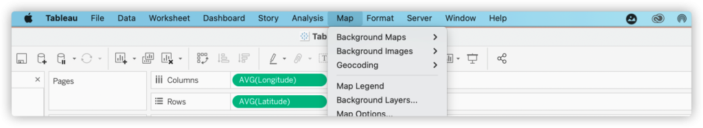
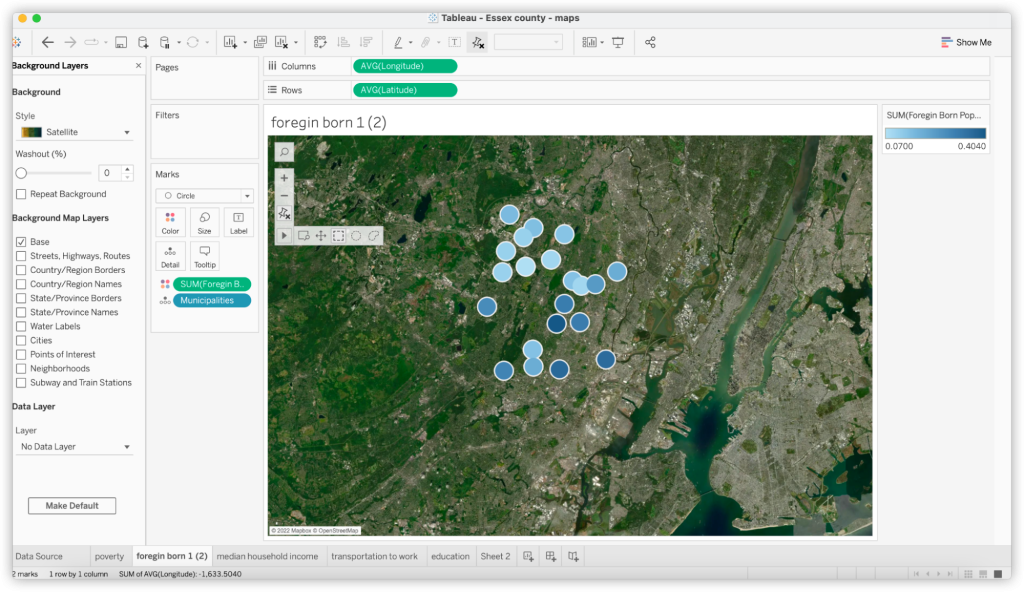
- Last but not least, choose the layers. You don’t want backgrounds to look overwhelming, so choose background layers according to your needs. You can go to Map and choose background layers that add clarity.
For example, if the data you want to present is the average time people spend on the metro, you may want to choose a street-level background that contains metro information, like this:
If the data you want to present is natural resources related, you may want to try a natural geographical background, like this:
These maps were made to lay the groundwork for new and upcoming community outreach and coverage for The Bloomfield Info Project. Though Tableau and other map programs are great for creating visual stories, we found we could also use these tools to help the Bloomfield Info Project better serve their communities.