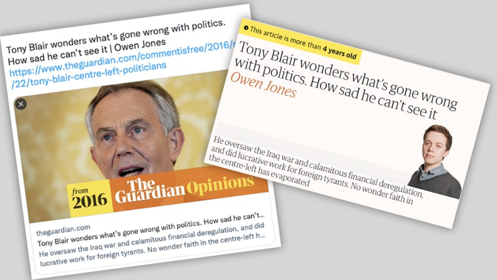
Screenshots above show how The Guardian embeds labels including the article’s age in links shared on social media, and on its website.
Helping readers make sense of digital news
The art and science of designing for understanding
On Twitter, when you share a five-year-old story from The Guardian, two interesting things happen. First, at the bottom of the included image, an overlaid tag declares the story is “from 2016.” And second, in some cases, next to the tag is a section name, “Opinions.”

The labels grew from a March 2019 insight by the Guardian’s audience team which noticed an old story about a bombing in Pakistan driving significant traffic from Facebook. The article was being intentionally shared as if it were new, and in the words of The Guardian’s Nick Dastoo, was being “weaponized” simply to drive outrage.
A month later, in April 2019, the Guardian began imprinting the date on social media shares, bolstering a practice that had already included similar labels on the article page itself.
The working theory was, some social media users will knowingly try to mislead, but the use of enhanced labeling will at least disrupt some of those bad actors.
The Guardian’s concern with both passive and active misuse of digital news is not a new one in the industry. The New York Times now has a similar date stamp, and many publishers are working to visually differentiate opinion from news content, especially with so much of the daily discussion of events happening in the decontextualized spaces of Facebook and Twitter.
My interest in this topic began a decade ago and on a different track. When I joined the Boston Globe as a senior product manager in 2011, the newspaper was in the process of designing BostonGlobe.com, and launching its “two brand” strategy.
The paper’s original Boston.com portal, launched in 1995, was free and carried the full journalistic output of the newsroom. The new BostonGlobe.com was to have a metered subscription model and become the digital home of staff reporting. This also added the complication of requiring a new content strategy for Boston.com, which would have only limited use of the Globe staff’s work.


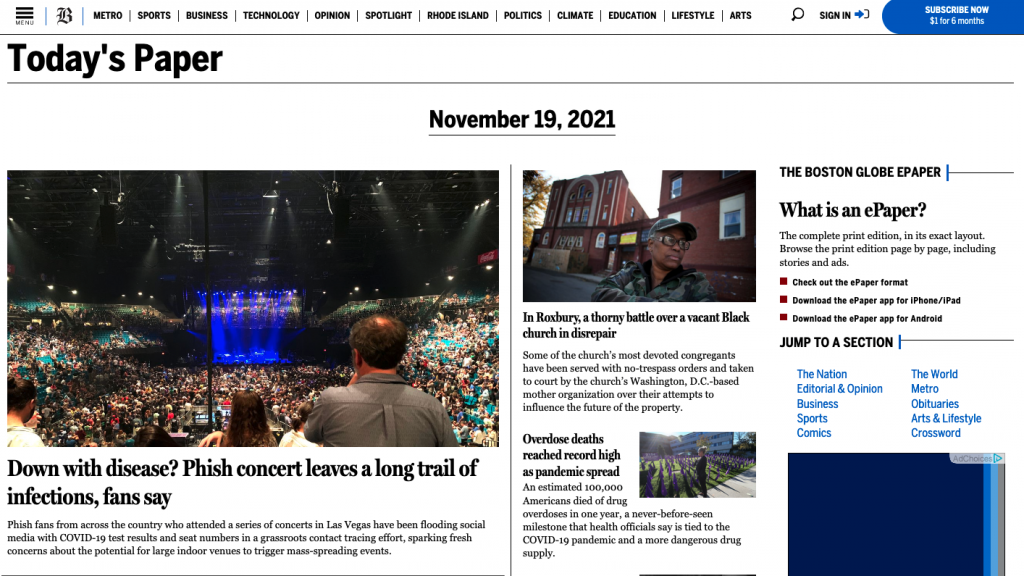
Despite numerous site redesigns since 2011, the Globe’s Today’s Paper section still survives (top) as does the much revamped Boston.com (bottom).
In the research leading up to launch, readers had expressed different expectations for the Globe’s new digital home page. One audience cohort wanted to see the latest-and-always-updated headlines, like Boston.com had traditionally offered. Others wanted the Boston Globe digital homepage to mirror the stories available on that morning’s print front page.
Clearly, those two needs were at odds. And adding to the discussion: the digital replica edition of the Globe’s print newspaper was growing in popularity with readers.
For digitally-minded staff, these findings were confounding. Why would readers want day-old news on their laptops or phones? And for replica readers, why would they want it in a just-like-print-but-on-a-small-screen PDF format?
The easy answer some journalists still cling to – a certain generation of readers just prefers print – is true to some extent but is also so wrapped in bias and cliché as to be useless as an explanation.
Working with two colleagues at Mizzou, Dr. Shuhua Zhou and Dr. Lei Gou, we reframed the question: If the goal of reading news is to “understand,” how does the experience in print differ from digital? Does one medium perform the job of “teaching” more effectively and if so, how?
We reviewed prior research and found that while attention had been paid to this general topic, nothing spoke in a cohesive or reader-focused perspective. So, leaning on James Gibson’s theory of affordances and Brenda Dervin’s theory of sense-making, we asked print and digital readers which features of each medium they use helps bring understanding to the news they read.
While researchers often study the production of journalism or its effects on audiences, our interest is more in the meta-information that supports the published material.
- How are elements on the page (print or digital) arranged?
- What intentional labels and navigation are provided?
- What are the reader’s expectations for the medium?
The premise is simple: as with The Guardian’s example, if a reader is unaware they are reading a five-year-old story, they will be unable to make a full and correct sense of the details and events described.
In two studies funded by the Reynolds Journalism Institute — one focused on print readers, the other digital — we asked readers about their news consumption habits, and sought to uncover the array of meta-context cues they might use to understand what they read. Among other behaviors, we wanted to know how they:
- Recognize news from opinion
- Evaluate the recency and urgency of a news story
- Navigate a news source to find a topic or story of interest
- Ascertain the trustworthiness of a news outlet
- Discover relevant stories while browsing
So far, we have identified 15 affordances (broadly speaking, the features or cues in a medium) that readers implicitly or explicitly rely on when consuming the news in print and digital formats. Many of these affordances are found in both mediums, though may be expressed differently in a broadsheet newspaper than on a mobile phone.
The 15 affordances are: (in alphabetical order)
- Adaptability – the medium’s ability to mold itself to the specific needs of the reader — such as changing text size in a web browser.
- Aesthetics – the perceived visual appeal of the product.
- Browsability – the ease with which a medium supports casual, non-goal-oriented information seeking behaviors.
- Completion – the psychological satisfaction of finishing the task of “reading the news.”
- Convenience – the ability to access an unlimited trove of information at almost any time.
- Genre – the ability to distinguish between different types of content, for instance news and opinion.
- Hypertextuality – the availability of links to other articles or resources.
- Immediacy – the assumption that digital news articles are published more frequently or updated more often than in print.
- Importance – the ability to understand the absolute or relative impact of a story.
- Interactivity – the facilitation of community and communication via a digital or print medium.
- Materiality – in print, the physical manifestation of ink on paper.
- Retrievability – the ability to find a previously seen or read article.
- Serendipity – the potential for discovering content of unexpected relevance.
- Trustability – the ability to correctly evaluate the authority of a publication.
- Wayfinding – the signposts and process of navigating through a print or digital publication.
We argue that each of these plays a role in understanding the news. But, the expression of each can greatly differ between print and digital news products.
The goal of this research is not simply to develop a more complete list of these affordances, or to argue that “print” is a superior medium for news. Rather, we hope to better understand the relationship between the production, presentation, and consumption of news as it evolved in print in order to improve the design and delivery and understanding of news on digital devices.
News publishers have an obligation both to inform, and to protect against efforts that would use our work to misinform. As William Howard Taft suggested, “Do not write so that you can be understood, write so that you cannot be misunderstood.” Journalism is not working if readers can find and consume it, but still not make sense of their communities. And digital news is broken if we allow bad actors to take advantage of its flaws to actively misinform.
Our two earlier examples of affordances, Genre and Immediacy, outline the discussion news organizations should be having.
In print, by well-accepted convention, signals for genre are supported by the article’s location in the publication (page A1 vs. C16), the labels atop each page and section, and a variety of design elements including columnist headshots. In digital, these signals are largely absent or minimized. And, since the majority of a news site’s traffic arrives via external referrals, every relevant context cue must, by necessity, be present on the story page itself.
And in a newspaper, there is little question the majority of articles in that day’s edition were written within the past 24 or 48 hours. That is the inherent logic (one might say “affordance”) of a daily periodical. But in digital, the concept of “edition” largely does not exist and a 100-year-old story is always just a click away.
Publishers must review their websites in consideration of these cognitive and psychological needs. How well are we supporting readers, and have we considered which print-centric elements may not effectively serve digital distribution? This tension exists for each of the affordances we have identified.
For instance, people like to:
Complete tasks
An edition (print or digital) can be fully read and put down. The open web is endless. How do we create a sense of, “I am fully informed” for digital audiences?
Understand importance and relevancy
The design conventions and structure of a print publication strongly signal editorial priority by placing stories at the top of the front page, with a large headline and photo. The templated nature of digital news often obscures this context — assuming a reader ever visits the home page or section front — which most do not. How do we signal “read this first” for digital readers who arrive via search or social media channels?
Find stories previously read
Retrieving information is ostensibly a strength of digital. But for news, it requires enough forethought to either bookmark the page, or to remember the original source, headline or keywords to locate it again via a search engine. How do we help digital readers wayfind within the news ecosystem — especially for local news — when their current experience is splintered across dozens of apps and sites?
Strengthening any individual affordance won’t dramatically improve the experience of digital news. But, viewing digital news as a product of many different signals including the reporting, the crafting of headlines, the usability of site navigation, the placement of section labels, and the context presented on social media — gives publishers the tools to better support reader needs, and one hopes, drive loyalty and support for newsrooms.
