
Maintaining digital projects in your newsroom

Create a Tableau dashboard that anyone can update with Google Sheets
I had a busy summer working with and creating interactive digital tools for the Mankato Free Press. My work ranged from daily graphics to bigger long-term digital tools. I branched out from my comfort zone, using tools like Tableau and Flourish in ways I haven’t before.
Along the way, I wanted to make sure the projects I worked on were sturdy and could continue to be successful past the end of my time with the Free Press.
COVID-19 dashboard and business data
One project I worked on was creating a page for COVID-19 data. When I found out reporters at the Free Press have been tracking COVID-19 data for the past year and a half, I wanted to create a tool for them and readers to be able to access the data at any time, and not just in bite-sized chunks.
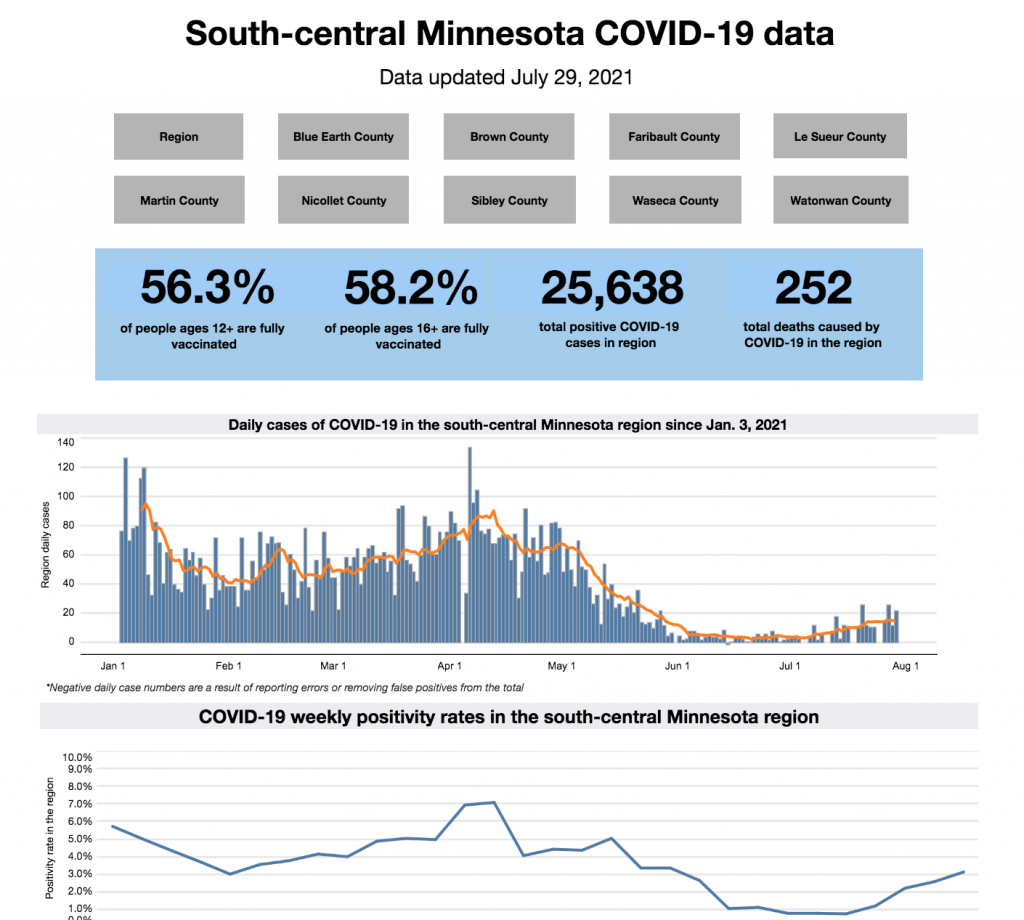
I used Tableau Desktop and its dashboard tools to create the COVID-19 dashboard for the Free Press. There was a lot of trial-and-error because I haven’t used Tableau to this extent before, but in the end we published the dashboard with COVID-19 data covering the nine counties in the coverage region plus the region as a whole. The data in the dashboard includes vaccine rates for ages 12 and up, 16 and up, 65 and up and the total population, total positive cases, total deaths, new cases by day, weekly positivity rates and cases and deaths per 10,000.
While a data-heavy dashboard like this may not be the content the majority of readers want to dive into, it’s a great public service news outlets can do for their readership. The dashboard can now be linked to any future story about COVID-19.
In order for the Free Press to continue using and updating the dashboard, I used Google Sheets as the source for the data. Whenever the data is updated on the shared sheet, the dashboard will automatically update. If you want the data to be updated immediately, there is a “request refresh” button at the bottom of the visualization on Tableau Public. This is a great way to ensure the newsroom will always have access to updating the data, and it doesn’t have to be the same person updating every time.
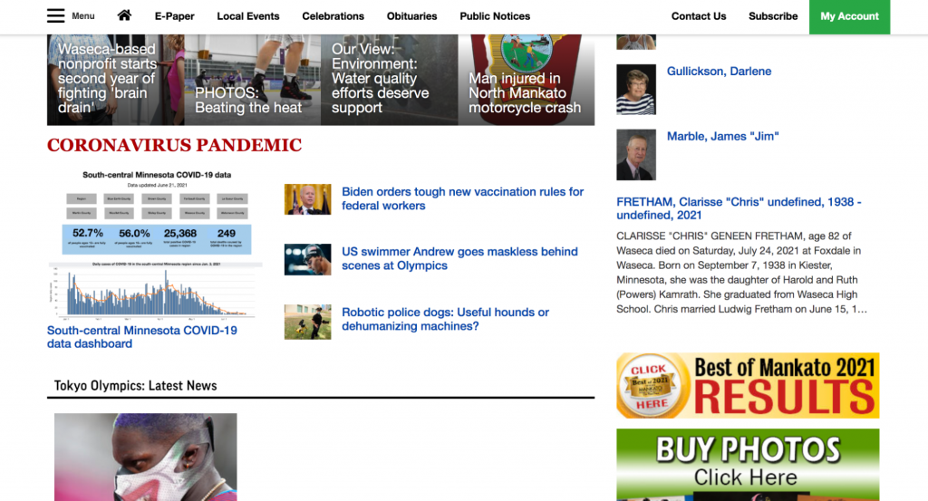
Once the dashboard was published, I anchored the link to the COVID-19 section on the home page of the Free Press’s website for readers to easily access.
I worked on another project using Tableau Desktop creating a digital version of business and economic data the Free Press releases monthly in its business magazine, Minnesota Valley Business. It works similarly to the COVID-19 dashboard. It’s connected to a Google sheet so it can be updated from a shared source.
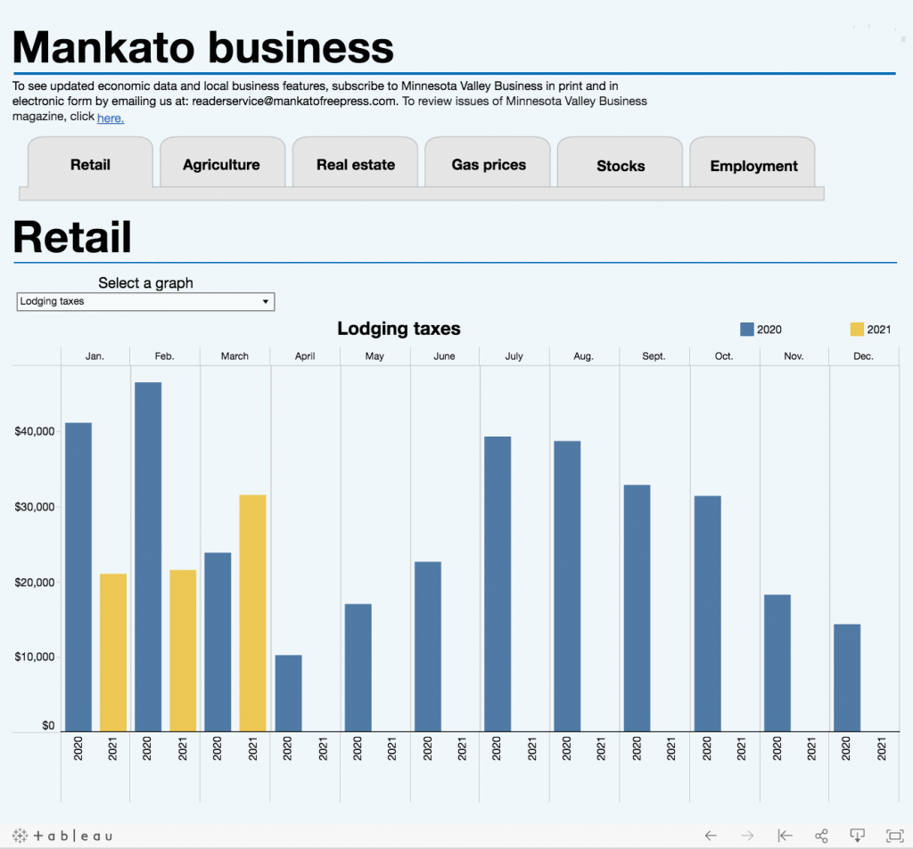
To see the full business data dashboard, click here.
If you or your newsroom want to use Tableau but need to learn how, Tableau has a lot of great resources on its website. The best part is, the instructional videos are free!
Flourish community measurement tool
Another project I worked on was a community measurement tool using coverage on specific topics. For example, the first one I created was a Mankato area schools education measurement tool. I combined the Free Press’s past coverage on Mankato area schools graduation rates and standardized testing scores into a card visualization in Flourish to create an overview of coverage. This is a great way to combine all of the coverage on a single topic together for readers. It allows for them to see coverage in context of a longer time frame.
When I first brainstormed ways to create this tool, I looked at a few online storytelling tools, including web story creators. I decided on Flourish because it’s easy to use but still allowed for customization. It is also easy for newsrooms to share visualizations in Flourish using company accounts.
Flourish offers great templates, but you are also able to customize different aspects using HTML. For this project I wanted to create collapsible text. I used these instructions from Flourish explaining how to create collapsible sections on your cards.
I also added a hyperlink to the words “Read our full coverage here” to the story the card was referencing.
Once I was finished with the cards, I made sure the visualization was on the Free Press company account, so it can be duplicated and edited for future use. If they ever want to create a new one, all they have to do is duplicate the visualization and change the text and images under the data tab.
Once the education measurement tool I created was published, it can now be linked to coverage on Mankato area schools and education.
During my time working on innovative projects for the Free Press, I was able to learn a lot while also creating new tools and methods of storytelling for them. I had the ability to experiment with tools I haven’t used before as well as tools I had worked with before.
Some advice I have for future student innovation fellows is to not be afraid to pitch your own ideas and come up with your own projects. This is your opportunity to branch out beyond your comfort zone and both you and your newsroom will benefit from it. Don’t forget to make sure your projects and innovative work can continue or be replicated past the end of your fellowship to the best of your ability.
Finally, don’t be afraid to experiment with tools and methods you haven’t used before. It will really help you get the most out of your fellowship.
Annie Jennemann is the RJI Student Innovation Fellow at the Mankato Free Press in Mankato, Minnesota. This summer our student fellows will be sharing dispatches from their fellowships in newsrooms across the country as a part of Innovation in Focus.