![A preview of the publish/share feature, which shows a heatmap of Kansas, and is titled Final Fine Payments of Kansas Nursing Homes [in USD].](https://rjionline.org/wp-content/uploads/sites/2/2022/03/miesnerg22030909-1024x576.png "A preview of the publish/share feature, which shows a heatmap of Kansas, and is titled Final Fine Payments of Kansas Nursing Homes [in USD].")
Before publishing the visualization, Infogram allows you to preview what the visualization looks like and how the interactivity feels.
Utilizing no-code tools for snappy data visualizations

How Infogram, Chartblocks and ChartExpo stack up
Making data visualizations that convey the meaning behind the data may seem challenging if you don’t have coding knowledge, but by using the right tools – the process becomes simple.
I tried the three free tools: Infogram, Chartblocks, and ChartExpo. Using them, I built data visualizations for the Missouri Independent on Nursing Home Fines in Kansas, in collaboration with Allison Kite, for an article that is still in progress. I created similar visualizations using all three programs to test how they compared, as well as trying out some of the unique features each offers.
Infogram
Infogram is an excellent data visualization tool, it reduces the time needed to create interactive, easy-to-understand visualizations. It feels similar to the web-based graphics editor, Canva. Not only is the UX similar between the two, but they both offer a variety of media creation and premade templates that allow the user to create an aesthetically pleasing graphic quickly.
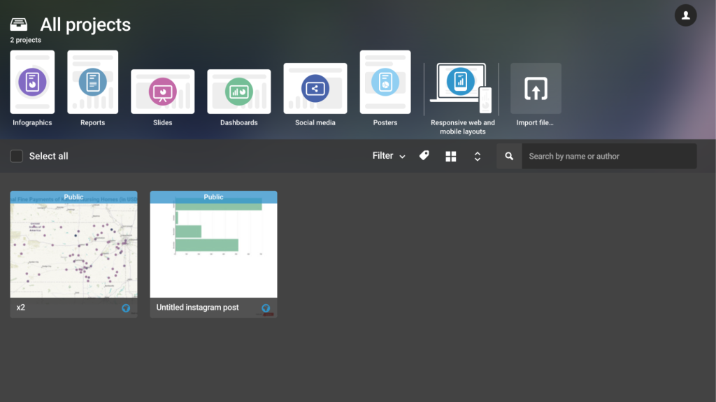
Infogram excels in user-friendly data visualization. Using the data set from the Missouri Independent, I was able to create this interactive heat map visualization within minutes.
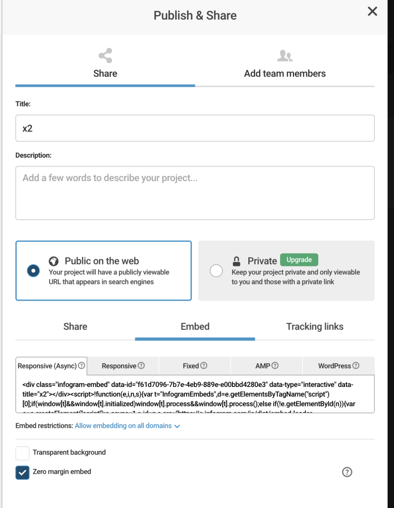
Infogram allows the user to embed the design into an article using a dynamically generated HTML element that can be added into a publication’s CMS. This feature is incredibly important for journalists, as it allows maintaining the increased interactivity that brings the data visualization to life.
One downside to Infogram is the 10 project limit for free users, as well as some restricted graph and template types. Journalists are able to delete old projects to create space for new ones, but the old projects will not remain live in old articles they have been embedded into.
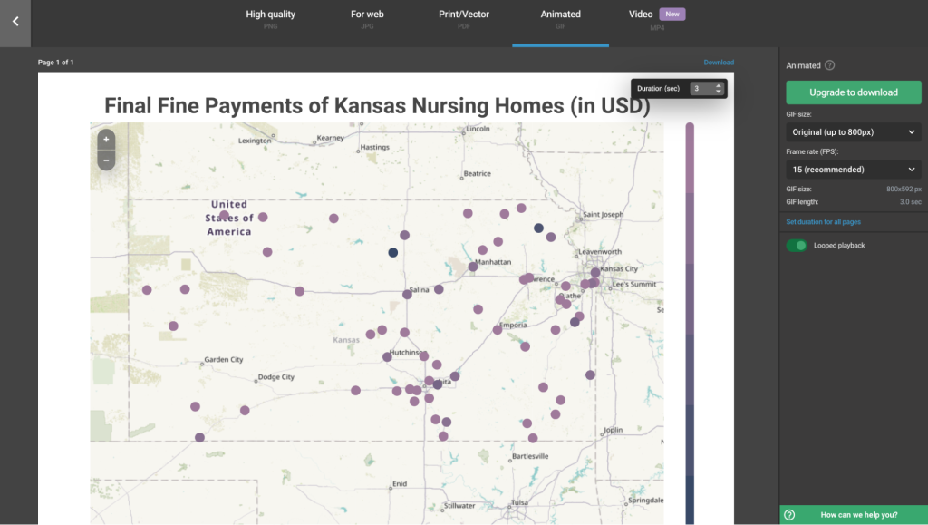
Additionally, Infogram has many options to download your visualization using different formats, but this feature is only available to paid users. While the downloaded video or gif won’t be as interactive as an embedded visualization, the feature does allow you to keep some interactivity when posting on social media platforms.
However, Infogram has many options for subscriptions starting at $19 a month, which could be a worthwhile investment for newsrooms reporting on a lot of data-heavy stories.
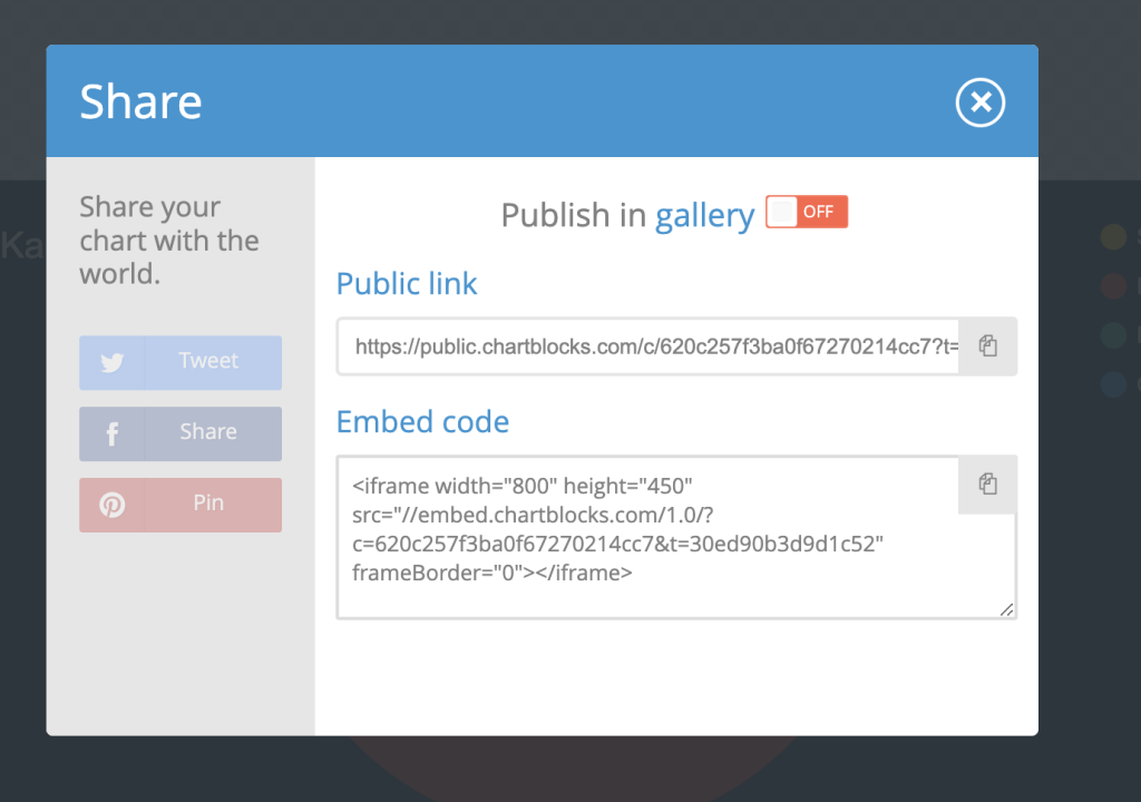
Chartblocks
Chartblocks follows a simple process to create data visualizations. A dataset for the visualization can be added in a variety of ways, including copying your data into the web-based spreadsheet, uploading a sheet from your computer, or utilizing a previous dataset.
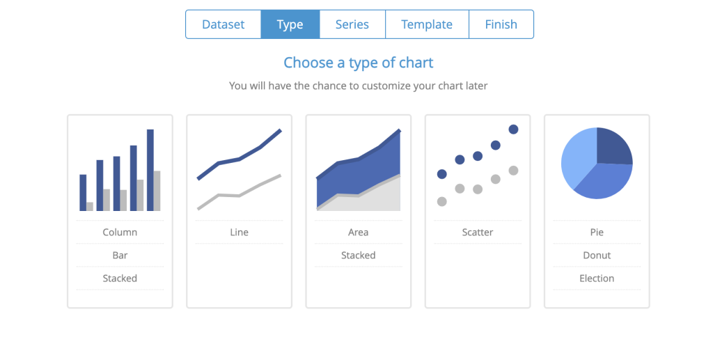
You are able to select the type of visualization you would like to create, from a wide selection of chart types. Finally, Chartblocks prompts you to select the columns of the chart to create the visualization as well as which style template you’d like to use.
After the initial visualization has been created, Chartblocks allows additional stylistic customization and data manipulation. For example, when I was creating a pie chart visualization on the amount of fines in each month, this was the original visualization.
Chartblocks generates a messy pie chart with so many different sections the visualization tool has run out of colors to use and assigned gray or white to 90% of the graph.
While the software is interpreting the data given, it isn’t finding the connection that I wanted in order to convey an easy message to readers. By only changing how the data was sorted, adding labels, and changing aesthetic settings for the legend I was able to convert that messy graph into this easy to read visualization.
With a few tweaks, the mess of pie chart has been transformed into an easy to read pie chart that is visually appealing.
Chartblocks also allows users to be able to embed interactive visualizations into CMS systems using a simple HTML tag. While many of the types of visualizations being created in the Chartblocks software don’t often require the interactivity of an embedded tag, the option to do so makes the platform even better.
ChartBlocks is user-friendly software that can create easy-to-interpret visualizations quickly. Some of the data and style customization features, such as data sorting, labeling, and legend customization, took me a little while to understand, but the learning curve for this software isn’t steep and could be mastered in an afternoon.
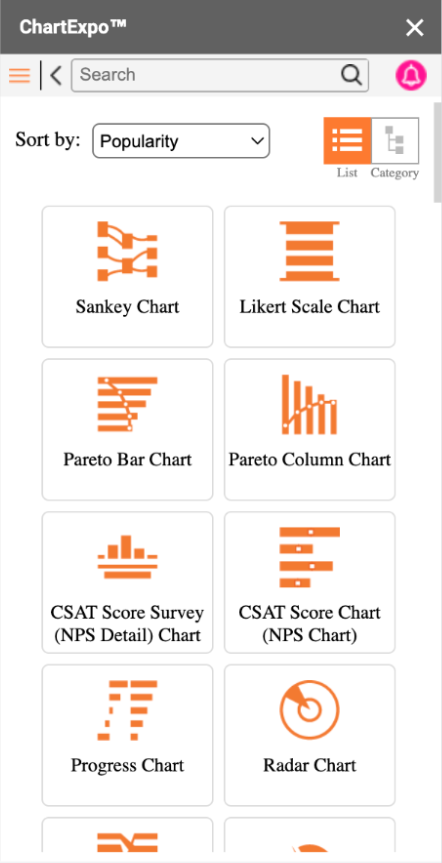
ChartExpo
ChartExpo has many products, but the one I tested out was a Google Sheets plug-in. I found ChartExpo to have an outdated interface which made it challenging to navigate. The software first prompts you to select the type of visualization. Then you select which sheet in the workbook you will be using data from, a column to be used as a metric, and a column for dimension. When attempting to select the sheet I wanted to use for visualization in ChartExpo, the application prompted me to re-select the sheet three times, which slowed down my visualization process.
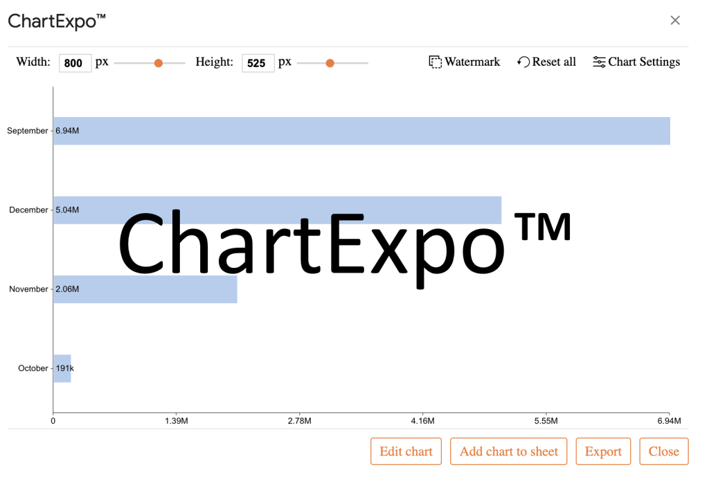
After the different variables have been entered into the software, an initial graph is generated in a pop-up over the spreadsheet. The application allows for some customization, including color, font, and tick mark increments. Even after some stylistic customization of the graph, I wasn’t able to create a visualization more aesthetically pleasing than the built-in graphing in Google Sheets.

Additionally, the visualizations created using the free ChartExpo add-in have a significant watermark that cannot be removed without paying a monthly fee. While the other softwares I used at the free level included some sort of branding, they were located at the bottom rather than the focal point of the visualization.
While the convenience of being embedded into a Google Sheet is nice, ChartExpo doesn’t offer any particular data visualization advantages over the existing graphing tools in the Google Sheets web application.
Final takeaways
After testing these three no-code data visualization tools, there are a few things I would recommend journalists keep in mind when selecting the right tool for their purposes:
The tools (and data) are not perfect
While data cleaning is usually done before the visualization process begins, sometimes there is a need to go back and clean the data more in order for it to work with the type of visualization you need. Be cognizant of the gaps in your dataset and tools when creating visualizations.
Double-click to adjust
When testing out the data visualization tools, I found that simply double-clicking on parts of a data visualization graph often pulled up the area where I needed to adjust settings in order to receive my desired effect.
Focus on impactful data points
Often, datasets will include many columns of data, which can be overwhelming for whoever is visualizing the dataset. In the dataset that I was using for The Missouri Independent, there were over 25 columns; some with missing data points and some too unique to each data point to be used in a meaningful way. Focusing on the important data points you want to highlight, will help you break down the work into manageable pieces.
Plan ahead, but also be able to make adjustments
Testing things out and making adjustments is crucial to a visualization’s success. If you find out new information during the process, adjust in the context of the data visualization. If you discover that your dataset is missing half of the values for a certain column, find a different column or clean the data more.
Editor’s note: This article has been edited for length and clarity by Mikaela Rodenbaugh and Kat Duncan.