Tag: Data Journalism
Mapping COVID-19 cases in Observable with Vega-Lite
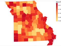
Choropleth maps show how data varies across a geographic region, a visualization technique used often to present a wide variety of data, including economic data, election results and, more recently, the prevalence of COVID-19 cases and deaths. I recently created a choropleth map that pulls live county-level COVID-19 case data from the Missouri Department of … Continued

Scrappy hacks for scrappy visual journalists
As far as I can tell, the Internet is mostly duct-taped together. And why should visual journalism be any different? In a world of flashy D3.js wrappers and React components and the like, sometimes you just need a chart—and you need it as quickly as possible. In other words, you don’t need interactivity; you need … Continued

RJI Fellow to develop data-journalism unit for smaller scale nonprofit newsroom
The Donald W. Reynolds Journalism Institute has awarded seven fellowships for the 2020–21 academic year for projects that address the increasing challenges in covering climate change, unpublishing, harassment of marginalized journalists and more.

Short Takes: How data uncovered great stories
Who said there would be math? In a field that can attract mathematically challenged individuals, data has become an essential tool for journalists. During the 2019 spring semester, student producers behind Gray Television’s OTT show “Post” showcased 20 pieces of journalism, most of which would not be possible without data.

Sonification: Turning stories into sound
Michael Corey, Senior Data Editor at Reveal, shares his tips for sonification storytelling
Data-driven storytelling: An essential part of telling stories
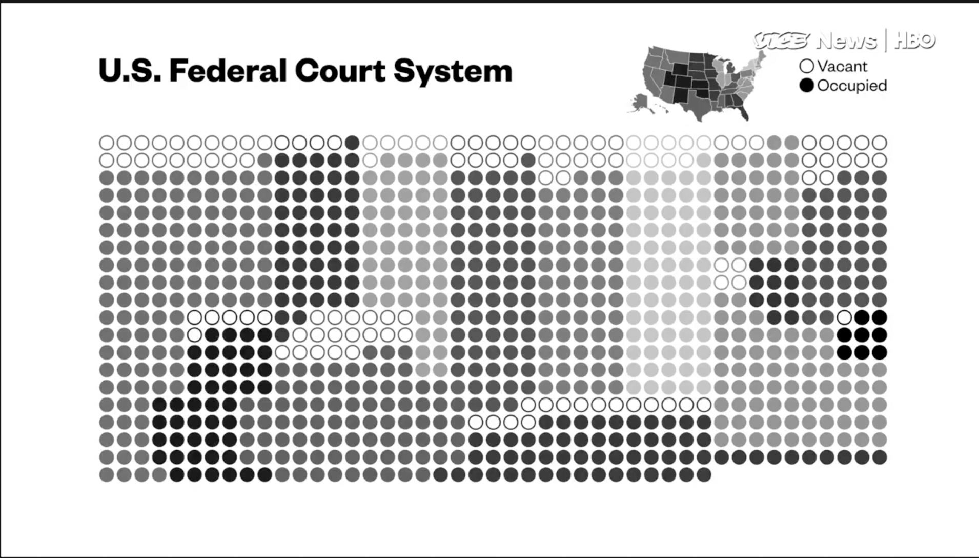
Allison McCann, data reporter with Vice News Tonight on HBO, speaks about the power of data-driven storytelling to provide important context and depth to journalism.