Tag: Data Journalism
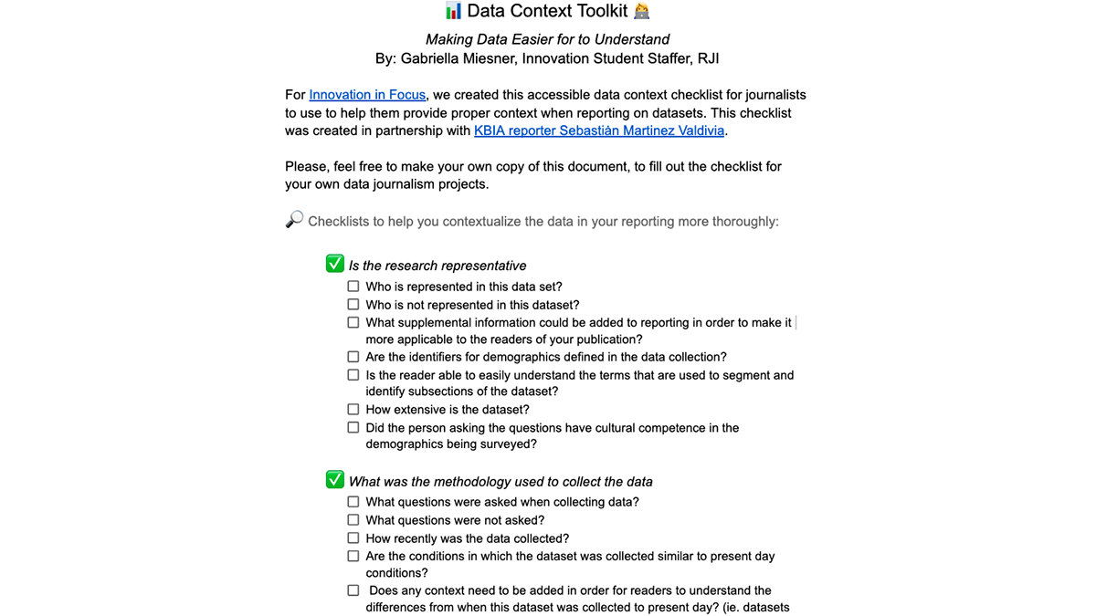
Providing context for data in journalism
One dataset we used for this work was the Missouri Healthnet Applications. Here are takeaways to assist you in making data points easier to understand for readers
![A preview of the publish/share feature, which shows a heatmap of Kansas, and is titled Final Fine Payments of Kansas Nursing Homes [in USD].](https://rjionline.org/wp-content/uploads/sites/2/2022/03/miesnerg22030909.png)
Utilizing no-code tools for snappy data visualizations
How Infogram, Chartblocks and ChartExpo stack up.

The people behind the data points
Weihua Li of the Marshall Project balances the severity and humanity of incarceration through data.
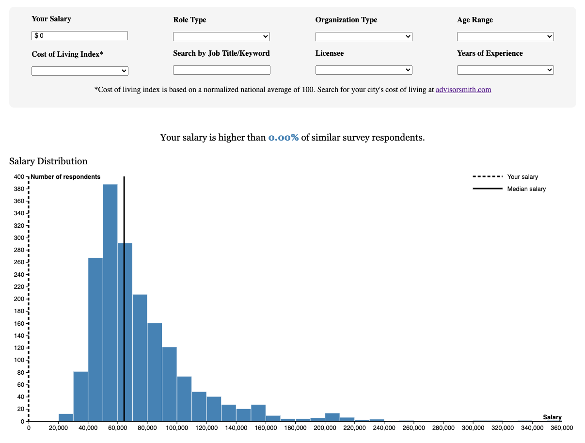
Building interactive visual experiences from data
How we helped the Current analyze and visualize public salary data.
A database and text system created for resources during the pandemic
Public Input texting service allows readers to get in touch with journalists.
Maintaining digital projects in your newsroom
Create a Tableau dashboard that anyone can update with Google Sheets I had a busy summer working with and creating interactive digital tools for the Mankato Free Press. My work ranged from daily graphics to bigger long-term digital tools. I branched out from my comfort zone, using tools like Tableau and Flourish in ways I … Continued

Women in Journalism Workshop 2021
The Women in Journalism Workshop is an annual workshop that focuses on challenges, accomplishments and issues specific to women in the journalism industry today.

How visual metaphor helps move our data off the page
And into people’s brains It’s a new year, and as I’m nearing the end of this fellowship, it seems worth pulling the lens back a bit. We’ve spent a lot of time thinking about nuts and bolts —how to build a bot, when to opt for quick and dirty hacks over fresh code, if and … Continued

Having a natural curiosity about mundane processes
Data journalism and where it’s headed next Alex Richards is an assistant professor S.I. Newhouse School of Public Communications at Syracuse University. I spoke to him about data journalism and what is in its future. Monnay: Can you describe your history and experience with data journalism? I was a graduate student at the University of … Continued

Pre-reporting for data journalists
A brief intro to exploratory analysis In a recent paper, a pair of statisticians took a stab at outlining “the most important statistical ideas of the past 50 years.” Among them: “counterfactual causal inference, bootstrapping and simulation-based inference, overparameterized models and regularization, multilevel models, generic computation algorithms, adaptive decision analysis, robust inference, and exploratory data … Continued