Tag: Data visualization

Journalists are creators now, and that’s a good thing
The views expressed in this column are those of the author and do not necessarily reflect the views of the Reynolds Journalism Institute or the University of Missouri. Journalism’s hostility is understandable, but our denial is not.In 2009, the former editor-in-chief at Thomson Reuters, David Schlesinger, described journalism as one of the great self-declared professions. He wrote, … Continued

Pre-reporting for data journalists
A brief intro to exploratory analysis In a recent paper, a pair of statisticians took a stab at outlining “the most important statistical ideas of the past 50 years.” Among them: “counterfactual causal inference, bootstrapping and simulation-based inference, overparameterized models and regularization, multilevel models, generic computation algorithms, adaptive decision analysis, robust inference, and exploratory data … Continued
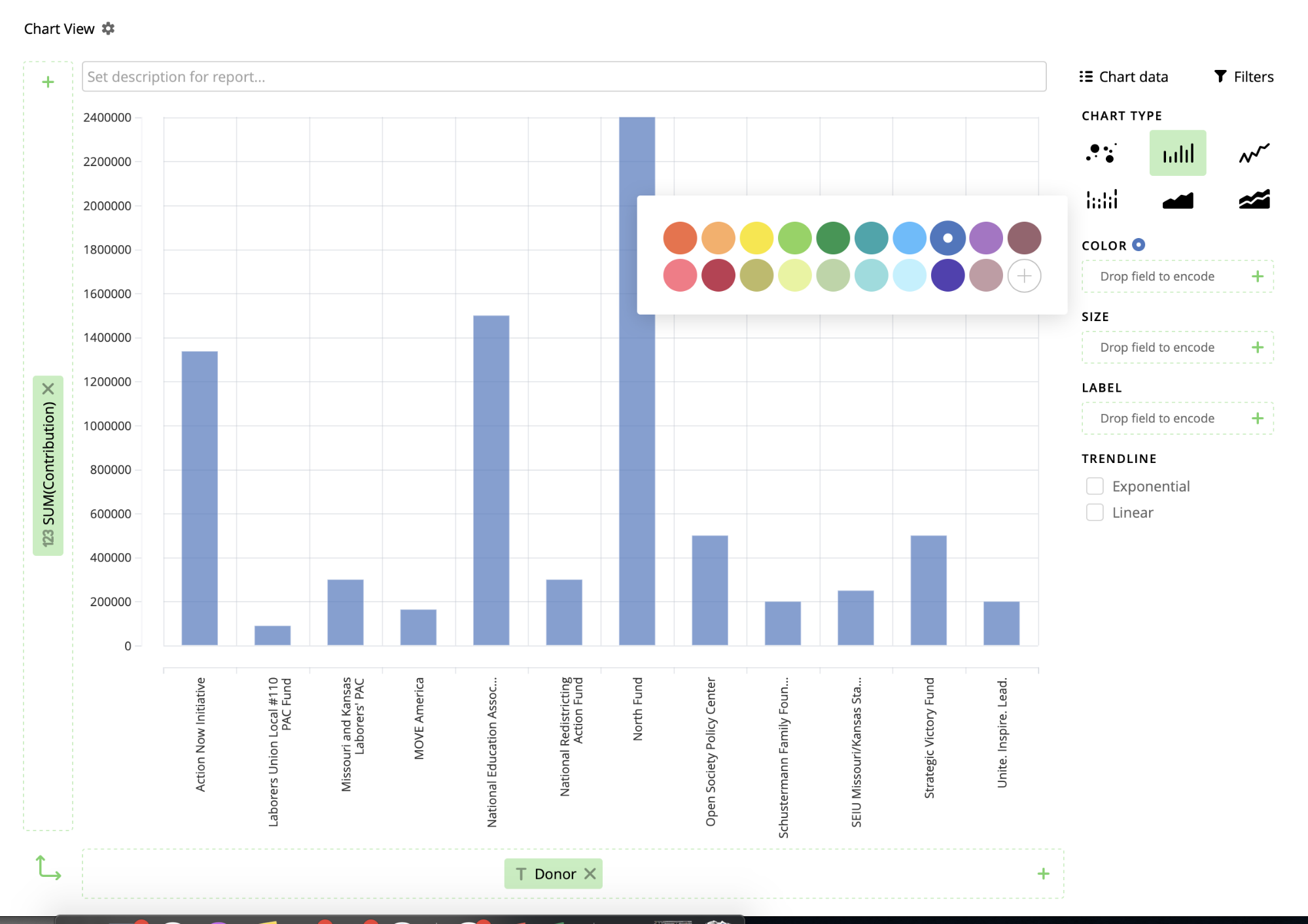
Inject, Pinpoint and Vizydrop: Tips and tricks
We tried multiple tools to help find, develop and illustrate a story for KBIA For my last Innovation in Focus piece for the year, I wanted to try a few new tools while I was reporting on the passing of Amendment 3 for KBIA with a group of three other journalists. You can read and … Continued
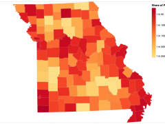
Mapping COVID-19 cases in Observable with Vega-Lite
Choropleth maps show how data varies across a geographic region, a visualization technique used often to present a wide variety of data, including economic data, election results and, more recently, the prevalence of COVID-19 cases and deaths. I recently created a choropleth map that pulls live county-level COVID-19 case data from the Missouri Department of … Continued

Build a real-time dataviz bot (for free!)
When it’s not busy playing host to cryptocurrency scams, Twitter remains a widely adopted platform for the distribution of bite-sized information. For that reason alone, it’s well-suited to sharing real-time data—especially via charts and graphics.
Data-driven storytelling: An essential part of telling stories
Allison McCann, data reporter with Vice News Tonight on HBO, speaks about the power of data-driven storytelling to provide important context and depth to journalism.

Postscript: A WordPress plugin for data visualization and multimedia
The first plugin from the Storytelling Tools project is now free in the WordPress directory.