Photo: Annie Spratt | Unsplash
5 ways to use Canva to upgrade your newsroom’s visual presence on social media
With its brand kit and newsroom specific graphics, Canva is a one-stop shop for elevating your social media presence
The views expressed in this column are those of the author and do not necessarily reflect the views of the Reynolds Journalism Institute or the University of Missouri.
In a previous column, I discussed the ways that newsrooms can create brand guidelines for a consistent look and feel on social media.
In those guidelines, things to consider included fonts, logos and colors that an organization plans on using on social media. Once these guidelines are established, it’s important to have them accessible to all in your newsroom that are involved in digital production.
One platform that serves as a great place to store all of these visual assets and information is Canva, an online graphic design platform. On the site, novice graphic design users can make visually stunning posts, videos and other stationery using a suite of templates that span a host of topics and designs.
Last year, the company introduced Canva for Newsrooms, a premium service that offers both small and large newsrooms the ability to create quick and clean social news graphics that are consistent with a brand’s visual identity.
Here’s how to get the most out of Canva’s social media design features and how to plan and publish content on social media:
1. Create a Brand Kit
One of the biggest features of Canva is the ability to create a Brand Kit. With the site, you can compile many of the visual assets you need for your brand in one place. With the Brand Kit, you can upload your organization’s specific fonts and logos to Canva and add your organization’s primary and secondary colors. The Brand Kit is then applied to your Canva Pro account, so that regardless of the user making the graphics, the look and feel is consistent.
2. Pick a few templates to work off of
In addition to the Brand Kit, Canva offers a variety of templates to use. Once the Brand Kit is established, consider adopting a handful of templates that you can use across social media using your organization’s colors and logos. Types of templates to include adding to your arsenal are quote cards, photo and text cards, and headline cards that enhance your social media posts.
3. Utilize re-sizing options
While it’s important to have a few different templates, it’s also important to ensure that the size of each graphic matches the platform that you are posting on. For example, social media posts on Facebook should utilize horizontal dimensions while platforms like Instagram stories should focus on vertical dimensions. Be sure to reference the most up to date social media dimension sizes when planning your posts, as they are constantly changing. In addition, Canva has its own premium resizer that can resize any graphics into a new dimension in order to scale quickly.
4. Consider what makes each platform unique
One of the most vital parts of social media strategy and management is ensuring that the content you create matches the platform. Just because a graphic does well on Twitter does not mean that it will translate to Facebook or Instagram seamlessly. Consider focusing on strong visuals and video on a platform like Instagram or Facebook and lean into strong quotes or statement graphics on a platform like Twitter.

5. Publish directly to the platform from Canva
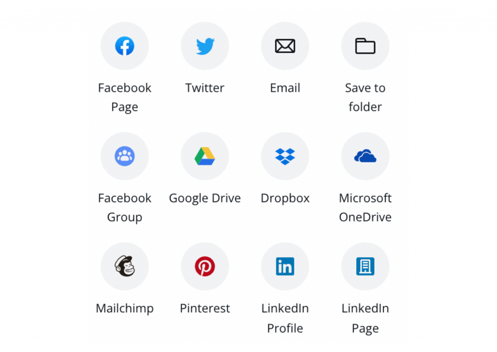
Another great tool from Canva is the ability to post directly on social media platforms from the website. With the tool, you can skip the step of downloading graphics to your computer and posting them on a social media site. Currently, Canva supports Twitter, Facebook, LinkedIn, Instagram, Slack and Pinterest posting. In addition, users can utilize the site’s content planner to have a bird’s eye view of when all of your posts are going up on each platform.
