Search Results for results
There are as many solutions as there are communities to serve
Takeaways from the Independent News Sustainability Summit.
RJI Residential Fellowship
Our residential fellowship is for an individual who wants to spend a year at RJI to create a resource to help with a current need, gap or challenge for journalists and/or newsrooms. The resource can be a platform, a tool, a series of workshops; it can be digital or physical. It just needs to be … Continued
Why you should care about your news site’s SEO
Common challenges, core basics and practical first steps.
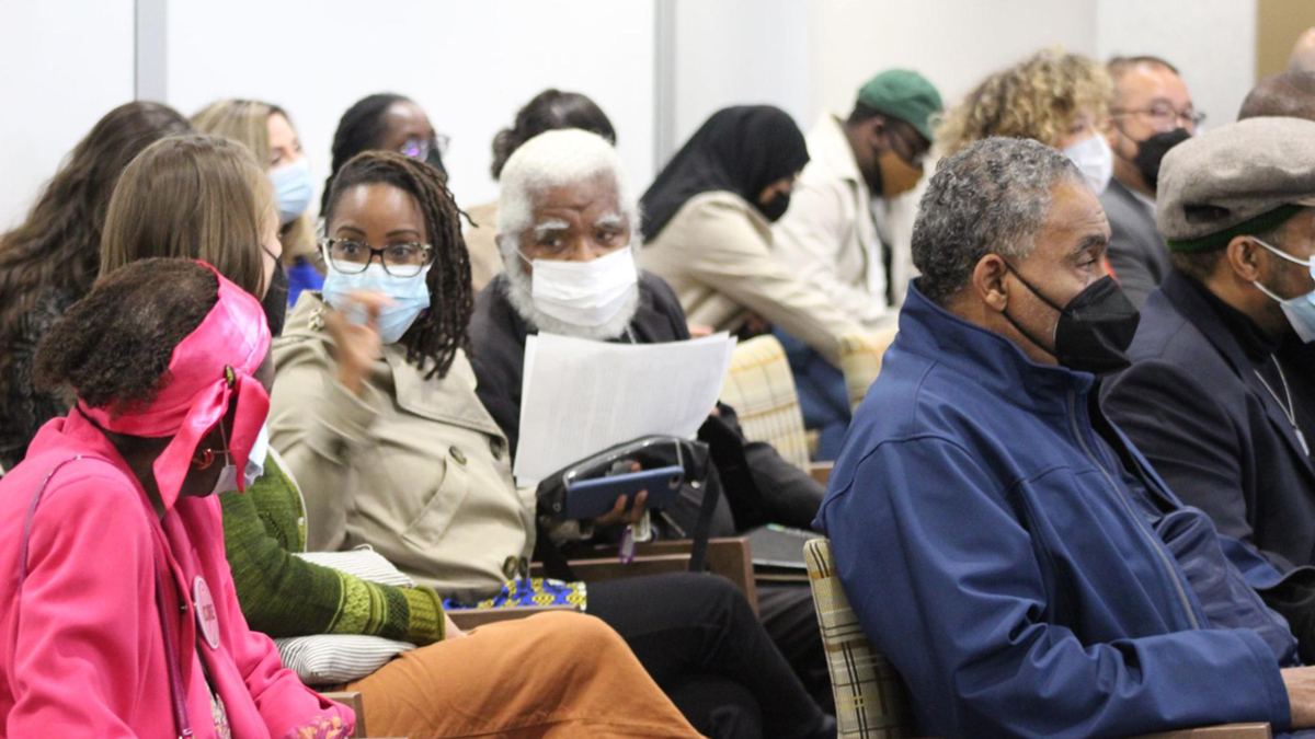
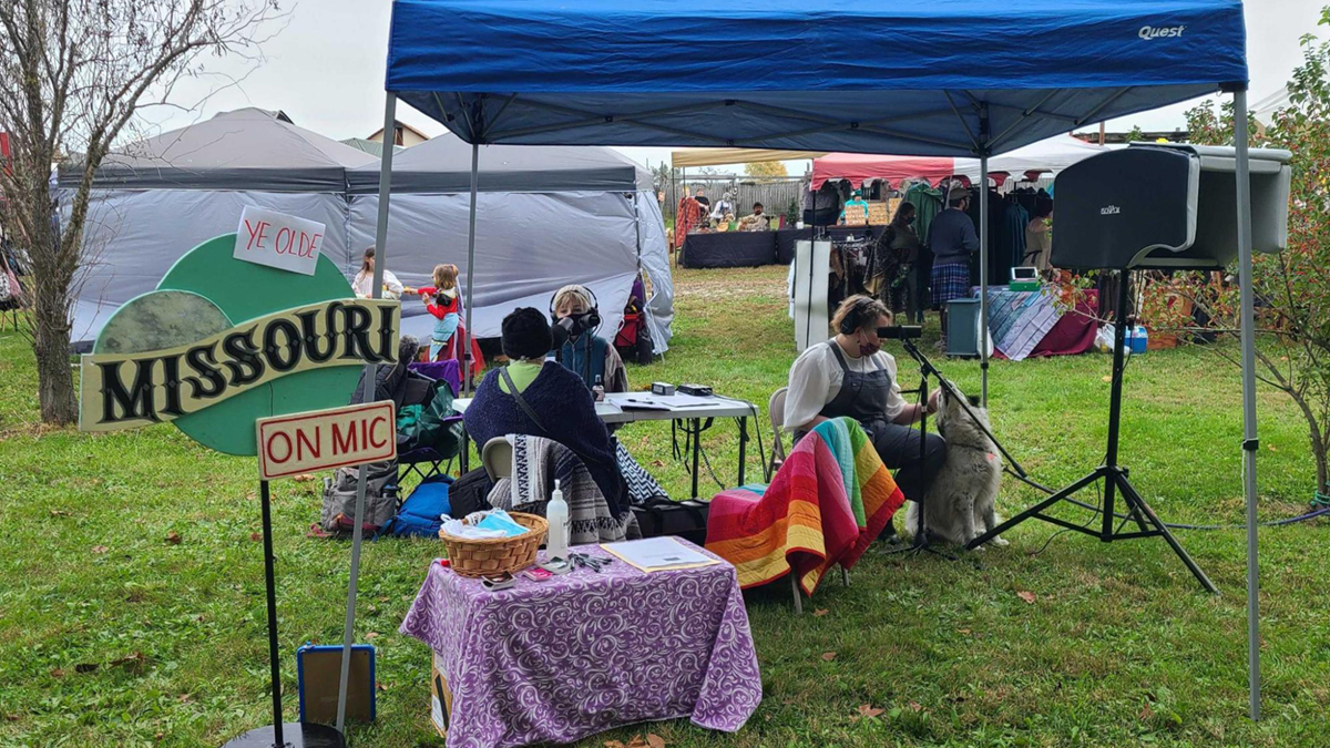
Why showing up is powerful
Let’s build a future where more productive civic engagement is a duty for newsrooms and an opportunity for our communities.
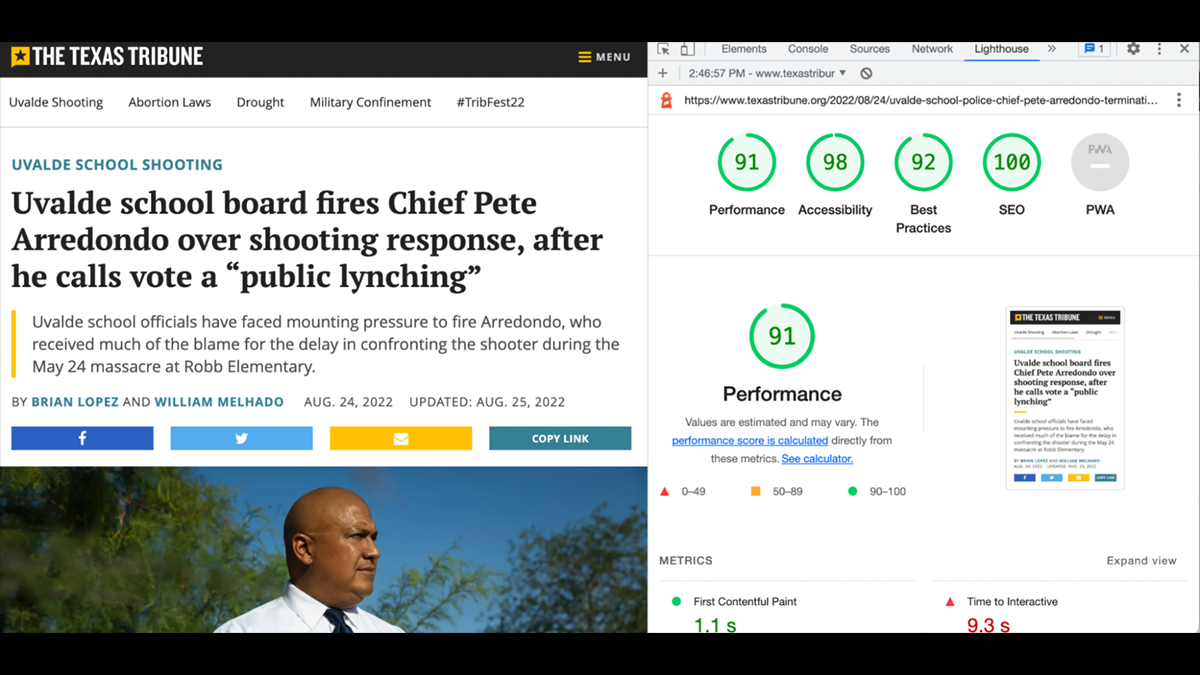
Making sense of your core web vitals
Learn how the loading speed, accessibility and other performance metrics of your news site stacks up.
How to conduct conversations-based audio journalism projects
From problem solving set-ups to streamlining your editing, here are our lessons learned.
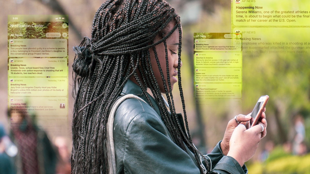
It’s not easy to craft a push alert strategy
This RJI Fellowship research report offers recommendations and insights on how to improve your approach.
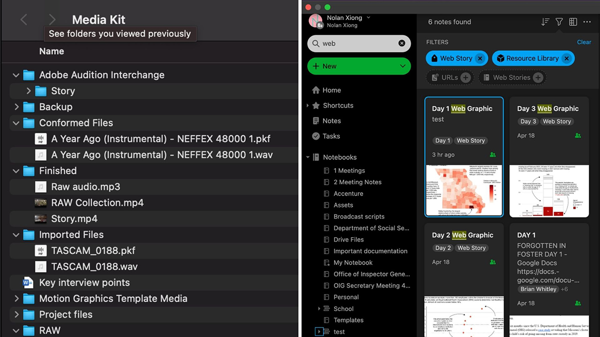
Simplified information management for journalism
Improve your workflow with new tools, faster search and additional organizational features.

News outlets and social media provide an avalanche of information during a crisis
How do you sift out the accurate from the inaccurate?
How to produce and measure impact on your journalism
It is about tracking a wide variety of aspects from story pitch to execution to promotion, to make sure your stories can affect the communities they’re created in service to.