How-to
Newsroom Notes: Covering pandemic, protests provides three valuable reminders
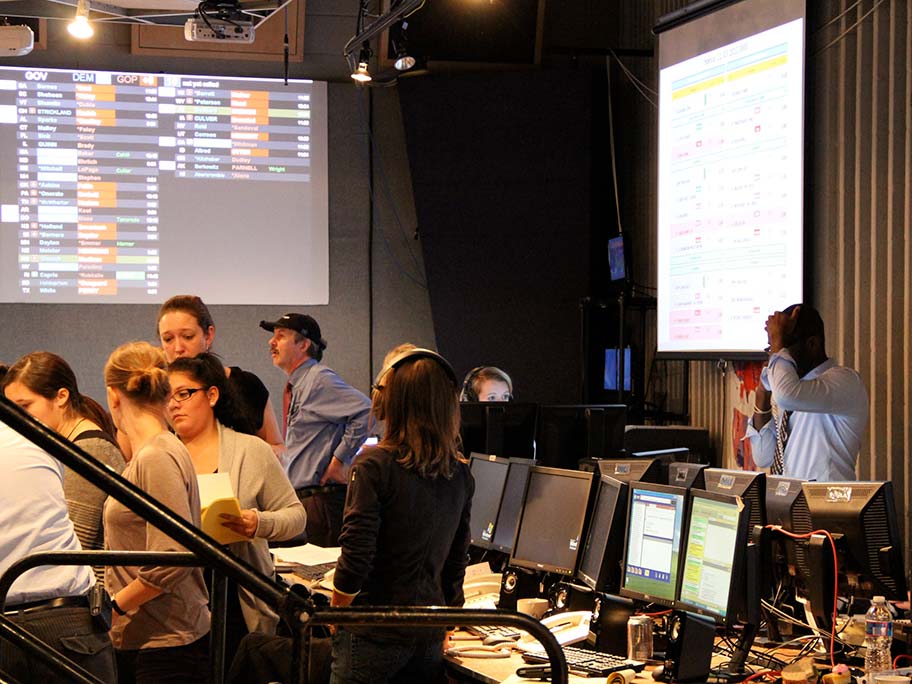
KOMU News is the nation’s only teaching laboratory inside a commercial, network-affiliated TV station. The challenges are no different from other newsrooms—just layered on top of the challenges facing the next generation of journalists. We’re providing a first-hand view (and maybe a little advice) from an industry veteran who agreed to lead the KOMU Newsroom during a faculty search process—just as the COVID-19 crisis began unfolding.
The why of source diversity and inclusive storytelling
Last year, I wrote a feature story for The Hechinger Report about the obstacles students of color face when trying to get into graduate school. I interviewed Black, Asian and Latino students, professors and education experts. When I wrote about the prevalence of skin cancer in Black and Latinos, I used real people and expert sources of color.
Lean into using your phone: Q&A with Sarah Singer
Sarah Singer is the senior director of innovation at Vice. I spoke to her about how Vice cultivates its presence and engagement across social platforms.
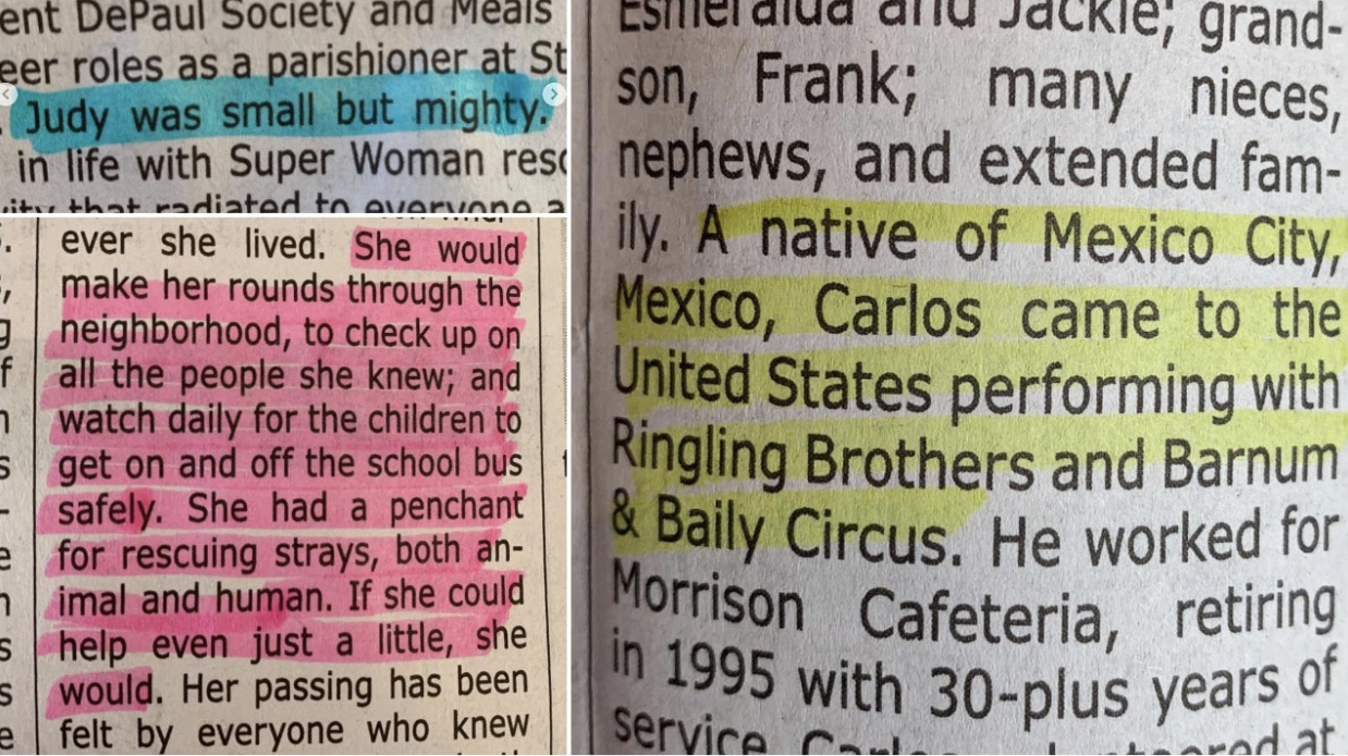
Turns out there’s a few things about obituaries that need re-thinking
Obituaries are a lot of things.
They’re a legal notice of death. They’re the story of a life. They’re a tool for grieving. And they’re a business.
In taking on one kind of obituary – the story – for this fellowship, I constantly bump into all the other forms.
Bolster your digital safety: An anti-hacking, anti-doxxing workshop
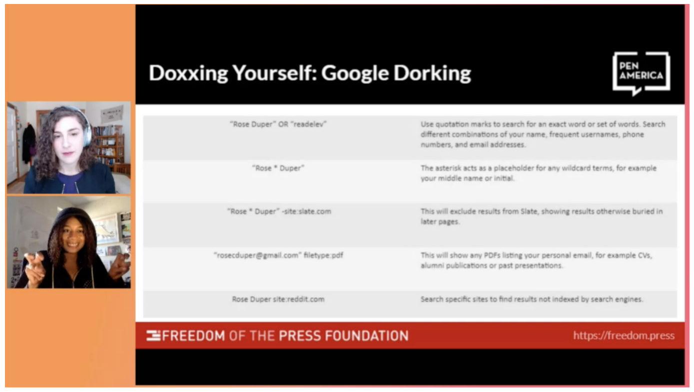
Journalists in all newsrooms, especially women, LGTBQ+ and BIPOC, are dealing with unprecedented levels of online abuse that can take form in publishing of private information, impersonations, hacking and more. In the ONA session, “Bolster Your Digital Safety: An Anti-Hacking, Anti-Doxxing Workshop,” Viktorya Vilk, program director for Digital Safety and Free Expression, PEN America and … Continued
Managing metrics that matter for subscriptions
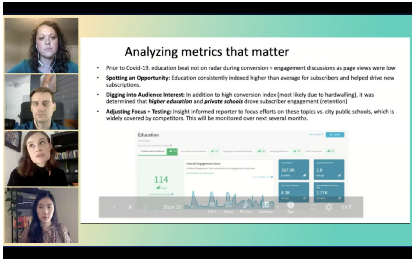
Managing metrics that matter Mike Denison, audience engagement editor at Science News, sees analytics and metrics as a tool to “cut through the noise and look beyond page views.” This year at ONA20, learning about the importance of analytics and metrics has shown to be of growing interest for the industry at a time when … Continued
Readers can help you plan your next move
The beginning of the coronavirus pandemic brought with it a surge in engagement and traffic to the Spanish materials we publish on our site, Documented Semanal. Within weeks, we had built an ecosystem where our readers, using our WhatsApp app, had guided us to create certain stories which would then draw in more subscribers who … Continued
Push notifications: Segmenting and connecting with your audience
Why use push notifications? When it comes to connecting with your audience, push notifications may not be the first thing that comes to mind. Some may even say notifications are outdated or irreverent when compared to the current technology. However, the company One Signal, saw an increase of two billion push notifications sent out each … Continued
Building a culture of great visuals
Boyzell Hosey, Deputy Editor of Photography, faces new challenges at the Tampa Bay Times in planning the daily visual report. He directs a significantly smaller photo staff than a decade ago in addition to the added burden of social distancing during the COVID-19 pandemic. But the plan boils down to the same principle as always, … Continued
‘Unpublishing’ may be a catchy term, but does it accurately encompass the issue?
Most journalists would agree that the words we use to identify important issues are intrinsic to understanding them. New phenomena get labeled through the process of discovery by individuals who, naturally, do not yet fully understand them. I propose we may need a better term for what we currently refer to as unpublishing. The Unpublishing … Continued
