
A test illustration for the Newspack Landing Page created by Beatričė Bankauskaitė. An illustration was inspired by Hannah K. Lee illustration created for TED.
Building a visual storytelling experience in Newspack


Newspack streamlines publisher content, but creative storytelling can be a challenge
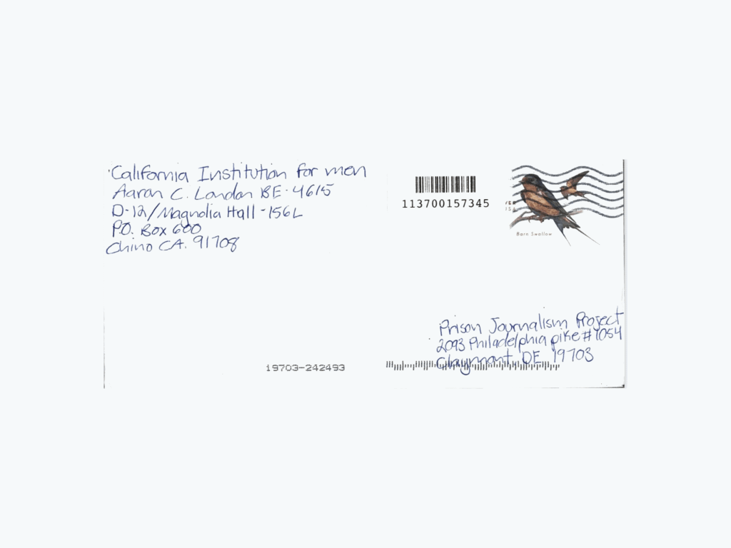
Inspired by the Strangers Project in New York, the Prison Journalism Project contacted currently incarcerated people around the United States and asked them, “What is it like to be you?” (also known as the WILT project). The WILT Project’s intention was to give a space for incarcerated people to share their experiences..
PJP received more than 50 handwritten answers in various forms, from letters answering the question to poems and reflections about incarcerated life. 55 letter submissions that met the project’s criteria were copied digitally and stored together.
Our part of the project’s goal was to present the submissions in an attractive and engaging form for PJP’s audience on their website, which uses Newspack’s platform. Newspack is a Content Management System (CMS) launched in 2019 for small and medium-size news organizations to publish their content. Newspack is built within WordPress, with some constraints. A simplified version of the platform, on the one hand, allows easier maintenance for publishers; however, it also can limit the options for creative decisions.
Since most of the PJP articles are published as separate pieces, PJP wanted to find a way within the platform’s constraints to create a more long-term, evergreen multimedia project with these testimonials from the incarcerated community.
Prototypes in Newspack
Newspack presents a substantial learning curve for anyone unfamiliar with WordPress. To work around any potential hurdles, we stewed over creating an embedded project to display the WILT submissions.
The intention of the first prototype was to highlight the differences in handwriting and postage stamps in a choose your own adventure style experience. Once a visitor enters, they would be presented with the project’s title “What’s it like to be you?” and a description of the project. Next, the screen fades into the main page of the project, where the reader decides which category of submissions they would like to read: poems, responses, or reflections. For whichever category chosen, the corresponding letters will appear with the original handwriting. From here, the reader can select their submission of choice to see the transcribed version.
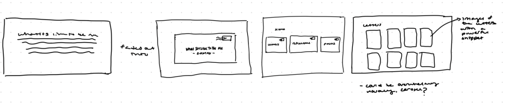
We felt the problem with this prototype was its lack of streamlined user experience. It was too much clicking and opening new pages to move through the experience. From here, we decided to give Newspack another try and figure out how we could display this project with no embeds, no plug-ins, and keeping the reader in one space.
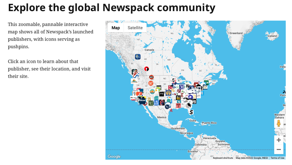
Newspack provides an interactive map that shows news publishers using the platform. Navigating through the map, one can click on an icon to learn about the publisher, its location and directly visit each website. To learn about Newspack capabilities, we explored the websites built with Newspack and found several organizations that tried unique layouts for longer-term projects.
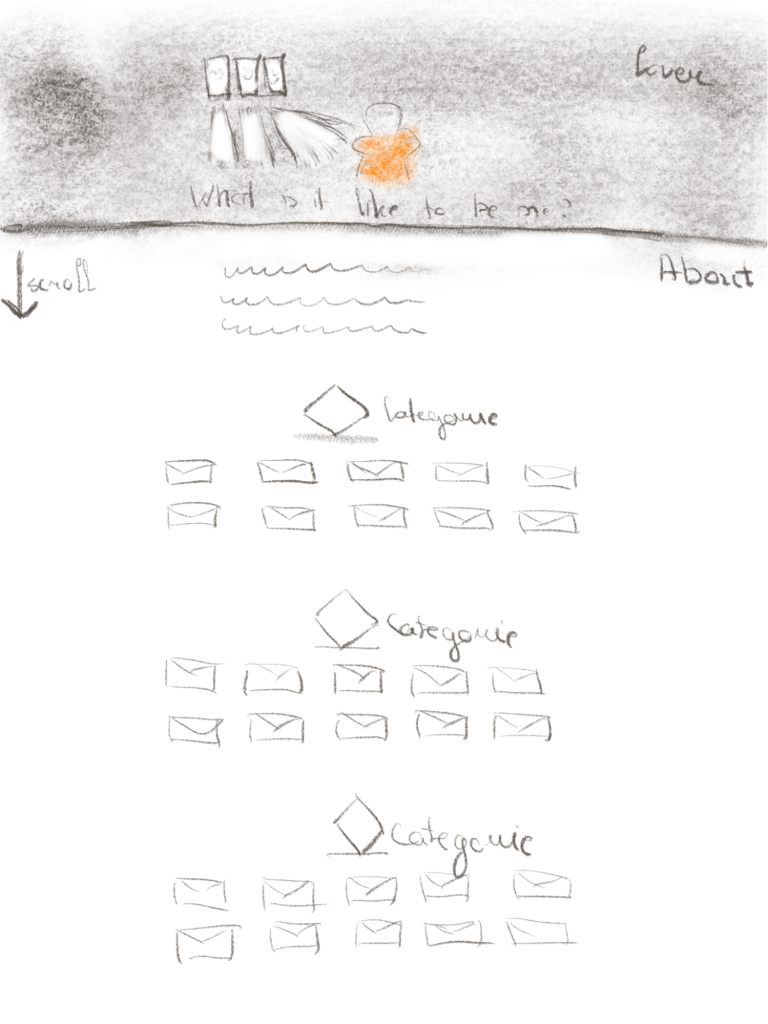
Based on our research of other projects, the second prototype followed the previous pattern to divide letters into free categories and use digital copies of the actual stamp and hand-written letters as icons to click on. However, horizontal navigation was replaced with a vertical, scroll-down-based pattern. The idea was to have an illustrated cover with the headline “What is it like to be you?” and a short description of the project below.
After designing our second layout, we created a private page on PJP’s website to start building. We tested the Newspack tools like the Latest Post block to see how they would work after publishing content to determine what blocks could be used for our project. As we continued testing our prototype versions kept changing as we iterated.
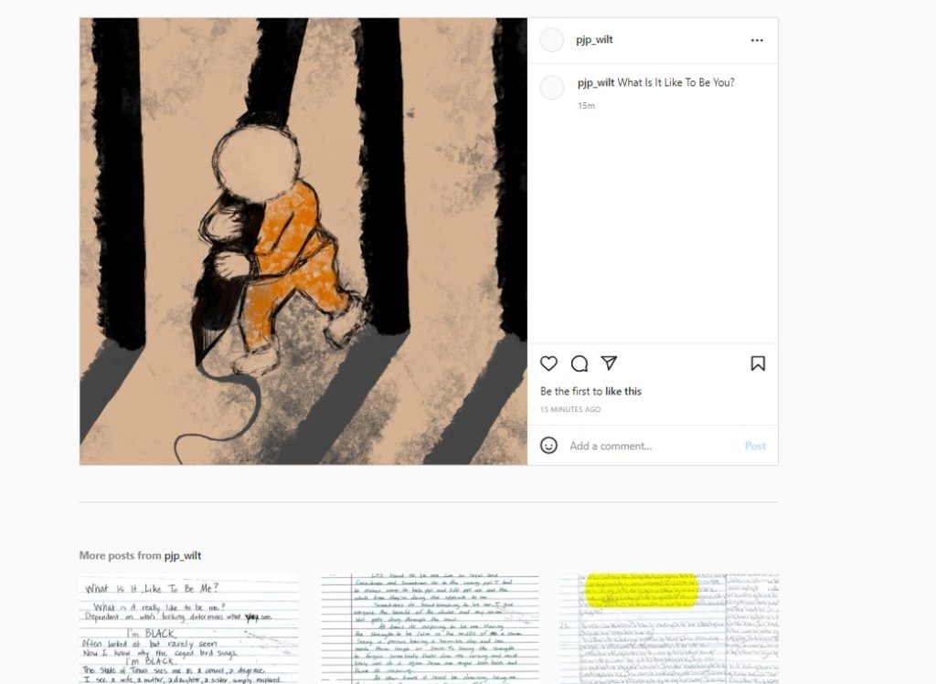
Newspack has two options for Instagram embeds. The one we picked is the Latest Instagram Post. This tool allows displaying all the posts from the chosen Instagram account by publishing data. Each time a new post is published on an Instagram account, it also appears on the landing page. To use this tool, one has to create a new Instagram account dedicated only to a single project. Then, Newspack has you create a Plugin account and connect it to your Instagram account. When accounts are linked, the tool displays posts automatically.
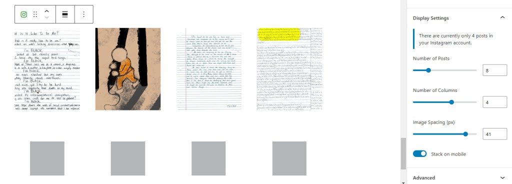
This block allows clicking on the image, which directs the reader to the original post on a separate window. We picked a square template for consistency and better display on the website options.
Our tips for presenting a multimedia project in Newspack
- Test the idea of the project before gathering submissions. Spending time pre-planning and testing content blocks within Newspack will allow you to determine better what type of content to gather and imagine the project’s result.
- Plan to include visual elements. Visuals play an essential role if you want to engage the audience. Having a single picture often used in a one-off article won’t be enough. Think about different visual assets, for example, videos or various types of illustrations to help tell the story.
- Ask project participants’ to submit their own illustrations. If you plan to use illustrations, ask those sending write-in submissions if they would like to express themselves in drawing or any other visual form. Then you can include their visual representations of their stories as part of the project.

- Think about the landing page’s header image. A header is like a book cover; it can determine if the audience stays on the page and delves deeper into the project. It will help tell the story and set the tone for the experience.
- Consider implementing audio narration. People have different preferences on how to engage with information. For example, if the project contains letters, the additional audio narration of the letter could provide an entirely different experience for readers to hear those words spoken out loud with tone and inflection or even by the subject themselves.
This article was edited by Mikaela Rodenbaugh and Kat Duncan.