How to build social-first data visualizations

Communicating key data and information to your audience through visuals
As audiences turn to social platforms for information, it has become increasingly important for news organizations to present data-driven stories, and their most significant findings, effectively in social-first posts and videos.
The Times Union regularly publishes compelling data stories in print and online, but many are not adapted for social media. Instead, like many newsrooms, its social posts typically rely on one or more story images and a headline. Data stories can be especially difficult to translate visually for social platforms because their complex statistics and essential context must be condensed into content that is both clear and visually engaging.
To make that job easier for reporters and producers, we created multiple brand templates on Canva that could be customized for individual data stories.
Here’s how we did it.
Step 1: Figuring out categories
In order to decide how many categories of templates and designs we needed, we met with Times Union’s data reporter to find out the type of data stories published in the past. Top types included:
- Historical trend stories
- Daily trend stories
- Election data stories
- Timelines
After skimming through published stories and consulting with the Digital Editor to get a sense of the designs needed, we decided on creating the following templates for repeated use:
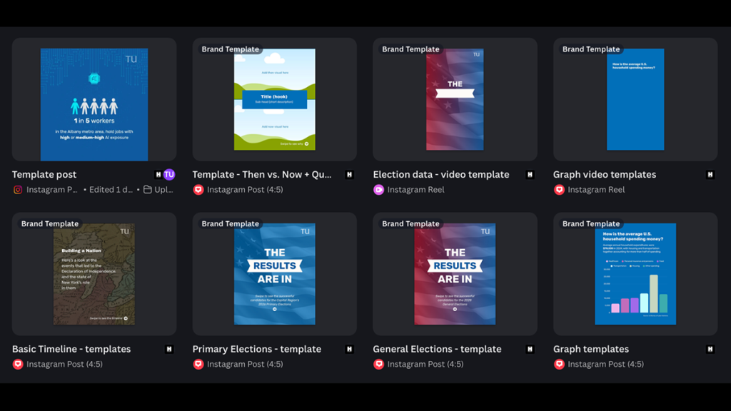
- A graphs template with multiple graph types
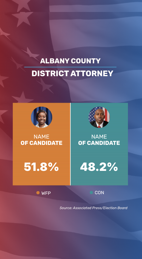
- A primary elections data template
- A general elections data template
- A basic timeline template
- A then vs. now template with a quote slide
Step 2: Getting familiar with brand identity
The Times Union has a distinct visual identity that remains consistent across its platforms. Its posts use a recognizable color palette, standardized logo placement, and a defined set of fonts.
Because we have access to Canva Pro, these brand elements are stored in a shared Brand Kit, making it easy to apply the correct colors, fonts, and logos when creating new templates. Note: if you’re a nonprofit newsroom, you can get canva pro for free. Otherwise pro starts at $144 a year.
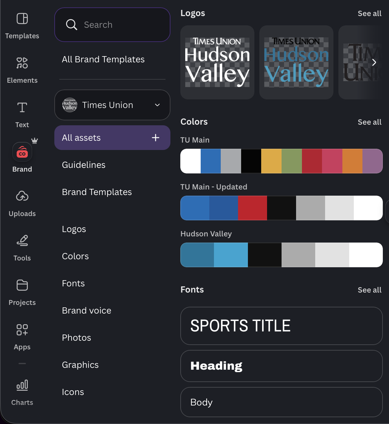
A Canva Pro subscription is not required to design and reuse branded templates. However, without it, users do not have access to the automated Brand Kit feature, which stores multiple brand colors, fonts, and logos in one place for all team members to use.
Before creating the templates, we studied the Times Union’s existing social media posts. We identified the colors used most frequently, the fonts selected for headlines and body text, and how and where the publication’s logos appeared.
This research was essential to determining how the Times Union’s identity could be incorporated into adaptable templates. Even when individual posts are customized, they should retain recognizable visual elements that distinguish them from content published by other news organizations.
A strong template should therefore offer flexibility while ensuring that every post remains immediately identifiable as part of the news publication’s brand.
Step 3: Creating templates
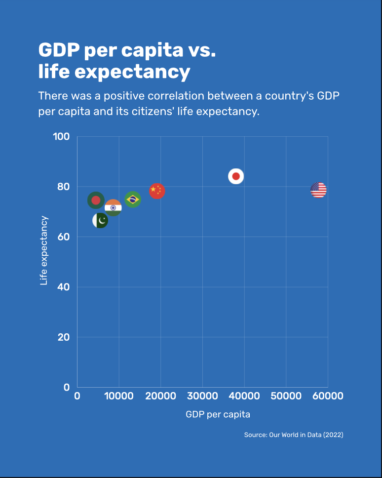
The first template we developed featured a range of chart types available in Canva.
Using sample data from publicly available sources, including the U.S. Census Bureau and Times Union data stories, we created 15 slides featuring different chart variations. Canva’s chart tools were customized to present the information in a clear and engaging way, including the use of pictorial symbols, emphasized figures, and other visual elements.
These templates give reporters and producers a broad selection of charts to choose from, helping them identify which format best suits their data or story. Each slide can also be adapted to fit the needs of a specific project.
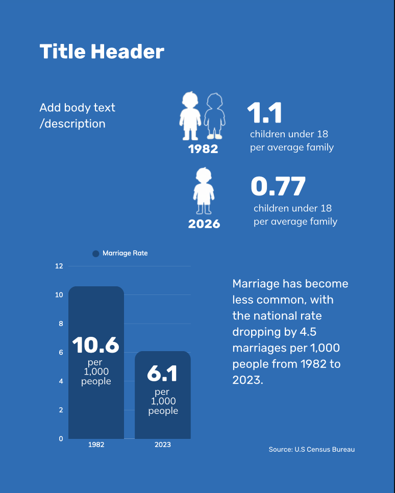
We also developed basic templates for timelines, quotations, and then-and-now comparisons. Although the Times Union already had a template for election results, it did not prominently display vote totals or winning percentages. We therefore created two additional templates tailored to primary and general election coverage.
You can use and customize our templates here:
- Graphs template
- General elections template
- Primary elections template
- Basic timeline template
- Quote + Then vs Now template
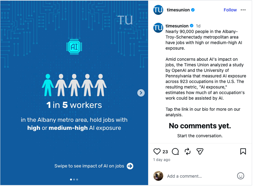
Here’s an example of a post made by Times Union that utilized our graph templates:
Step 4: Creating samples
To demonstrate how the templates could be applied in practice, we selected several data-heavy stories previously published by the Times Union and customized the templates to create a complete carousel.
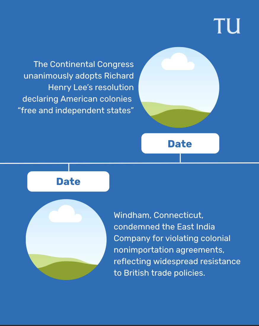
Template we used:
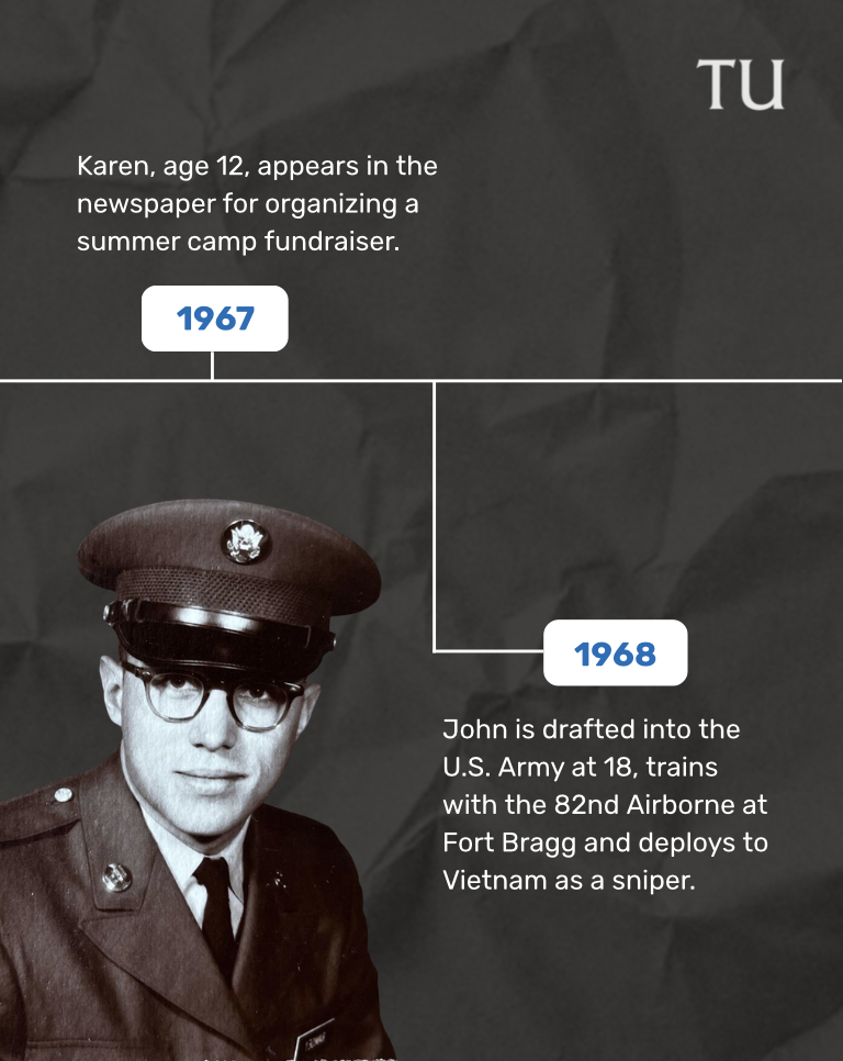
How we customised:
Step 5: Turning to video
Static graphic carousels can communicate the context and key findings of a data story effectively, but a well-paced video using the same visual elements may help capture different engagement.
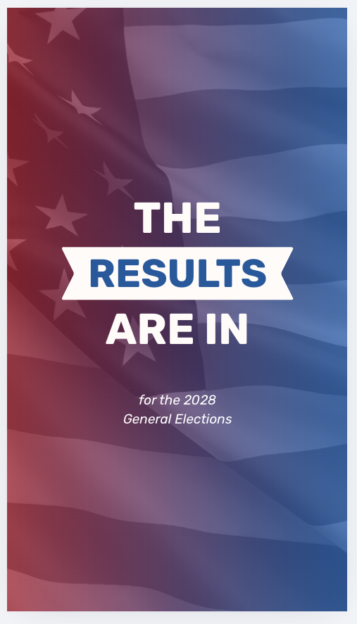
To create this format, we adapted the graph and election-data carousels into video templates. We duplicated the existing designs and applied Canva animations to individual graphics and text elements, transforming each carousel into a video.
Reporters and producers can fully customize the timing, sequence and style of the animations to suit the story and platform.
You can use and customize these templates:
Cite this article
Zai, Laiba (2026, July 23). How to build social-first data visualizations. Reynolds Journalism Institute. Retrieved from: https://rjionline.org/news/how-to-build-social-first-data-visualizations/