Search Results for results
The argument for sensitivity readers
Equity cannot be achieved through staffing alone Some years ago my news organization began employing sensitivity readers in our work. We didn’t call it that at the time. The broad imperative of these sensitivity professionals was to help ensure that a story did not in any way harm or further marginalize identity communities featured in … Continued
We’ve created a democratic, worker-led, care-centered newsroom
And now we’re sharing how you can apply that to your own workplace.
Testing API’s source tracking tool with local newsrooms
Lessons learned and common challenges with implementing the Source Matters tool.
Maximizing your membership program with product thinking and user research
Increase the value of membership for members by meeting them where they are, testing internal assumptions and employing product thinking.
Going beyond local data to contextualize a community issue
Tools and advice for finding and analyzing data in rural Lake County, California.
How to gain buy-in and knowledge before building a news product
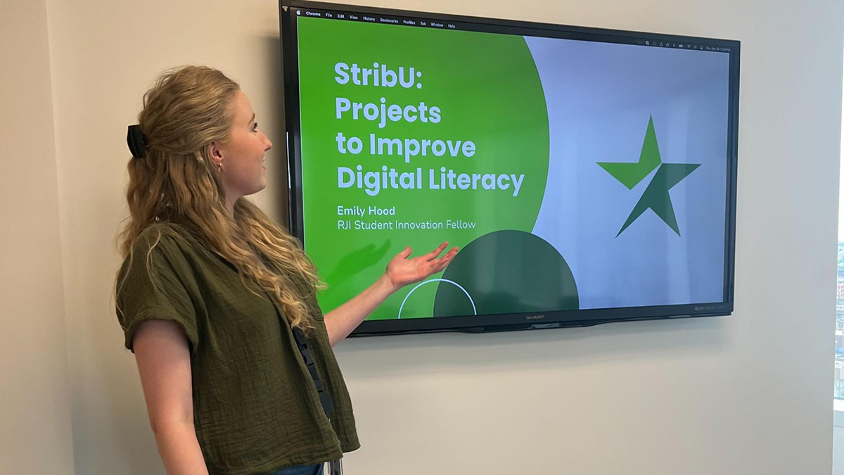
At the Star Tribune, Emily Hood will be creating a Slackbot to generate audience analytics reports. These reports can better support the newsroom as they learn about their online performance and adjust their content strategies.
RJI Community-Centered Symposium
RJI is hosting a symposium for a cohort of 30 community-centered journalists who want to come together to share and create thoughtful and actionable ways to serve our communities better.
The art of prompting AI: Science or Witchcraft?
While there are no secret prompts that will unlock new levels of responses, you will get vastly different results depending on how you prompt and which language model you use.
Four ways consumer investigative journalism is changing local TV news
Solutions oriented, community-focused reporting is making an impact and bringing in viewers.
How can newsrooms track where their stories are getting republished?
Republication tracking tools and pixels are easy to install, but far from perfect in delivering results.


