
A screenshot of a Lighthouse report on an article in The Texas Tribune.
Making sense of your core web vitals

Learn how the loading speed, accessibility and other performance metrics of your news site stacks up
You might think the first step of a story’s SEO journey starts with publishing, but there are more steps before it that contribute to successful SEO.
Search engines judge all of your content based not just its performance, but also the user experience. They’re doing it using a standard called Core Web Vitals. These vitals measure how appealing your content is not just for the text you put on the page, but also how easy a page is to interact with.
When judging interaction in search, one key measurement is making sure your page loads fast. The worst thing to experience with a slow web connection is an article taking a long time to load. Studies have found that users on mobile web have an attention span of about 4 to 8 seconds and lose patience even sooner on pages they are not familiar with. Every second that an article doesn’t load is a chance for the user to leave without receiving vital information from that news source.
Google gives specific metrics, down to fractions of seconds, but they also return broad reports that can help you understand your Core Web Vitals.
When you input a URL into this tool, it will give you scores ranging from 0 to 100 on the core tenets of Core Web Vitals with 100 being the best. It breaks down metrics and categories to explain how the page could be improved for users seeing your stories.
When Google studied millions of pages, they found that users were 24% less likely to abandon pages that met their Core Web Vitals thresholds.
The experiment
One of the first conversations I had after learning I was a fellow was to touch base with journalism professor Amy Schmitz Weiss from San Diego State University, whom I have collaborated with in the past. One of her first questions was whether or not I had looked into LION, a large association of independent news publishers.
The first thing I saw was their organized dataset of members. I instantly thought about measuring performance across all of their sites. Then I found an open source list from Ben Welsh — a data journalist from the Los Angeles Times, from his News Homepages project. Then University of Missouri professor and Knight Chair in Journalism Damon Kiesow showed me a list from past RJI Fellow Barrett Golding’s project of news sites, so I mixed them all together as a test list.
At first I looked at homepages. How are news site homepages performing? Are they meeting core web vital thresholds? Can we learn anything about publishers as a whole with all this data? Is it possible to build a baseline, so publishers can run reports and understand contextually where they sit on the spectrum of success?
Then I looked at articles on each website. I tried to pull the longest links from each site, thinking they were the most likely to be a story or a photo gallery or video, and tested those for the same performance metrics.
I wrote a script to check news homepages from June 29 to August 8 and articles from July 2 to August 8. This created a dataset of 93,560 tests of homepages and 69,198 articles which were all scored running Google Lighthouse tools. I ended up checking 1,628 different news homepages and 691 different news article websites.
Here is an interactive guide to the data I created, so anyone who views the sheet can tweak it and see how their publication fared in the dataset.
Performance
How fast does your page load? Core Web Vitals judges many key metrics to calculate this score. In all of the data, only 657 articles (0.94%) and 58 homepages (0.06%) returned a score of 100. Only six organizations received at least one 100 rating.
The midpoint for all the articles was a 54, while homepages was only a 24.

In this graph, the closer to 100, the better the performance. It shows that generally, individual articles have better performance than home pages. The height of the box shows how far apart the best and worst performing pages are.
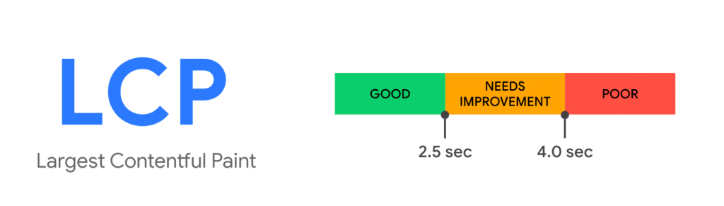
There are three key performance metrics, but I’m going to focus on Largest Contentful Paint (LCP). This name might sound intimidating, but the easiest way to think about it is: the time it takes for the page to load.
The score is the amount of time it takes the page to load the largest block of text, image or video. Google considers pages with scores of 2.5 seconds or less to be Good and over 4 seconds is the worst category.
In the article data, 9,817 items (14%) scored 2.5 seconds or less, which came from 345 different news organizations.
| Largest Contentful Paint Score | Article Total | Percentage of Articles |
| 2.5 seconds or less | 9,817 | 14.18% |
| Above 2.5, up to 4.0 seconds | 19,562 | 28.26% |
| Above 4.0 seconds | 39,140 | 56.56% |
One of the best performers was The Texas Tribune where 84.5% of their articles performed at what Google regards as “Good”, a Largest Contentful Paint score of 2.5 seconds or less. The average score across all the Texas Tribune articles was 2.06 seconds. Texas Tribune articles that performed “good” averaged 1.73 seconds in the test.
Ashley Hebler, the Texas Tribune’s Engineering Manager, said that their team relies on caching, which is when sites store data resources to reuse them later.
“Caching plays a big role in our site’s performance strategy,” Hebler said. “The engineering team leverages caching services to keep resources quickly accessible, which is especially important during times of high traffic. We also focus on delivering only assets the user needs through code splitting and lazy loading.”
As for tools that the Texas Tribune uses to maintain their performance, Hebler said they have worked to optimize images through an open source tool named Thumbor.
“Thumbor helps ensure we serve appropriately sized images for the right browser and viewport with modern image formats like WebP,” Hebler said. “Zooming out, departments throughout the organization including ad operations, photo, multimedia and design also value our readers’ ability to load a fast site and work with engineers to keep web performance metrics in balance with other goals. It takes buy-in from everyone and we’re lucky to have that.”
| Outlet | Percentage of Articles performing “good” | Average LCP Performance (seconds) across all articles tested |
| Texas Tribune | 84.5% | 2.06 |
| The Ringer | 55.2% | 3.46 |
| New Yorker | 51.4% | 3.38 |
| New York Times | 31.9% | 7.70 |
| The Washington Post | 31.9% | 4.03 |
On the other side, one particular struggle came in the 302 tests of Minneapolis Star Tribune articles, whose performance metric ended up just over 7 of 100. The average LCP score on a Star Tribune article was 28 seconds. The article page sizes are around 7 megabytes (MB), when Google recommends around 1.5 MB. Their articles load around 1 MB of unused JavaScript on the page that Lighthouse thinks can be reduced or deferred, tests of their pages found an average of 7.16 seconds of JavaScript that could be loaded later.
| Outlet | Percentage of Articles performing “poor” | Average LCP Performance (seconds) across all articles tested |
| Minneapolis Star Tribune | 99.0% | 28.68 |
| KCCI | 99.5% | 19.95 |
| Journal-News | 96.8% | 17.93 |
| Boston Globe | 100% | 15.53 |
| Orange County Register | 100% | 13.00 |
| Albuquerque Journal | 100% | 12.80 |
News organizations’ home pages do not fare as well as the articles. Less than 5% of homepage tests returned a Largest Contentful Paint score of 2.5 seconds or less.
| Largest Contentful Paint Score | Homepage Total | Percentage of Homepages |
| 2.5 seconds or less (“good”) | 4,391 | 4.69% |
| Above 2.5, up to 4.0 seconds | 16,458 | 17.59% |
| Above 4.0 seconds | 70,682 | 75.54% |
The other four scores
Performance is the key score I’m focusing on here, but there are other key scores that Google takes into account, and so should we.
Accessibility
Can everyone view your page? Google values accessibility as making sure you address concerns for vision and other impairments. If you have been on Twitter lately, you have seen the long overdue inclusion of ALT text, providing alternative text in images helps give people accurate and relevant information from their news sources.
If your site offers text to speech or lets users be able to use a screen reader, you are likely helping support people with low or impaired vision access to your story. When someone uses a screen reader, they rely on links having a unique name. If there is no unique name, chances are a screen reader can’t access it.
Some users can’t use a mouse or touchscreen, so make sure keyboards and other devices allow them to scroll the page. Captions and transcripts are a must, the Americans with Disabilities Act requires video that is on television that is put online to have closed captions. Captions and transcripts also help people who can’t hear certain frequencies.
Are you helping users who have autism, dyslexia or other cognitive issues (among others) by limiting distractions, shifts and animations that distract from their experience? The Worldwide Web Consortium suggests the best way to find out whether your content works for people with cognitive and learning disabilities is to have them perform usability testing. Figuring out users’ pitfalls on your pages will likely help make your content more accessible for all.

If this is your first step into improving your news experience for accessibility, a good place to start is 2021 RJI Fellow Hannah Wise’s Disability Matters toolkit.
Best practices
Core Web Vitals considers best practices to be if you are using clean code and mainly logging your errors in the browser console. Much like Accessibility, all the publishers performed above average in both sets of data — at an 83 or above for over half the items.

SEO
Core Web Vitals asks if publishers are following basic SEO principles. Examples in articles include whether or not you are using proper title and h1 elements. Technical examples include making sure the pages you want crawled are exposed to Google and having a sitemap. Most publishers are doing very well in this regard.

Progressive Web Wpp (PWA)
Progressive Web Apps are a way of offering a fast mobile experience without a user needing to install your mobile app. A good example is if you have ever forgotten to have the Starbucks app on your phone or were in a low connectivity network, Starbucks’ PWA runs just as well and is 99.84% smaller in size than the mobile app. Progressive Web Apps seek to optimize for offline as well as online use. Google offers guidelines on how to make sure your Progressive Web App is as powerful as it could be.

How do I test my own page?
All of my tests are only a snapshot in time and the best news is every publisher has a chance to improve.
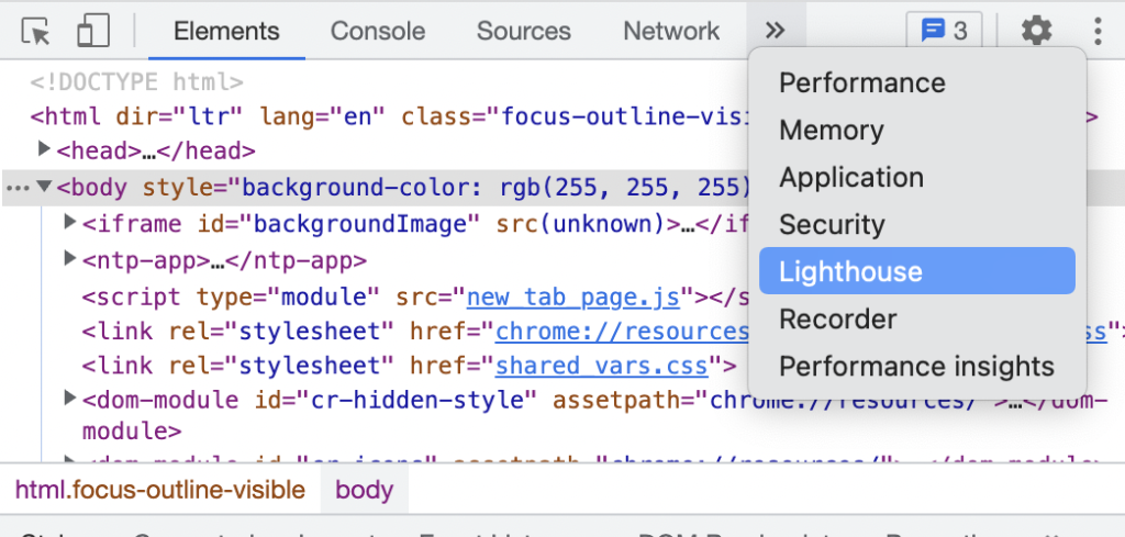
Here is a quick way for you to figure out your own Lighthouse scores, all it requires is the Google Chrome browser.
Go into View > Developer > Developer Tools. You will see some code on whatever page you are on and then hit the two arrows next to these core items like Elements, Console, Sources, and Network until you find Lighthouse.
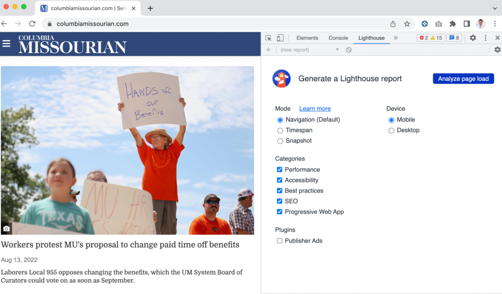
When you are on the page you want to analyze, hit Analyze page load and you will run an audit on your page. Then you can compare how your page stacks up.
You will get scores in each category mentioned above and then you can use these graphs below to see where you rank.
If your score is in the blue box it means you rank between the 25th and 75th percentile in the test data. If your data is above that, then that means you exceed the 75th percentile and that’s great performance in any category.


Interact with this data
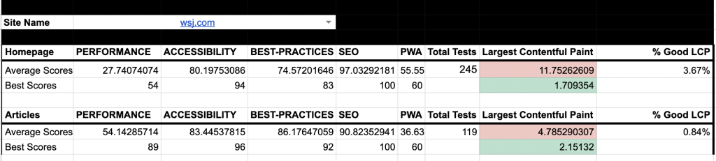
I have included all of my test data with filters as an interactive guide for you to use. Go into the first tab and select a site and the data will compile. Charts in this article are included below to contextualize how well any site you choose performed in the data.
You can search for a site and see the average scores in terms of their articles and homepages as well as their best scores. You can then compare your results to others in the industry to see where you stack up.
Want to follow up or learn more? Feel free to contact me and I can show you the tutorials I used to create my test.
If you’re interested in following my project and what else I learn through the process, find out how you can participate.
Other great resources on this topic include
- Michael Donohoe at Rest of World built an Article Performance Leaderboard that tests hundreds of news sites and updates their data daily
- Ben Welsh added a performance ranking report to his News Homepages project
- Jessie Willms and Shelby Blackley’s WTF is SEO? Newsletter post on Core Web Vitals
- Barry Adams’ SEO for Google News newsletter’s Core Web Vitals for News Publishers post
- Google recently announced they would be improving Core Web Vitals reports to help identify issues with URLs
- If you need help convincing people why Core Web Vitals are important, Google points to success case studies on how improving scores can point to higher conversion
Comments